Sign-up form best practices: what a year of audits taught me
Generated by Klaviyo AI
Maria Trotta, Senior Digital Strategist on Klaviyo's Professional Services team, draws on a year of auditing Klaviyo accounts (plus 12 years running lifecycle and retention at DTC brands) to break down why most sign-up forms underperform and what separates the ones that convert. The piece uses real brand examples — Bearpaw, MERIT Beauty, Caden Lane, Tata Harper, Leonisa, and minnow — to walk through benchmarks, common failure points, and a testing framework for improving submit rates.
- Submit rates should beat the 3% floor: Klaviyo's general benchmark is a 3% submit rate, but Trotta calls that a low bar — she's seen brands hit 8–20%. Expected ranges vary by form type: standard pop-ups run 3–8%, while exit-intent and phone-only forms tend to land at 10–13%.
- Weak incentives and generic copy tank performance: Low submit rates usually come down to a form that isn't giving people a reason to care — common culprits include generic non-branded copy, identical email and SMS messaging, poor mobile optimization, weak copy hierarchy, and no creative investment.
- Converting forms share four traits: Across her audits, high-performing forms consistently include an eye-catching headline, a clear incentive, a real value proposition, and compliance copy that reads with personality rather than fine print — as seen in examples like MERIT Beauty's pop-up, which pairs a product image with a concise "ships free" offer.
When was the last time you looked at your sign-up form?
If you can't remember, you're not alone. Many of the brands I work with haven’t updated their sign-up form in years.
But when you neglect your front door, you lose curb appeal and no one wants to visit. And that means you miss out on valuable relationships. When each new subscriber is a potential customer, that’s a lot of revenue potential to leave up to one outdated form.
I've spent the last year auditing Klaviyo accounts across dozens of brands. Before that, I spent 12 years running lifecycle and retention as a team of one at DTC beauty and lifestyle brands.
I've seen a lot of forms. Most of them are fine. But “fine” is the problem.
What's a good sign-up form submit rate?
While Klaviyo sets the general benchmark submit rate at 3%, I would say that’s a low bar.
I’ve worked with brands with submit rates in the 8–20% range. If you’re under 3%, it’s time to re-evaluate your strategy. If you’re at 3%, you should still be working on it.
Where your form lands in that range depends a lot on what kind of form it is and who it's targeting. Here’s what I’d expect to see:
- Standard pop-up form (first touch on your homepage): 3–8%
- Exit-intent forms: 10–13%
- Phone number capture-only forms: 10–13%, especially when targeted at email subscribers
The more targeted it is, the better the sign-up form tends to perform. A standard “Sign up for our newsletter” pop-up asks a stranger for a lot with very little context. An exit-intent form or a phone number-specific ask, shown to someone who's already engaged, is more likely to convert.
Footwear brand Bearpaw runs a bigger incentive on their exit pop-up than on their welcome pop-up, perhaps based on the theory that someone who’s about to leave needs a stronger reason to stay. Their exit pop-up submit rate now sits at 2.7x the median of their 100 closest peers.
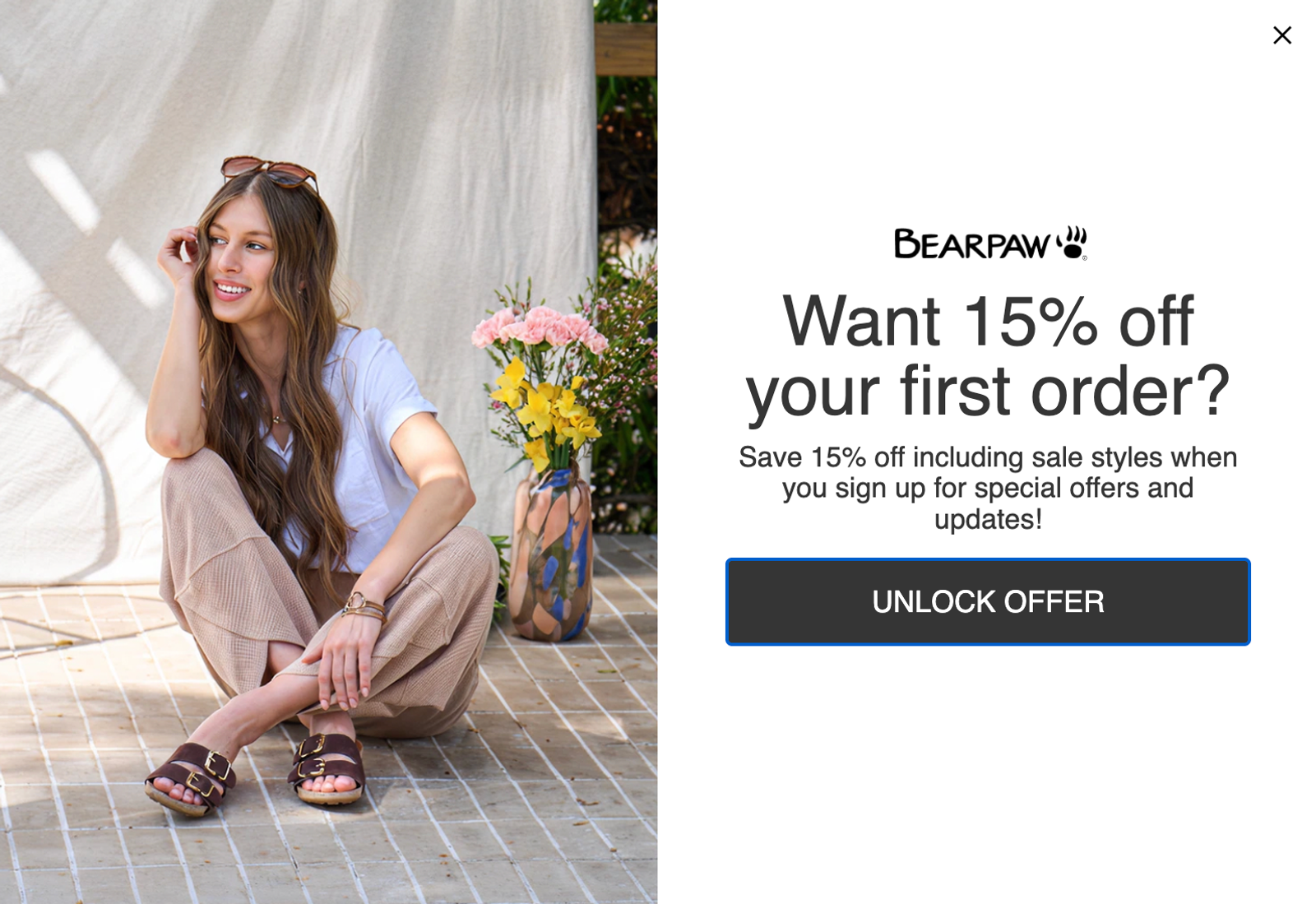
Source: Bearpaw
Why is my sign-up form underperforming?
Low submit rates usually trace back to one of two things: a weak incentive, or a form that just isn't giving people a reason to care.
Sign-up forms need to offer something of value that gives the customer a reason to hand over a personal piece of information. Most customers don't even redeem the welcome code, but the sheer fact that they got something makes it feel like a fair exchange.
In other words, the incentive signals the relationship is a two-way street. Free shipping, early access, an exclusive text message-only drop, a small discount: any of these can work, as long as there's a clear “Here's what you get” attached to “Here's what I'm asking for.”
Sometimes, retention teams have trouble getting sign-up forms approved at all. Creative teams often see pop-ups or forms with discounts as beneath the brand, and I understand the sentiment. Nobody wants their site to feel like a discount outlet.
But the assumption that a well-designed pop-up form is inherently spammy or tacky is really just a hypothesis. And hypotheses can be tested. Your customers probably like certain sign-up form elements more than you do. Personally, I’m not super into a spin to win. But I used it with a brand, and it earned a 20% sign-up rate. So what if I don't love it? Our audience did.
As a marketer, your job is to design your sign-up form to follow your brand guidelines, and always listen to what your audience wants. At the end of the day, think, “Do I want customers or not?”
Other reasons for sign-up form underperformance are fairly consistent across brands:
- Generic, non-branded copy: If your form copy could belong to any brand, it's not doing its job.
- Identical copy for email and text messaging: These are two different lists and very different asks when it comes to a customer’s attention.
- Poor mobile optimization: 53% of consumers make retail or ecommerce purchases on mobile, according to Klaviyo’s 2025 Future of Consumer Marketing Report. Assume the majority of traffic will come from mobile and that your form design needs to be mobile-first. This is non-negotiable.
- Weak copy hierarchy: If you're offering a discount, that offer needs to be the first thing someone sees. Don’t bury it under 3 lines of brand narrative.
- No creative investment: A block of solid color with white text and no images technically counts as a form, but it probably won’t convert.
Treat a pop-up form as seriously as any other piece of brand marketing. If leadership decides against a pop-up form, that’s their call to make. But go back to your goals, and run experiments to see where your highest-value customers are coming from. If it’s your pop-up, it may be worth re-evaluating.
What’s the anatomy of a sign-up form that actually converts?
Across the audits I've run, the forms that consistently perform well share 4 things:
- An eye-catching headline: Use copy that stops users in their tracks.
- A clear incentive: Include a discount or product offer rather than just asking someone to join a list.
- A real value proposition: Explain why someone should want to receive your emails or text messages.
- Compliance done right: Include consent language that names your company, has personality, and doesn't read like fine print.
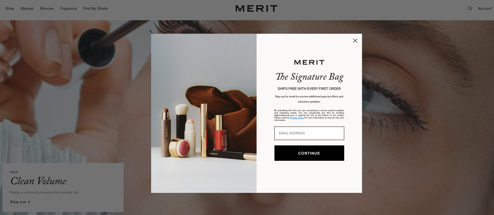
MERIT Beauty's sign-up pop-up form includes a product image, a clear incentive (“Ships free with every first order”), and compliance copy that’s concise and noticeable.
Source: MERIT Beauty
Using your sign-up forms as personalization engines
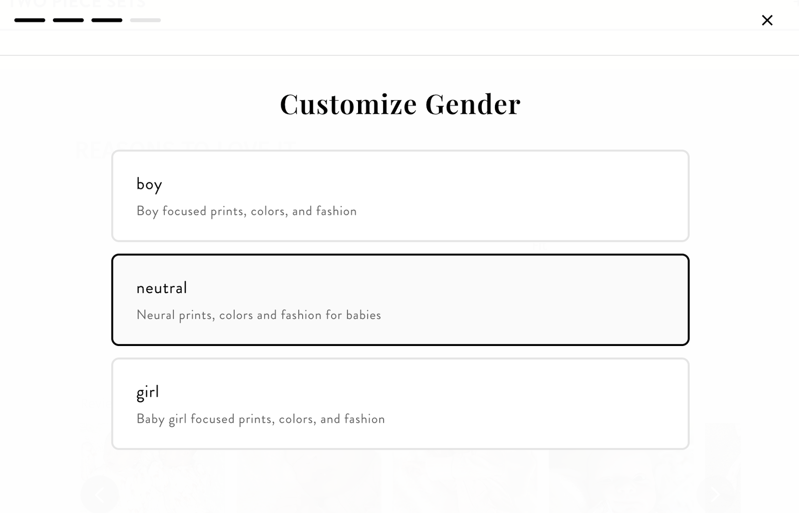
Conventional wisdom says fewer form fields means higher conversion, but that's not universal. Baby clothing brand Caden Lane tested 30 versions of their sign-up form and found the opposite: their conversion rate was highest when the form asked for more context, not less, including who the shopper was buying for.
The extra fields let Caden Lane personalize every future message to every subscriber, and shoppers responded well to that trade-off.
Source: Caden Lane
Using AI to optimize your sign-up forms
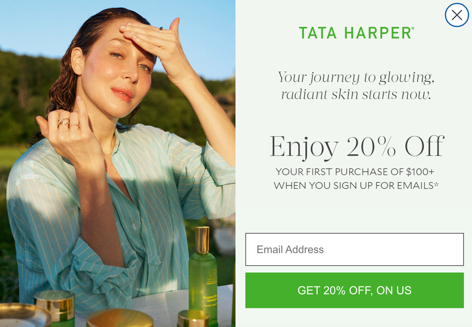
AI forms display optimization can refine your pop-up timing, creative, and audience rules, testing variations automatically and serving the best-performing version to each visitor. Skincare brand Tata Harper, for example, saw a 65% increase in sign-up form submissions after using forms display optimization on two forms, all without having to run manual tests.
Source: Tata Harper
When and where should my sign-up form appear?
People spend a lot of time debating pop-up vs. slide-in vs. full-screen. In my experience, that's not the most important conversation, especially when mobile forms take up the full screen anyway.
What’s more important are your form settings: the time delay, your target audience, form frequency, and page exclusions. Here are a few things to keep in mind:
- Pair a time delay with a scroll trigger, rather than showing the form immediately on page load. Something like a 5-second delay combined with a 20% scroll gives people a chance to orient themselves before you ask for anything.
- Exclude pages where a form doesn't belong. Your check-out and about pages are two obvious destinations to exclude your sign-up forms from.
- Don't skip the teaser. If someone closes your form on first load and there's no way back in, that subscriber is gone for good. A teaser module gives them an easy way to get back to signing up when they’re ready.
Some brands really don’t want to use the teaser, which is okay. But in that case, I’d recommend having delays across your website to make sure you're not losing people the second they land on the page. Based on my experience, skipping the teaser will cost you.
Text message-specific forms have different challenges and considerations. Asking someone to type a full phone number and confirm consent with a one-time code is a bigger ask than dropping in an email address. With Klaviyo’s Smart Opt-in, subscribers can confirm their consent with autofill without leaving your site.
Intimate apparel brand Leonisa targeted their text message sign-up prompts specifically to mobile shoppers, perhaps based on the logic that people already browsing on their phones would be the likeliest to opt in for mobile marketing. In the US, that targeting drove 1.6x the median form fill rate for Leonisa's peer group, according to Klaviyo benchmarks.
How can I set up a testing program for my sign-up forms?
Klaviyo's AI-powered forms display optimization is a useful way to find the best form timing and settings. To get a clear dataset, run these tests during times that are business as usual, not during busy sale periods and launches.
The instinct to test during a high-traffic moment, like a sale or a product launch, makes sense on the surface: more traffic should mean more data. But the behavior underneath that traffic isn't the same.
Somebody is probably going to sign up during a sale or a launch because it's new and exciting, and the offer is usually better than what you'd show on a regular day. So that test isn't telling you what your baseline form performance actually is.
The better approach is to build a full picture over time: a baseline test during a quiet period, plus separate tests during your bigger moments, so you know what actually works in each context rather than assuming one setting fits every scenario.
Important notes:
- Whichever test you run, give it enough time to reach statistical significance. Let it accumulate at least a few hundred submits per variation before calling a winner, and resist the urge to check the results daily. Early leads flip more often than you'd think.
- Always change only the variable you’re testing. For example, if you’re testing incentive type, make sure you keep headline, copy, images, timing, and structure the same, so you can be sure it’s the variable you’re testing that causes any differences.
With that in mind, here are some example A/B tests you can run:
Incentive type (e.g., percentage off vs. dollar amount vs. free shipping)
Different incentives can be worth roughly the same to the customer but perform very differently on the form. For example:
- A: “Get 15% off your first order.”
- B: “Free shipping on your first order, always on us.”
Incentive amount (e.g., 10% vs. 15%)
Find the smallest offer that still converts, so you're not giving away margin the form doesn't need. For example:
- A: “Unlock 10% off your first order.”
- B: “Unlock 15% off your first order.”
Headline copy (e.g., offer-first vs. brand-first)
Test an offer against a line in your brand voice, and let the submit rate settle the internal debate. For example:
- A: “Get 15% off your first order.”
- B: “Your best skin starts here” (and move the offer to the subhead).
Imagery (e.g., product shot vs. lifestyle shot vs. no image)
A form with strong imagery often beats a text-only version more than any copy tweak would. But you can prove it with a test. For example:
- A: form with a product image on a clean background
- B: the same form with a photo featuring a customer using the product
- C: the same form, no image at all
Timing (e.g., immediate vs. a 5-second delay paired with a 20% scroll trigger)
This is to test audience settings and timing. For example:
- A: form fires on page load
- B: form fires after a 5-second delay and 20% scroll depth
Form structure (e.g., single-step vs. multi-step)
Test whether your audience is willing to fill out more form fields or not. If they are, you can send more targeted messages in the future. Gauge success based on both submit rate and what that extra field can do for personalization. For example:
- A: one screen asking for email address only
- B: two screens, where the first screen asks for email address, and the second asks a question like, “Who are you shopping for?”
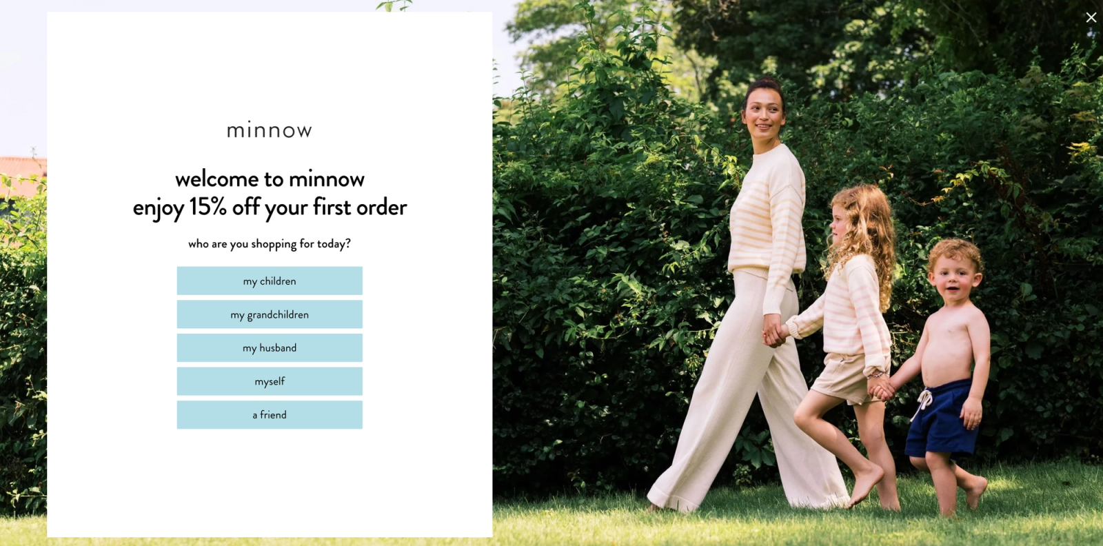
In this example from apparel brand minnow, the first step of the form asks the subscriber who they’re shopping for. The form features a lifestyle image along with their brand colors, their logo, and a large headline with the 15%-off promotion.
Source: Minnow
Teaser status (e.g., on vs. off)
If your team is skeptical of the teaser, this test settles the argument with your own data instead of someone else's best practice. For example:
- A: The teaser tab stays docked at the bottom of the screen after someone closes the form.
- B: No teaser, and the form is gone once closed.
How often should I redesign my sign-up forms?
Revisit your forms on a schedule, not just when something breaks. Put it on the calendar. I recommend brands revisit their forms at least once a quarter.
If you're running a sitewide sale, your sign-up form needs to match that offer. But you’ll also have to update everything downstream: your sign-up form, welcome flow, and abandoned cart messaging should all show the same promotion or discount, messaging, and branding.
Your ongoing sign-up form update schedule could look something like:
- Quarterly baseline refresh, even if it's just a new seasonal image and a copy pass
- BFCM and major sitewide sales, with messaging that matches your flows
- Product launches, where a form update can double as a teaser for what's coming
- Early-access moments, for brands with loyalty programs or VIP tiers
If it's been more than a quarter since anyone looked at your sign-up form, it’s been too long. Review for sharper copy, add real incentives, make sure design is mobile-first, and set the timing so people have room to actually notice the offer before you ask for their information.
Turn your sign-up forms into a growth channel with Klaviyo
Get everything you need to audit, test, and rebuild your forms lives in one place with Klaviyo. The autonomous B2C CRM makes it easy to test your strategy again and again, with:
- Centralized subscriber data in unified customer profiles, essential for 1:1 personalization at scale
- Sign-up forms that come with built-in targeting rules, A/B testing, and AI forms display optimization, so you can test your way to better submit rates
- Smart Opt-in for text message marketing, which lets subscribers confirm consent with autofill so they don’t have to go to their messages to find a code

Related content