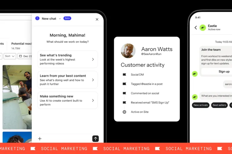
New overview dashboard enhancements
Generated by Klaviyo AI
The post outlines new capabilities in Klaviyo’s overview dashboard that improve performance tracking, deliverability insights, signup form monitoring, and sharing of results. It explains how marketers can compare periods, understand email health by domain, view form metrics in one place, and export dashboards as PDFs.
- Year-over-year comparisonUsers can compare performance to the same period in the prior year, including key events like Cyber Week, using flexible date range options.
- Deliverability by domainThe dashboard now surfaces email deliverability metrics by email domain, helping identify issues with specific mailbox providers through bounce, spam complaint, and unsubscribe rates.
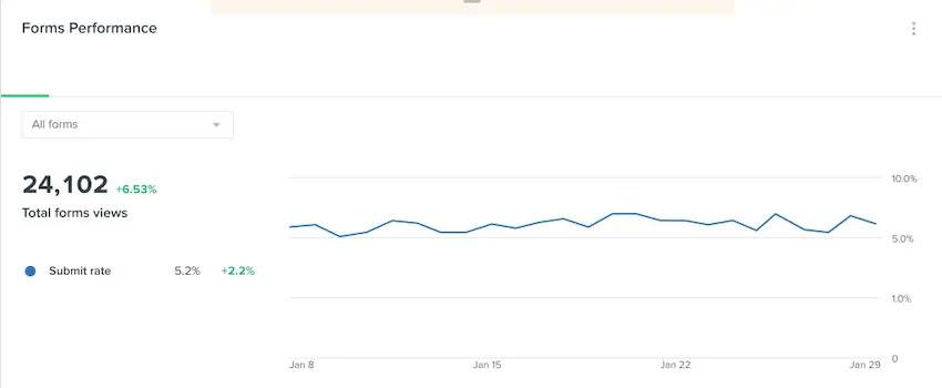
- Signup form insightsA new forms performance widget shows submit rates and highlights which signup forms are performing well or may need optimization, alongside email and SMS metrics.
- PDF export sharingDashboards can be exported as PDFs so stakeholders can quickly review visual summaries of campaign performance and trends over time.
- Customizable performance hubThe overview dashboard serves as a customizable, centralized source of truth for tracking key marketing metrics across channels for different types of brands.
Earlier this year, we released our new overview dashboard, giving you a central place within Klaviyo to track and understand your marketing performance.
The new dashboard makes it easy to answer some of the tough questions you’re continually asked as a marketer: “What channels are making us the most money?” “How does our performance compare to our competitors?” “Are we getting better over time?”
We’re happy to announce new enhancements to the overview dashboard to make it even easier to track your performance across all marketing channels and to share your results.
With the new functionality, you can:
- Compare your performance to the same time period in the prior year
- Track email deliverability and sender reputation across different mailbox providers
- Measure signup form performance alongside your other marketing channels
- Export your dashboard as a PDF to easily share results and visuals
Compare performance to prior year
You’re a marketer at an online apparel retailer and you’ve just wrapped up your second Black Friday/Cyber Monday with the brand. This year, you made some changes to your strategy that you think will lead to more purchases. As you’re looking at your performance metrics, you want to know if your decisions paid off.
Now, with the overview dashboard you can easily compare your performance to the same period the prior year. Comparing your Cyber Week results to the prior year, you quickly see revenue is up almost 7%. It’s clear your decisions paid off, and now, you have a better sense of how to set your brand up for success on next year’s Black Friday and Cyber Monday campaigns.
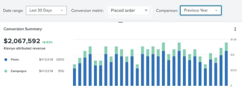
Want to give it a try? Simply switch the comparison period at the top of the dashboard from “previous period” to “previous year.” This will update the comparison metrics — the percentages shown in green and red — to show increase or decline from prior-year results. Need to compare performance to a specific time period in the past? Set your date range using “month to date,” “week to date,” or a custom time period.
Understand deliverability across mailbox providers
Klaviyo helps brands of all kinds boost revenue through SMS and email marketing — and the first step to success is making sure your messages are actually getting to your customers, instead of landing in the spam folder, or disappearing into an abyss of obsolete email addresses.
The overview dashboard shows key email deliverability metrics, including email bounce rate, spam complaint rate, and unsubscribe rate — metrics that paint the picture of whether your emails are resonating with your audience. If you notice that all these rates are climbing, it’s time to take a step back to clean your lists, revisit the relevance of your content, and ensure you’re making it easy for customers to unsubscribe.
Email deliverability is a challenge because every mailbox app — from Gmail to Yahoo to AOL — uses different algorithms and metrics to evaluate incoming emails and determine whether or not they’re spam. All this evaluating happens inside a black box, so while you can’t know before you click send on your first-ever email campaign how it will perform across all these different providers, you can keep an eye on your engagement metrics for each individual provider to indicate where you may have issues.
Now, the overview dashboard shows you email deliverability by email domain. These metrics help you spot issues with certain mailbox providers signaling that you may need to revisit the quality of your list or send to a smaller engaged audience.
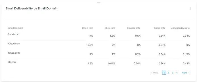
Email deliverability: It’s complicated. But it’s the foundation for a successful email marketing program. Check out our Help Center article to learn more about deliverability best practices.
Track signup form performance in the same interface
Now, in addition to seeing your email and SMS results in one place, you can also use the overview dashboard to track key metrics for your signup forms.
Gone are the days of navigating to Klaviyo’s signup form page to see these results. A brand new forms performance widget showcases your form submit rate right in the dashboard. Check out the stats on a single form, or get the big picture with a quick look at which forms are performing well and which forms need some attention. If your form submit rate is not where you’d like it to be, take a look at these best practices to increase conversions.
Easily share results and data visuals
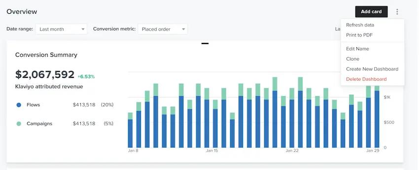
The overview reporting dashboard for email campaigns and more is your one-stop shop for understanding how your marketing efforts are performing. With the ability to fully customize the dashboard, you have the insights you need at your fingertips to prepare for your next performance recap with your boss or the rest of your team.
Of course, sometimes, your boss or teammates might need easy, direct access to this one-stop shop, too — so we’ve also made that easier than ever. Now, you can download and export your dashboard so your boss or other key stakeholders can quickly see how your marketing program is performing. Easy-to-read visuals showcase what’s working — and where there is opportunity to improve.
Remember that email campaign that exceeded all targets and drove the most revenue last month? The campaign’s success is more impressive when your boss can see the results mapped on a chart compared to prior campaigns.
The new export functionality provides a quick and easy way to share a snapshot of your marketing performance with those who need it.
Your one-stop shop for tracking performance
Every brand is different. We want to make sure Klaviyo’s overview dashboard is your single source of truth for viewing your key metrics, no matter what size or kind of business you have, or who your customers are. That’s why we’re introducing even more customization options, deeper insights, and more easily accessible data for all.
If you’re already using the overview dashboard to track performance, log in to start using these enhancements today.
If you’re new to the overview dashboard, don’t worry: Diving in is easy. Here’s more information on how to get started and take your email and SMS marketing to the next level.

Related content