Is your business getting web traffic every month?
If so, conversions from pop-up forms can make up a big chunk of your list building, communication, and revenue opportunities.
The data proves it: if you don’t incorporate pop-up forms into your web strategy, you’re doing your ecommerce store a massive disservice.
When Backlinko’s Brian Dean, for example, trialed an email pop-up on his website, he ended up increasing his subscription numbers from 35 to 75 per day, with a 3.42% conversion rate.
Here, we go over the basics of email pop-ups so you can start to understand the important role they play in your online presence—and your business as a whole.
What is an email pop-up?
An email pop-up, also known as a sign-up form or pop-up form, is an on-screen window with an email address form field that appears on a website.
More broadly, brands use on-site pop-up forms in many ways—to offer someone a discount right before they abandon their cart, for example, or to collect their phone number for SMS marketing.
But an email pop-up, specifically, prompts visitors to enter their email address, usually in exchange for something, so your brand can get permission to communicate with them in the future.
Email pop-ups are one of the most common and effective email list building strategies. The larger your email list, the bigger the audience you have to spread the word about your brand—and the more chances you have to nurture subscribers toward making their first purchase or turning customers into brand champions.
Why email pop-ups matter
Here are just a few of the key benefits you can expect when you implement and optimize email pop-ups on your website:
1. Email pop-ups grow your email list—and your customer base
At their most basic level, your email pop-up form is your primary vehicle for growing your subscriber list. Even if it’s only a stepping stone to future revenue, it’s a vital one—because what pop-ups actually do is grow your list of potential customers.
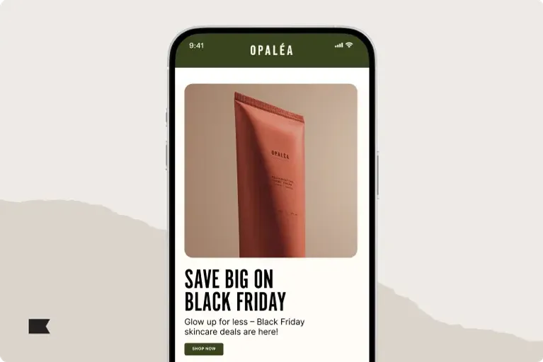
2. Pop-ups can communicate a seasonal or special promotional offer
If you’re running multiple offers, a pop-up can be a great way to consolidate them so they’re easier to find. Customers will appreciate the discount code transparency and have more of an incentive to purchase—but if they’re not ready to buy, you can slip in an ask for an email address, too.
3. Pop-ups can make the browsing experience feel more relevant
We all know how effective Amazon’s product recommendations have been. Email pop-ups can offer a similar experience for your customers.
Nothing increases the success of any communication quite like relevance. It’s also what makes a pop-up go from annoying to acceptable—perhaps even welcome.
Email pop-ups can make the shopping experience feel more relevant when you personalize them based on shoppers’ on-site behavior, such as:
- Creating a unique email pop-up form based on the source of traffic (e.g., how someone found your website)
- Only showing an email pop-up form to browsers who show exit intent, so you can keep in touch with them once they leave your website
- Filtering out existing email subscribers from seeing your email pop-up
Components of an effective email pop-up
Incentive
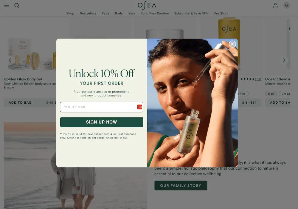
Think of the information you’re asking for on your email pop-up as a form of currency. Your visitor wants to get something of equal or greater value in return for giving you their email address.
Here are a few common incentives to consider using on your email pop-up:
- Percentage off
- Dollar amount off
- Free gift with purchase
- Chance to win a contest or giveaway
- Free shipping
- PDF downloads and guidebooks
Note: You don’t need to offer a discount to grow your email list. Always A/B test whether a discount is the right move for your brand.
Brava Fabrics, for example, used to offer a 10% discount for new subscribers. But when they A/B tested a different incentive—the opportunity to enter a contest to win €300 in free products—they discovered the two offers performed identically.
Headline
Your headline is meant to grab attention, so make it bold. Experiment with calling out the offer in the headline, rather than the description text.
If you don’t have an offer for your pop-up, lean in to your brand voice to craft a unique headline—one that resonates with your audience.
Description text
Your description text elaborates on your headline. Whether that means adding context to an offer or not, this text should explain what someone will gain by entering their email address into your form.
Some pop-up text uses bullet points for clarity, but you may want to use a short paragraph. Keep it concise yet persuasive.
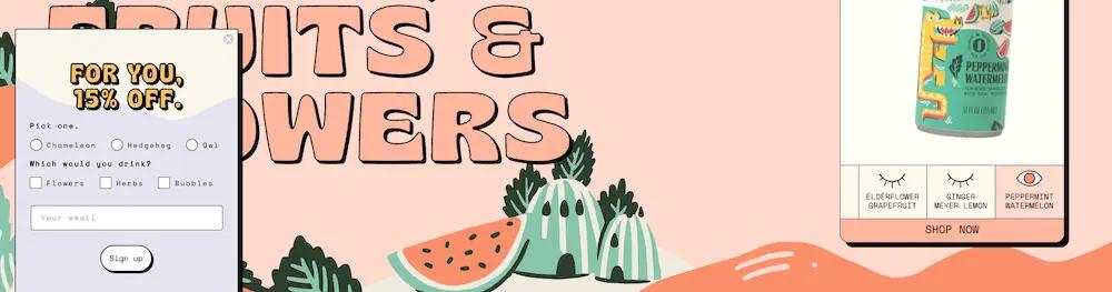
Form fields
Form fields are where people enter their information, typically an email address. Sometimes brands will ask for more information, like a phone number for SMS marketing or a birthday for a more personalized brand experience.
While data from Wisepop suggests one field converts better (4.30%) than multiple fields (2.61%-3.45%), it’s more productive to think of form fields as a trade-off. For example, while you may yield fewer conversions when asking for two pieces of information, it’s worth it if you can drive revenue because you’ve gathered that extra information.
On this note, multi-step forms are a good avenue for testing how your site visitors prefer to pass along their information.
A multi-step form allows you to collect more data points than just someone’s email—such as their phone number, if you’re also working on growing your SMS list. But because you’re gathering this information in separate steps rather than all at once, you decrease the likelihood of a potential subscriber getting overwhelmed and forgoing the form all together.
CTA button
The CTA button is what people click or tap to submit their information. The text on the button should use action-oriented language to create a sense of urgency. Basic examples include “Subscribe,” “Sign Up,” or “Get Your Discount,” but you can be as creative as your brand voice will allow.
When you’re setting up your email pop-up, consider A/B testing:
- CTA button color
- CTA button size
- CTA language
Exit button
An exit button is what allows people to easily dismiss the pop-up if they’re not interested in subscribing. The option to dismiss is a crucial part of creating a positive user experience for your website visitors.
Your exit button can be a simple “X” in the corner, or a text link that says “Dismiss.” Note that using text link language like “I don’t like discounts” may come across as manipulative or passive-aggressive.
Compliance text
For brands with a European presence that are required to follow GDPR, you must include compliance text that communicates:
- What kind of emails the subscriber will receive (marketing emails)
- Where people can read your privacy policy
- A way to agree to your privacy policy, in the form of a checkbox
3 common types of pop-ups to use on your website
Not all pop-ups are created equal. Some interfere with site interactions until they’re dismissed—which may be what you want, depending on your goal—while others sit on the sidelines, waiting for an interaction.
Here are the 3 most common types of pop-ups to consider:
1. Standard window pop-up
A standard window pop-up appears as a standalone window on top of a website’s content. As opposed to pop-up modals, which fully obscure website content, standard pop-ups obscure only a portion of the website and are usually easy to dismiss.
Your standard window pop-up design will depend on how prominent you’d like your pop-up to be, so make sure to define your goal before making any design decisions.
2. Overlay pop-up (a.k.a. full-screen pop-up)
Overlay pop-ups are considered the most intrusive form of pop-up because they obscure the entirety of the website’s content.
While it’s difficult to find an overlay pop-up in the wild as most brands tend to shy away from them, you may encounter one that serves a larger website goal.
3. Fly-out pop-up (a.k.a. slide-in pop-up)
A fly-out email pop-up appears from the side of a website. It’s typically smaller than a standard window pop-up and doesn’t cover much of the page.
Fly-out pop-ups are often used as a less intrusive alternative to standard pop-ups, with the goal of capturing an email address after someone has had a chance to browse the website at their leisure.
Run through 11 best practices for using email pop-ups to capture website traffic, with a few real-life examples to get you started.
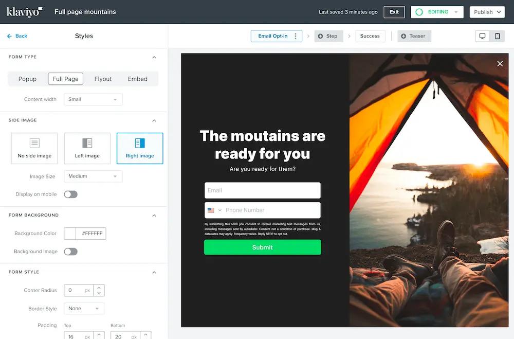
Get the tipsSet up your email pop-ups with Klaviyo
Email pop-ups turn website visitors into email subscribers—and they’re how you build a foundation for communicating in a style and tone that’s completely your own.
Klaviyo not only makes it easy to build your email pop-ups with a drag-and-drop builder and over 50 ready-to-customize templates. It also handles email, SMS, and web forms under the same roof as all your customer data—which simplifies and streamlines every stage of the email pop-up process, including:
- Specifying who should see your pop-ups and who shouldn’t
- Launching pop-ups with different triggers—scroll depth, exit intent, etc.
- Collecting more than just email addresses, including phone numbers for SMS or customer preferences and information for future personalization efforts (remember to set up a separate welcome flow for email vs. SMS)
- Using multi-step forms to collect information in stages, as a less overwhelming option for website visitors
- Testing and optimizing forms for maximum performance
Related content
- 13 best practices to create sign up forms that convert
- Getting started with sign-up forms in Klaviyo
- 14 tips for growing your SMS list and getting more opt-ins—without breaking compliance laws
Power smarter digital relationships with Klaviyo SMS.
Get started
Related content