Pop-up forms are still very much alive—and they’re essential to building email and SMS marketing lists.
According to 2023 data from Wisepops, the average conversion rate on a pop-up is 3.80%. But if you’re in the top 10% of businesses, you can see conversion rates up to 23.67%.
These numbers fluctuate based on a variety of factors, including trigger type, number of fields, images, device type, and more. Pop-ups with an image, for example, earn an average conversion rate of 4.96%, according to Wisepops.
But if you can drive a high amount of traffic to your website, the value of email pop-ups, also known as sign-up forms or pop-up forms, becomes a no-brainer.
Setting up a successful email pop-up can help you grow your email list and increase conversions. Here, we run through 11 best practices to help you capture a lot of that website traffic, with a few real-life examples to get you started.
1. Segment and target the right audience
With email pop-ups, the people you exclude are almost more important than the people you include. If one of your goals is to make your pop-ups less intrusive, start by suppressing existing subscribers as an audience segment that shouldn’t see your pop-ups. If they’ve already subscribed, they don’t need to see your email pop-up again.
So what about audience segments that should see your email pop-ups? Try crafting pop-ups for:
- New website visitors: introductory pop-up
- Returning website visitors: follow-up pop-up
- Customers who abandoned their shopping cart: persuasive pop-up
- Existing customers: special offer pop-up
You can also tailor your pop-up to website behavior. This changes the context of the pop-up and therefore the copy. Create pop-ups that appear based on:
- Scroll depth: product- or section-specific pop-up
- Time on page: ask to subscribe after different time intervals
- Exit intent: last-ditch effort pop-up
2. Write a strong headline
A strong pop-up headline achieves the perfect balance of clear and unexpected.
While most pop-ups on the internet aren’t very engaging, one way to make yours stand out is testing your way to a winning headline. A strong pop-up headline:
Tailor your headline to fit the goal of your pop-up.
Always aim to be clear over clever, but consider experimenting with wit, voice, and compelling offers people can’t ignore.
Craft a headline that gives the visitor a taste of who you are.
It may not surprise you that this example from healthy soda brand Olipop is an exit intent pop-up—meaning it appears when someone is trying to leave the brand’s website.
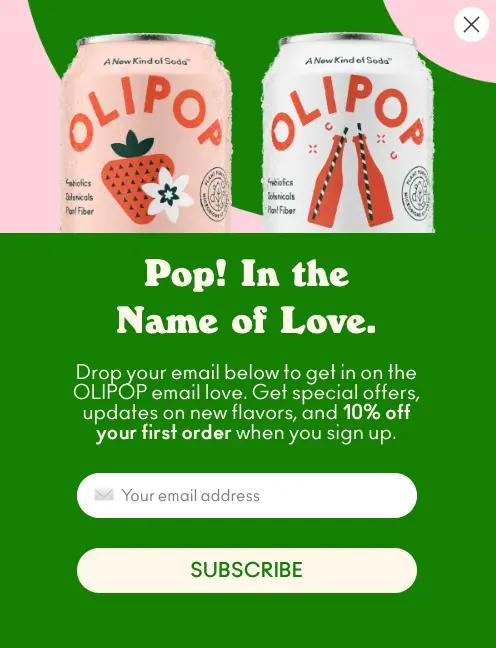
Known for their bright colors and cheeky copy, Olipop encourages people to stay on site with a pun. The headline fits the brand voice and the context for the pop-up.
3. Write simple, straightforward copy
Your email pop-up has one job: to persuade the visitor to subscribe to your emails.
Your best bet for capturing that email address is to be clear about the exchange. While you may be able to test clever vs. clear for your headline, your pop-up copy should always be more straightforward. It’s a promise you’re making to your subscriber: that you understand the privilege of obtaining their email address, and you won’t abuse it.
This example from Italian design brand Alessi doubles down on copy and leaves out a headline entirely.
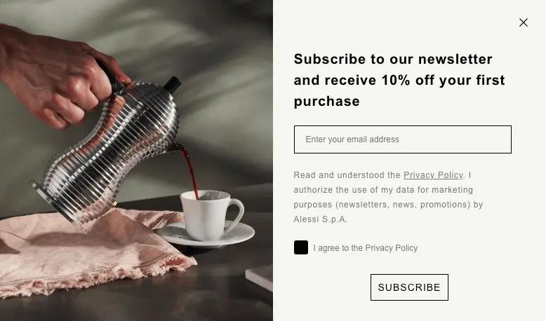
Alessi opts to communicate an offer and dedicate more space to their privacy policy, which offers GDPR-compliant transparency for how the brand will use the subscriber’s email address.
4. Offer an irresistible incentive
You can experiment with headlines and copy to the nth degree, but nothing gets someone to share their email address more than an incentive.
But do you offer a discount? A free gift or shipping with purchase? Entry into a contest or giveaway? Exclusive content? If you don’t want to break the bank, you can get creative with testing different pop-up incentives.
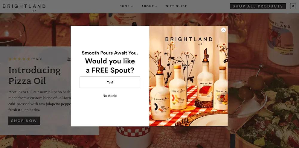
If you operate in an industry like skincare, where your product costs very little to make and you can sell it for a high price, a free gift with purchase might be a smart alternative to a discount. In this email pop-up, olive oil brand Brightland, for example, offers a free pouring spout in exchange for contact information:
5. Create an eye-catching design
Good design is subjective. What looks great for one brand won’t look so great for another. And keeping up with design trends is difficult if you don’t have access to a full-time designer.
This is why customizable templates are important. If you want to deploy your email pop-ups across many pages at scale, you probably won’t have a lot of time to fiddle around with design—but a well-designed email pop-up can make a big difference in terms of conversion.
Some of the most important design elements of an email pop-up include:
- A modern font
- A lovely color palette
- A great product shot
- A stand-out call-to-action (CTA) button
- A clean design with minimal fields (more on this later)
- Bonus: a photo that represents your audience
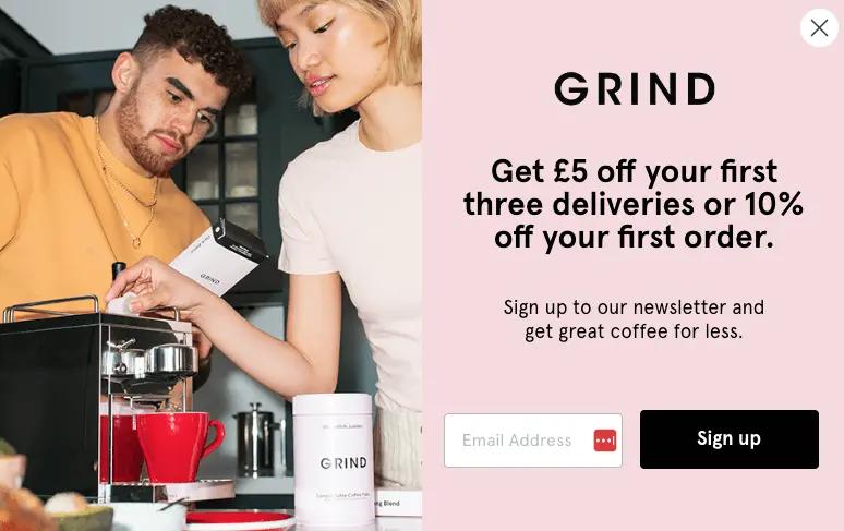
This example from coffee brand Grind combines all of these elements into one. The brand colors pop against a product shot with people in it, and the font carries some flair that isn’t standard or outdated.
6. Keep fields to a minimum—but test additional fields
The latest data from Wisepops suggests one field converts better (4.30%) than multiple fields (2.61%-3.45%), but every brand is different.
Be prepared to test your way into the optimal number of form fields for you, and make sure you have plans to use whatever additional data you capture.
While you may yield fewer conversions when asking for two pieces of information, it’s worth it if you can drive revenue because you’ve gathered that extra information—and better segment your list or personalize your messages in the future.
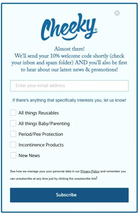
Here, Cheeky Wipes asks for one additional piece of information that not only allows them to segment their audience from the jump, but also, importantly, enables subscribers to tailor their experience with the brand. By adding checkbox preferences for future specific product recommendations, the brand lets subscribers call the shots—and promises that they’ll only receive relevant product offers based on their choices.
On a similar note, multi-step forms are a good avenue for testing how your site visitors prefer to pass along their information.
A multi-step form allows you to collect more data points than just someone’s email—such as their phone number, if you’re also working on growing your SMS list. But because you’re gathering this information in separate steps rather than all at once, you decrease the likelihood of a potential subscriber getting overwhelmed and forgoing the form all together.
7. Include a clear CTA
Your CTA button is the thing people click to convert on your email pop-up, so needless to say, it’s important. Consider your CTA your last opportunity to express what the reader gets for subscribing.
Basic design rules like a large button, good color contrast, and minimal language are what make an effective CTA. But here, tableware brand Zarina takes it a step further, using a “Get Code” CTA to emphasize that subscribing gets the shopper a discount.
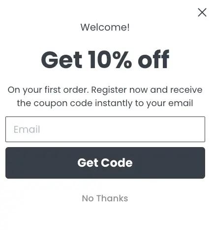
Compared to the more standard “Subscribe” CTA, this slight tweak in language indicates that a brand is giving something rather than getting something.
8. Consider less in-your-face pop-up types
If you want to test less intrusive types of pop-ups, consider a fly-out pop-up, a.k.a. a slide-in pop-up.
Fly-outs can slide in and out on your website, and they’re a great option for mobile where space is limited. We recommend testing slide-in pop-ups based on where someone’s thumb sits beside their mobile screen to see if they perform better than they would on desktop.
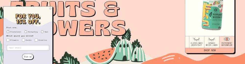
This example from Aura Bora appears as a fly-out only after you’ve scrolled down a certain percentage of the homepage. It’s eye-catching, the offer is clear, and the brand gets to capture a lot of information—but the user doesn’t have to interact with it if they’re not ready.
Discover the importance of email-ups: different types, components, & how they can help boost your conversions.
Get the scoop9. Make your pop-up window easy to close for accessibility
When you’re designing your email pop-up experience, keep people with disabilities top of mind. This means ensuring your pop-up window adheres to accessibility standards and is easy to close for everyone, but most of all for people with motor and visual impairments.
Accessibility is a win-win for everyone because it means you’re giving people the choice to engage with your pop-up on their own terms. In addition to building trust and establishing a positive relationship with your audience, this allows visitors to browse your site without interruption.
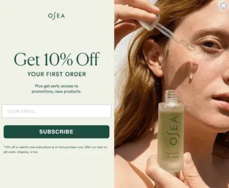
This example from vegan skincare brand OSEA shows a clear “X” button in the top-right corner, contrasted against a different color within a photo. The X is white against gray—obvious enough that someone can easily find it, but not so obvious that it takes center stage.
10. Monitor performance and A/B test
After you’ve built your email pop-up, track its performance and improve it through A/B testing. Some metrics to measure include:
- Total number of sign-ups
- Conversion rates
- Bounce rates on pages where your pop-ups appear
To conduct an A/B test, choose one variable to test at a time, whether it’s your headline, CTA button, or offer. Create two versions of your pop-up and test only that one element, so your results are clear. Monitor the results and make adjustments based on which version performs the best.
If your pop-up isn’t converting as expected, change the offer or trigger and re-test until you find the right combination that resonates with your audience.
11. Use an integrated platform for forms, email, and SMS
It’s possible to use separate platforms for every piece of the marketing ecosystem. But just because it’s possible doesn’t mean it’s smart, efficient, or affordable—especially when you have a lean team.
Klaviyo not only makes it easy to build your email pop-ups with a drag-and-drop builder and over 50 ready-to-customize templates. It also handles email, SMS, and web forms under the same roof as all your customer data—which simplifies and streamlines every stage of the email pop-up process, from targeting to testing to optimizing.
Related content
- 14 tips for growing your SMS list and getting more opt-ins—without breaking compliance laws
- 13 best practices to create sign up forms that convert
- Getting started with sign-up forms in Klaviyo
Power smarter digital relationships with Klaviyo SMS.
Get started
Related content