Email Strategies That Drive Results
Generated by Klaviyo AI
These email examples show how brands use customer data, segmentation, timing, and relevant content to increase engagement and sales. They cover welcome flows, product education, promotions, seasonal campaigns, launches, and abandonment automations.
- Personalised segmentation: Preference, behavioural, and psychographic data help brands deliver more relevant products, offers, and messages.
- Useful education: Tutorials, recipes, use cases, and customer stories can reduce uncertainty before and after a purchase.
- Strategic timing: Seasonal moments, launch countdowns, and decision points make campaigns more timely and compelling.
- Conversion tactics: Discounts, bundles, urgency, guarantees, reviews, and free offers can work together to encourage purchases.
- Authentic connection: Founder stories, company updates, community invitations, and values-led content can strengthen customer relationships.
It’s true—your customers are overwhelmed by their inboxes.
But it’s not so much that people don’t want to hear from you—it’s that they want your email marketing efforts to reflect their preferences and their relationship with your brand.
When brands tap into customer data to send well-timed, personalised campaigns, the difference is clear.
According to Klaviyo’s latest industry benchmarks, the industry-leading top 10% of emails convert five times more subscribers and generate nine times more revenue per recipient. This is likely due to the difference between batch-and-blast tactics and highly segmented campaigns designed to be extremely relevant for a specific audience.
If writing your next email feels like a struggle, you’re not alone.
These 35 email marketing examples from Klaviyo customers can help spark some fresh ideas for your newsletters, email automations, and campaigns. All of them demonstrate how clever segmentation leads to better, more relevant content.
1. Little Sleepies’ community-building welcome email
Type: welcome email
Your welcome email series should do at least one of three things:
- Introduce your brand.
- Showcase your products.
- Feature offers to drive purchases.
Little Sleepies, a childrenswear company, nails all of these in their email. The founder immediately builds trust by introducing herself and her children to emphasise that she knows what it’s like to be in her audience’s shoes.
The email combines this personal connection with a welcome discount and a link to join a VIP group—showing that they’re not just selling pyjamas, they’re also creating a community for busy parents.
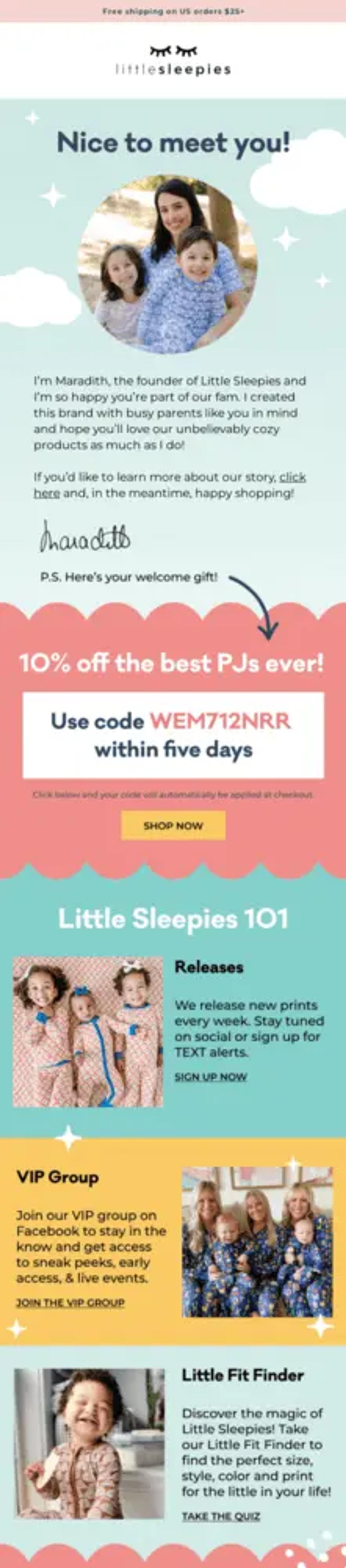
Image source: Really Good Emails
2. Cuyana’s minimalist, trust-building welcome flow
Type: welcome email
Apparel brand Cuyana uses a minimalist welcome series to communicate the brand’s “less is more” philosophy through its clean design and thoughtful product storytelling. They number each email in their welcome flow—similar to a magazine issue—setting clear expectations about what’s to come, which starts the relationship off on the right foot.
Cuyana also weaves high-quality lifestyle photography into their emails, helping customers envision their products in everyday settings while also showcasing their craftsmanship and quality.
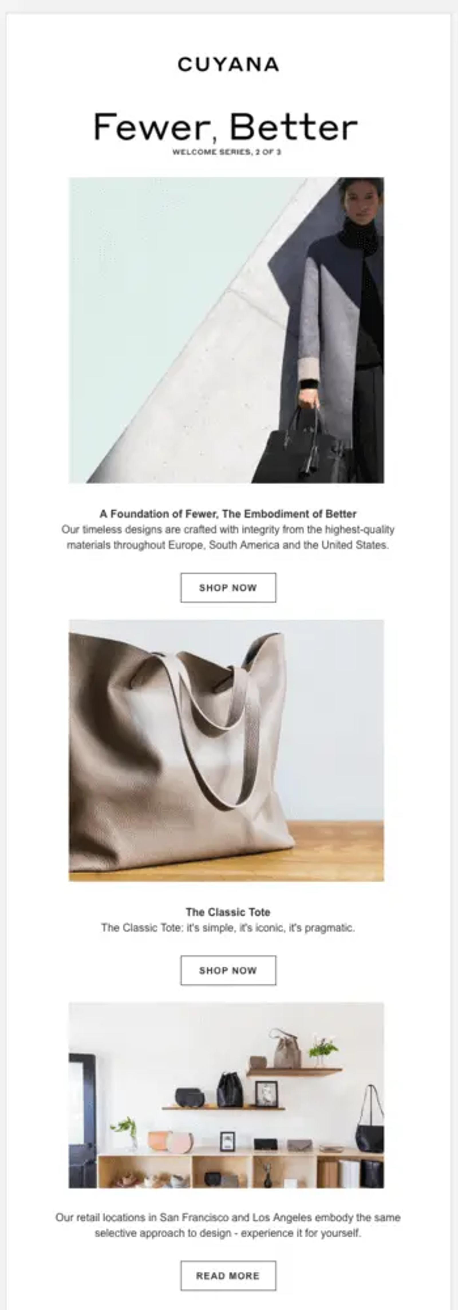
Image source: Really Good Emails
3. Fishwife’s playful product education
Type: product education email
Tinned seafood company Fishwife takes a playful approach to an educational email by showing nine different ways to use their anchovy product.
This type of visual education is a powerful way to communicate product use cases during the consideration stage. If subscribers are undecided about buying, this email may give them the information they need to make a final decision to purchase.
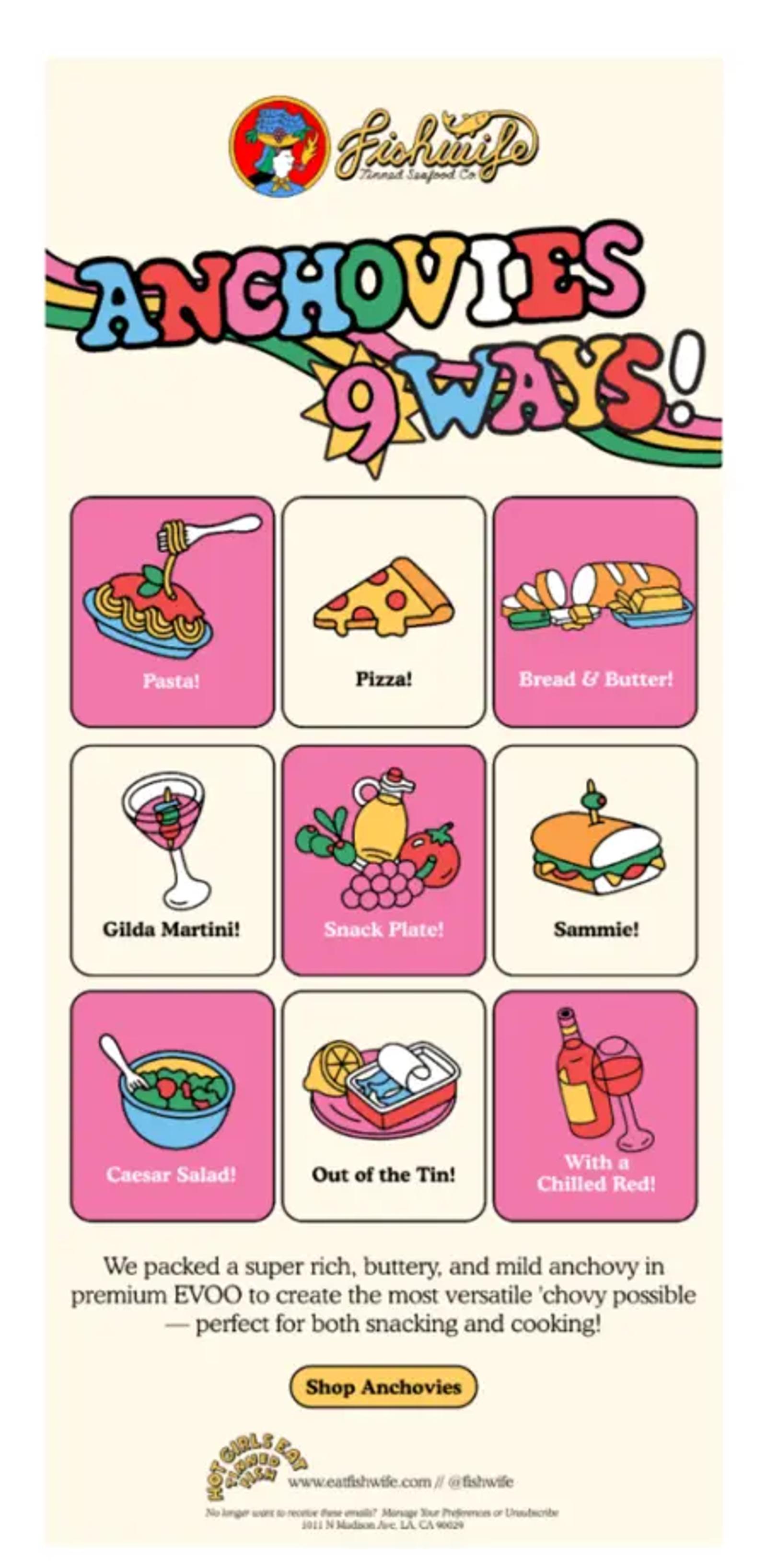
Image source: Really Good Emails
4. ILIA’s quick product tutorial
Type: post-purchase email
The first time you order a product, you might spend a lot of time figuring out how to make the best use of it. Cosmetics brand ILIA’s strategy removes that friction by sending product tutorials post-purchase.
The email shows the customer that ILIA cares about their experience at every step. As a result, customers can immediately use the product once it arrives and get better results. And from the brand’s perspective, the quick tutorial—and a CTA for complementary product suggestions—can help improve repeat purchases and retention rates over time.
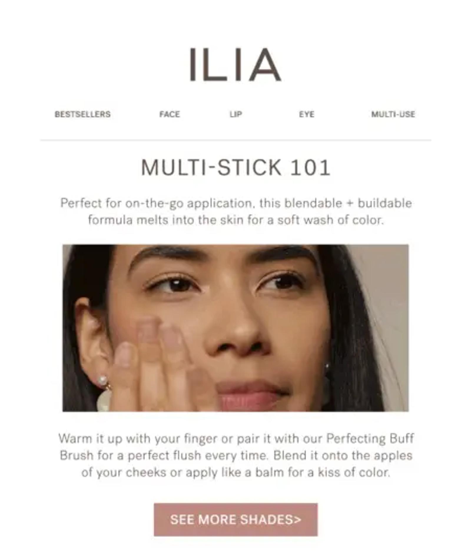
Image source: Really Good Emails
5. Tushy’s humorous objection handling
Type: product education email
Bidet company Tushy tackles a potentially awkward subject with humour and clarity. The email uses a combination of witty headlines, educational statements, and myth-busting content to address cultural hesitations about bidets.
If your brand sells products that require a lot of education before purchase, consider this example as inspiration.
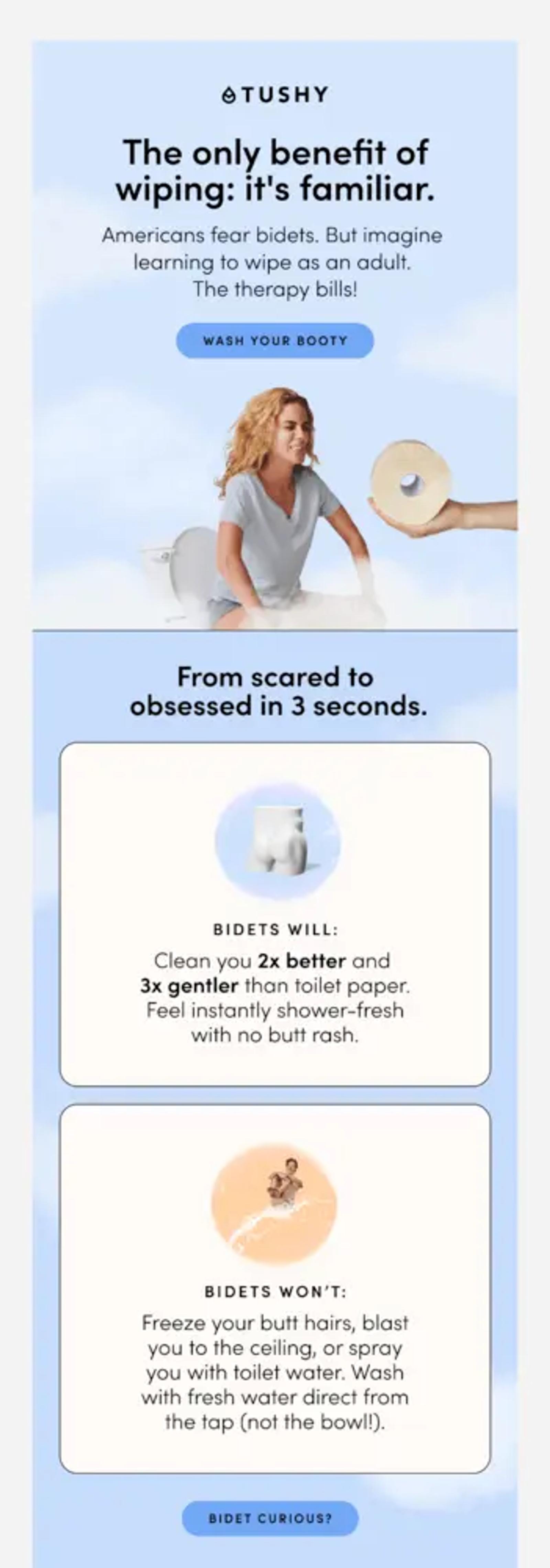
Image source: Really Good Emails
6. Made In’s expert-led educational email
Type: product education email
Made In, known for their restaurant-quality cookware, know their target audience: home cooks who are passionate about food and want to learn to cook from the best.
Between the endorsement from a renowned chef and the step-by-step breakdown of what they’ll need, customers can easily picture themselves cooking with Made In’s products—just like real chefs do.
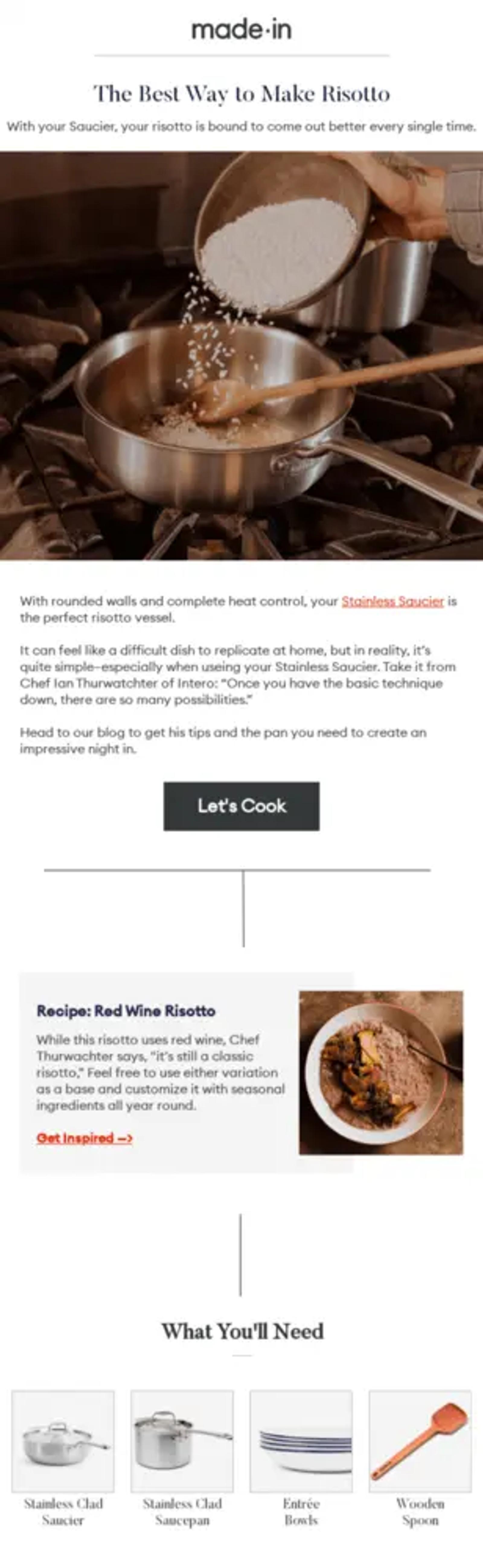
Image source: Really Good Emails
7. Esmi’s mini case study
Type: customer story email
Skincare brand Esmi uses a real customer’s transformation story to drive more sales.
The brand breaks down the customer’s daily skincare routine and includes real transformation photos, a customer quote, and a product catalogue to redirect subscribers to the right product collection. This is a great example of how to show, not tell.
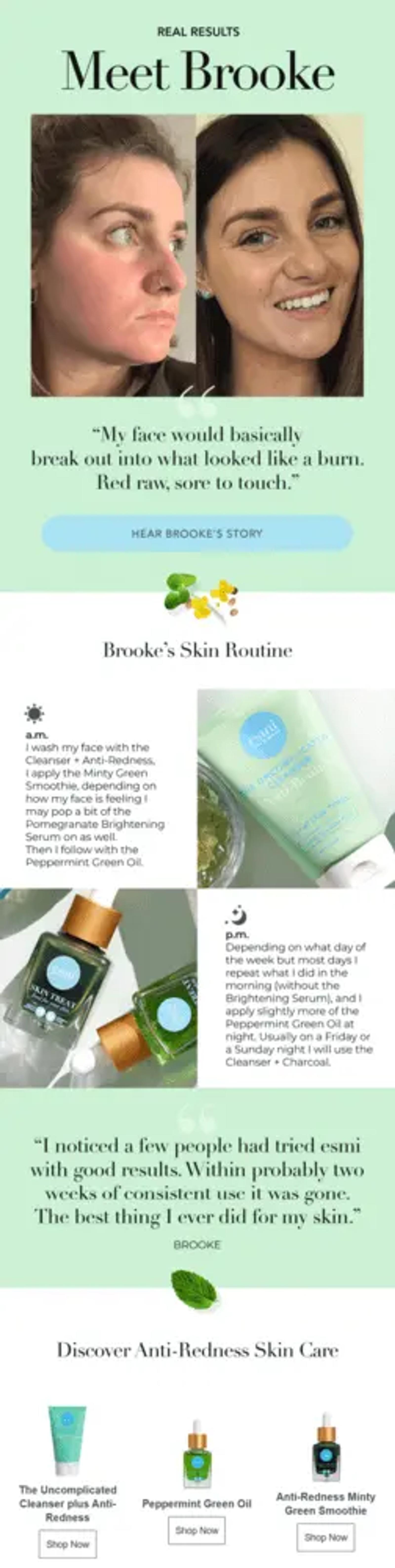
Image source: Milled
8. Marine Layer’s sustainability outreach
Type: company update email
Clothing company Marine Layer shares their annual impact report because they recognise their audience’s growing interest in sustainable fashion. Marine Layer connects with eco-conscious customers by highlighting how they walk the talk when it comes to sustainability.
They also end with a call to action for their Re-Spun take-back programme, where they direct subscribers to one of their main recycling initiatives.
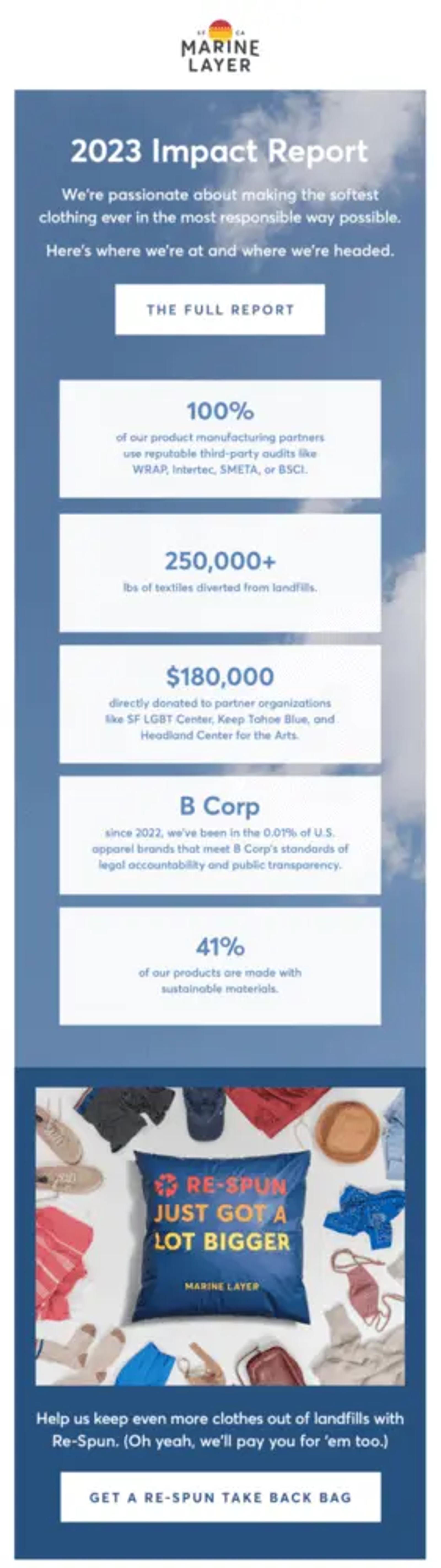
Image source: Really Good Emails
9. Hedley & Bennett’s authentic Black Lives Matter campaign
Type: social awareness email
When the Black Lives Matter movement resurged in 2020, Hedley & Bennett sent an email amplifying Black-owned businesses and organisations.
An approach like this is a wonderful way to identify with your audience’s values and build an emotional connection that goes beyond a simple transaction. If you take this approach, just make sure it’s relevant to your business, otherwise it can come across as inauthentic. Hedley & Bennett sell kitchenware, so it makes sense that they’re highlighting Black-owned businesses and Black chefs here.
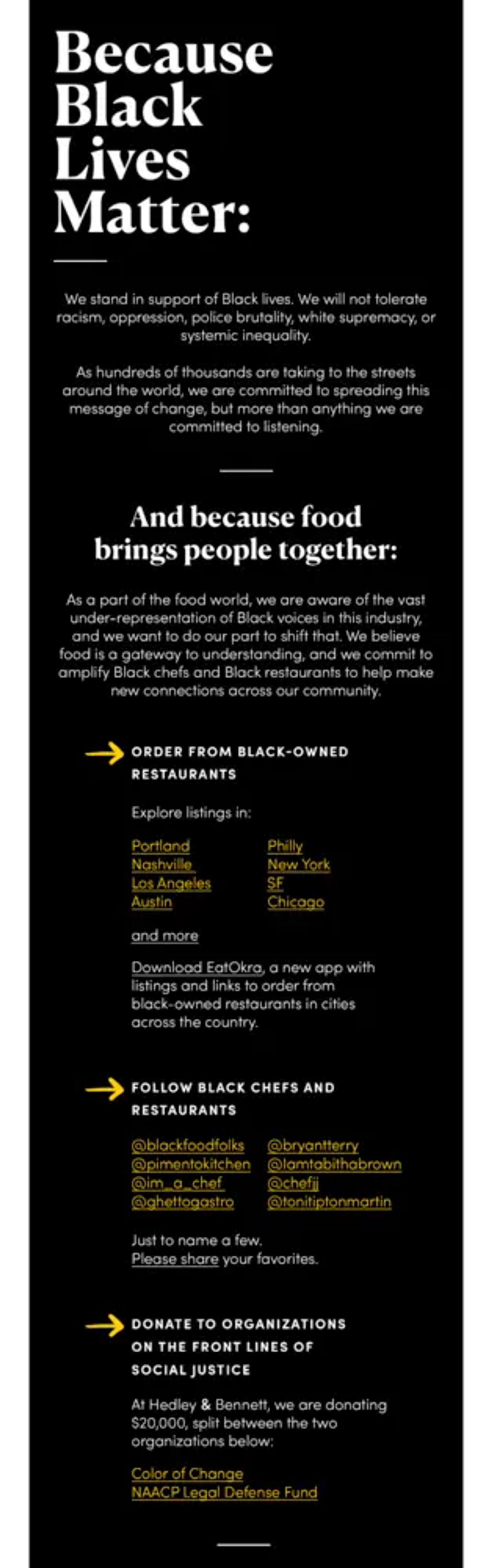
Image source: Really Good Emails
10. Tecovas’s origin story
Type: company update email
Company updates help keep customers informed about how your brand is performing, which strengthens brand affinity and shows you care about customer feedback.
Handmade boots and accessories company Tecovas celebrates its 10th anniversary with a look back at how far it has come as a brand.
By sharing their backstory, Tecovas creates a more personal connection with their customers. This approach not only builds greater loyalty, but also keeps their brand front of mind for customers the next time they make a purchase in their category.
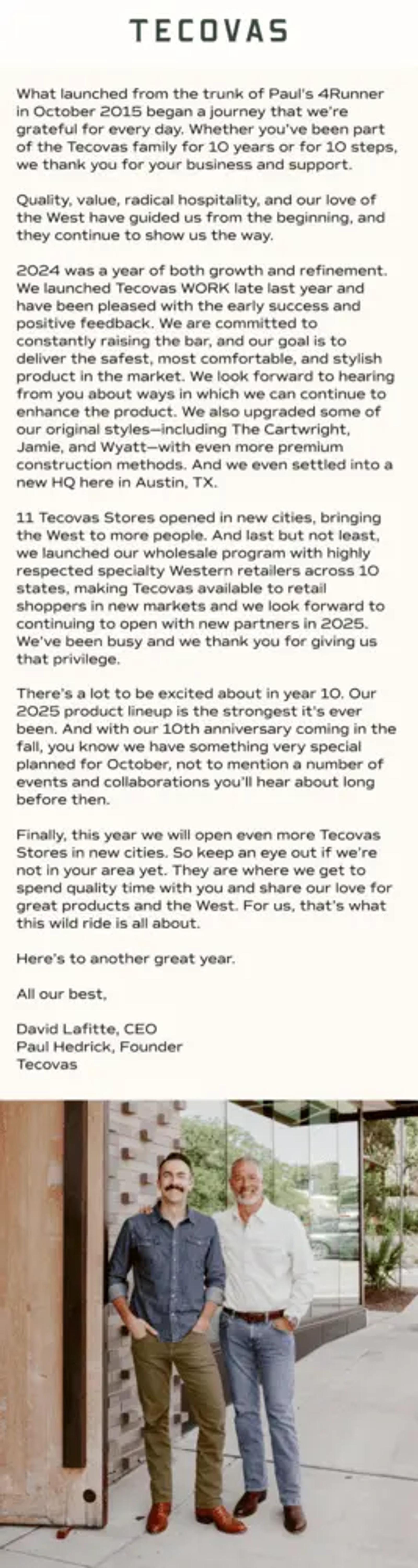
Image source: Milled
11. Graza’s newsletter made for foodies
Type: newsletter
Olive oil brand Graza combines product education with lifestyle content in an engaging newsletter format, showcasing their skill in crafting compelling newsletters that captivate their audience. Knowing their audience is eager for meal inspiration, they feature recipes from food experts and chefs that highlight their olive oil.
The emails offer immediate value, giving subscribers compelling reasons to open them week after week. This approach helps Graza become part of their subscribers’ everyday cooking habits, making them must-haves in the kitchen.
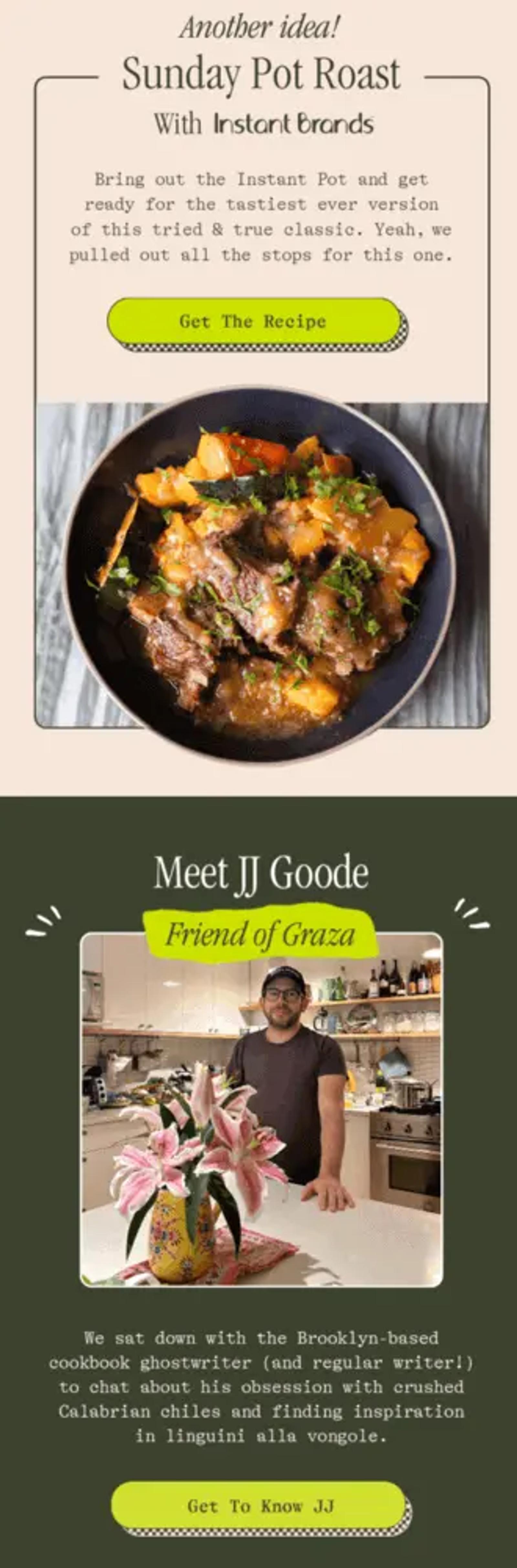
Image source: Really Good Emails
12. Bearpaw’s segmented product catalogue
Type: promotional email
Bearpaw is known for their comfortable footwear. At some point, Bearpaw may have asked subscribers to tick a box on a form to indicate they prefer vegan products. If they ticked “yes”, they likely would have received this email about Bearpaw’s vegan range.
This is a great example of how a brand can use data to personalise customer outreach. The more data you have about your customer’s preferences, the more relevant your emails will be. And especially in this case, when featured products are attached to personal values, the potential for a win is great.
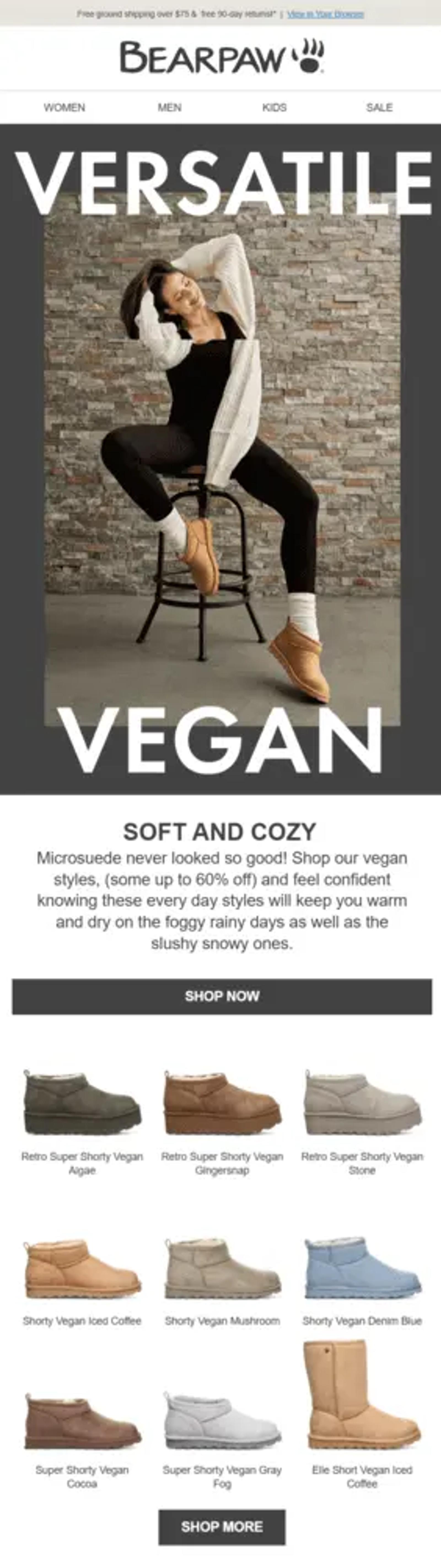
Image source: Milled
13. Garrett Popcorn’s well-timed promotion
Type: promotional email
Garrett Popcorn sends strategic Friday emails, catching subscribers just as they’re deciding on their weekend plans. The casual “No Plans, Just Snacks” message makes staying in feel like the best choice.
This is a great email marketing example of sending campaigns at the perfect time, when a subscriber is trying to make a decision. When you can catch people at inflection points like this, your message is immediately relevant—and far less likely to clutter up an inbox.
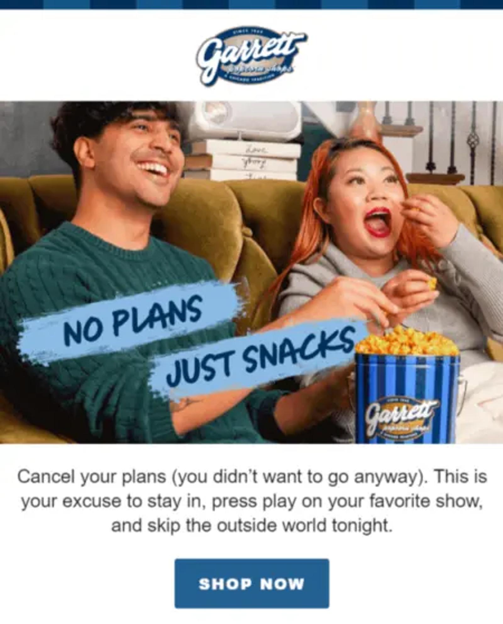
Image source: Milled
14. Manly Bands’ psychographic data collection
Type: promotional email
Wedding bands company Manly Bands uses personality-based descriptions to match products to people. They group the products into distinct personality types, like “The Spy” and “The Commander,” making it easier for subscribers to decide which product to buy.
In the process, the brand also collects meaningful psychographic data, which it can use to segment and personalise campaigns in the future—driving even more targeted sales. It’s a win-win for customers who expect personalised experiences and for the brand that requires data to deliver those experiences.
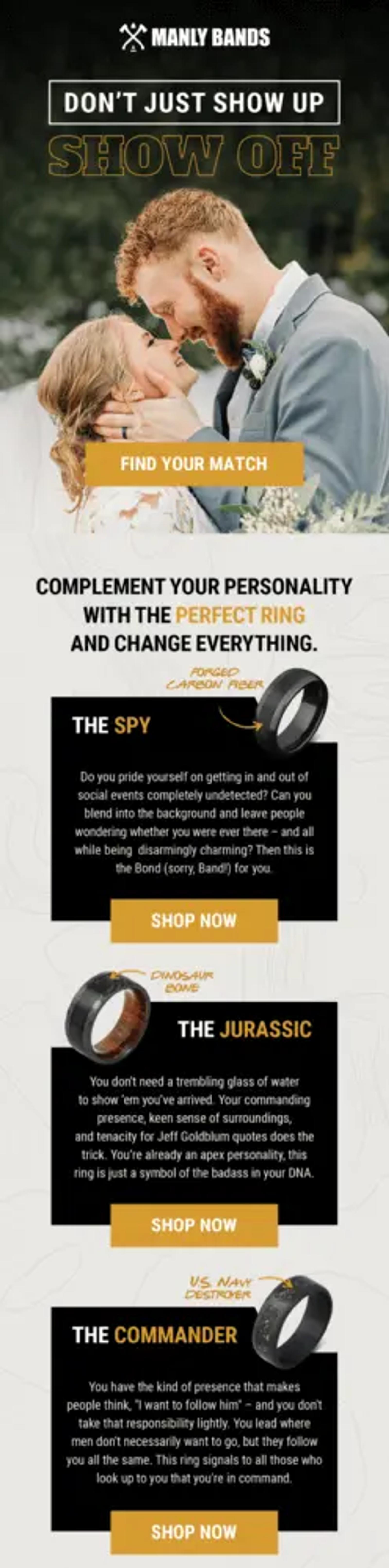
Image source: Milled
15. Chamberlain Coffee’s flash sale
Type: promotional email
Shoppers love flash sales. They’re the perfect opportunity to snap up products they’ve had their eye on for a while. Chamberlain Coffee uses this strategy to drive immediate sales through a “random refunds” promotion—a tactic that turns a simple purchase into an exciting game of chance.
At the end, 5 lucky winners get their entire order refunded—a massive (and highly motivating) incentive for customers to place that next order.
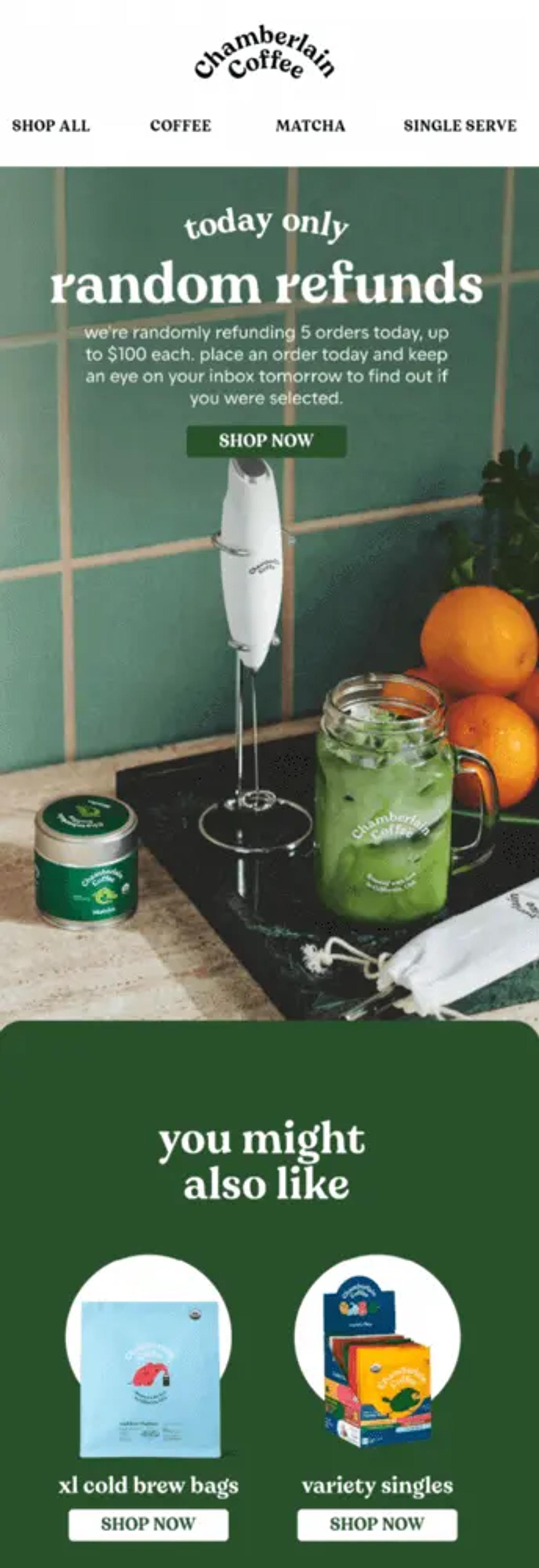
Image source: Really Good Emails
16. Ride FRSH’s pop culture reference
Type:offer email
Air freshener brand Ride FRSH uses pop culture references and memes to tackle embarrassment around bad odours. What stands out to us about this email is the same-day free shipping.
This incentive adds urgency to the purchase decision and offers a great deal for customers who may want to buy just one or two air fresheners but were perhaps put off by shipping costs.
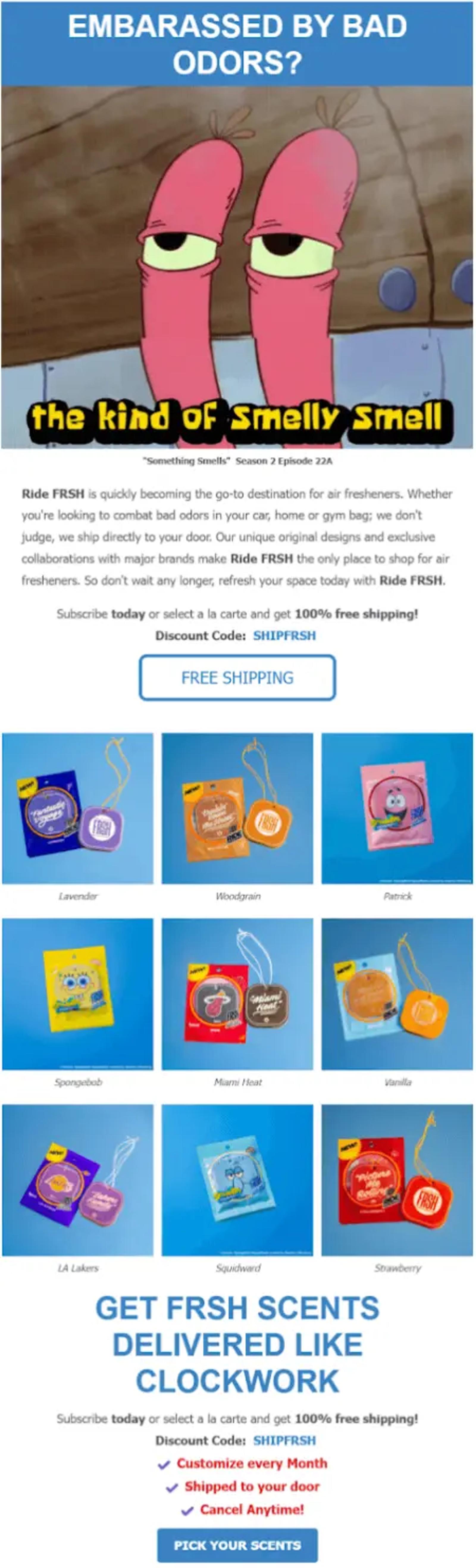
Image source: Milled
17. PrettyLitter’s Halloween promotion
Type:seasonal email
Cat litter company PrettyLitter’sHalloween-themed promotional email purr-fectly balances seasonal fun with product benefits.
This email—which features reviews from past customers, the benefits of the product, a promo code, and a free offer to drive action—is a great example of how you can layer multiple conversion tactics to build a compelling offer.
To create an even better experience, you can also personalise these emails based on past purchase history or wishlist items.
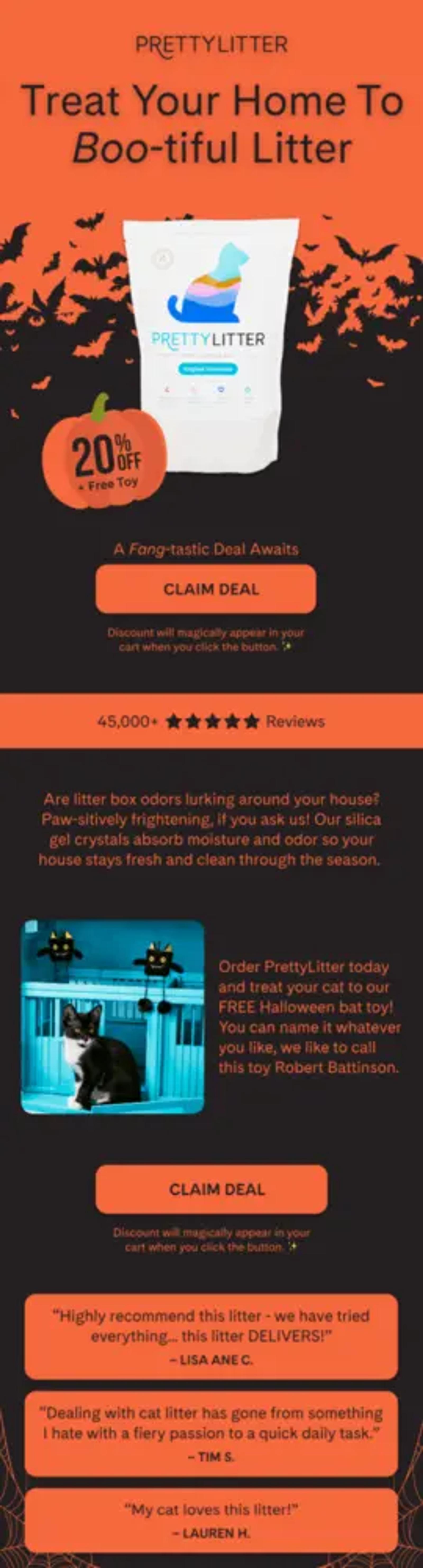
Image source: Really Good Emails
18. Grind Coffee’s well-timed outreach
Type:seasonal email
Grind, a coffee delivery service, uses the switch to daylight saving time as an opportunity to point out that their customers’ allotted coffee-drinking window has just been extended.
The witty message—more daylight equals more time for coffee—makes it, at the very least, a memorable touchpoint for people who might be considering a purchase.
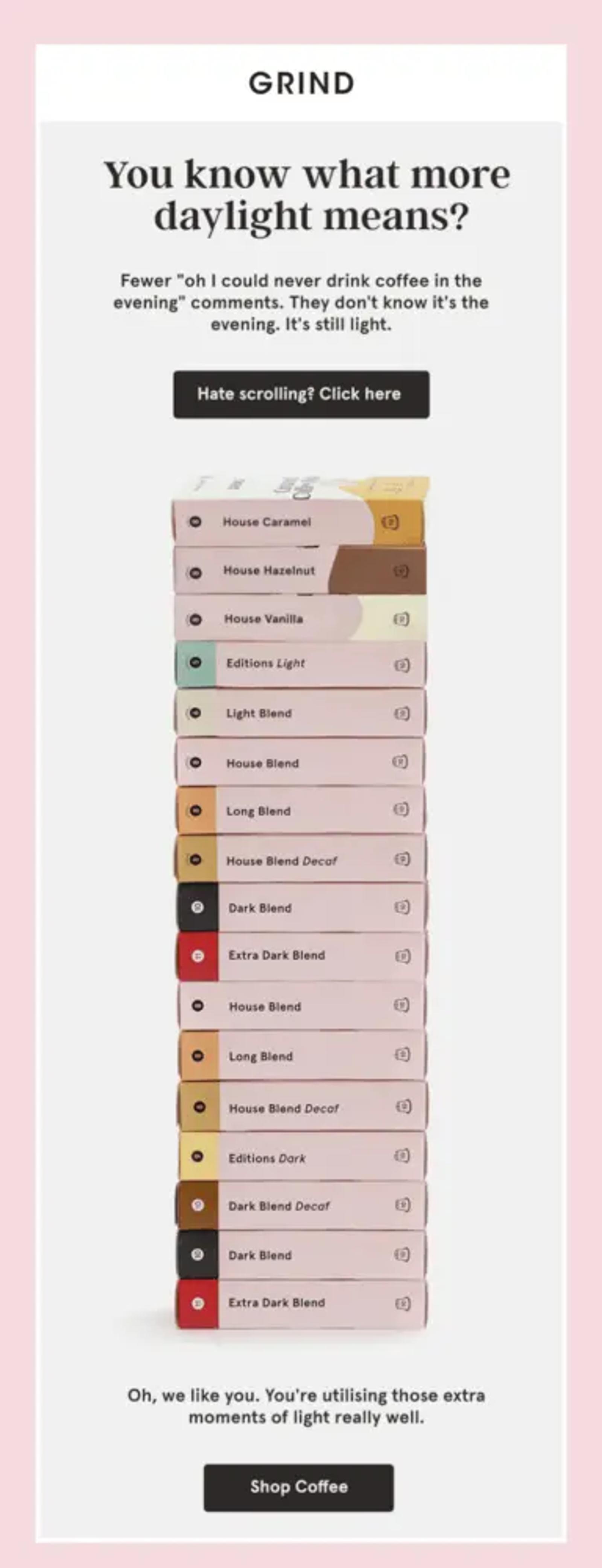
Image source: Really Good Emails
19. Jenni Kayne’s digital lookbook
Type:seasonal email
Luxury apparel and home brand Jenni Kayne launched their summer collection by crafting a subtle summer narrative through carefully curated images and minimal copy.
While some brands might add more copy to explain the story behind the launch, Jenni Kayne’s email resembles a physical lookbook, making it easy for subscribers to picture the products in their homes. They also include multiple product types within the email so people can choose their own journey depending on their needs, driving more visits.

Image source: Really Good Emails
20. 100% Pure’s FOMO campaign
Type:seasonal email
Skincare brand 100% Pure turns the 12 Days of Christmas into a 12-day Christmas email marketing campaign to drive more sales over the festive period. It combines urgency with fear of missing out (FOMO), as the offer on day 1 is available for, well, just one day.
The email includes three strategic elements:
- A clear explanation of the product and offer
- A few bundles to increase the average order value
- A 60-day returns guarantee to overcome hesitation
As a result, the email communicates everything a subscriber needs to know about the day’s offer—and which products they can try at a lower cost before they’re gone. They also limit the 12 deals to 24 hours each, encouraging subscribers to check their inbox every day to access more enticing offers. It’s a clever way to turn engagement into revenue.
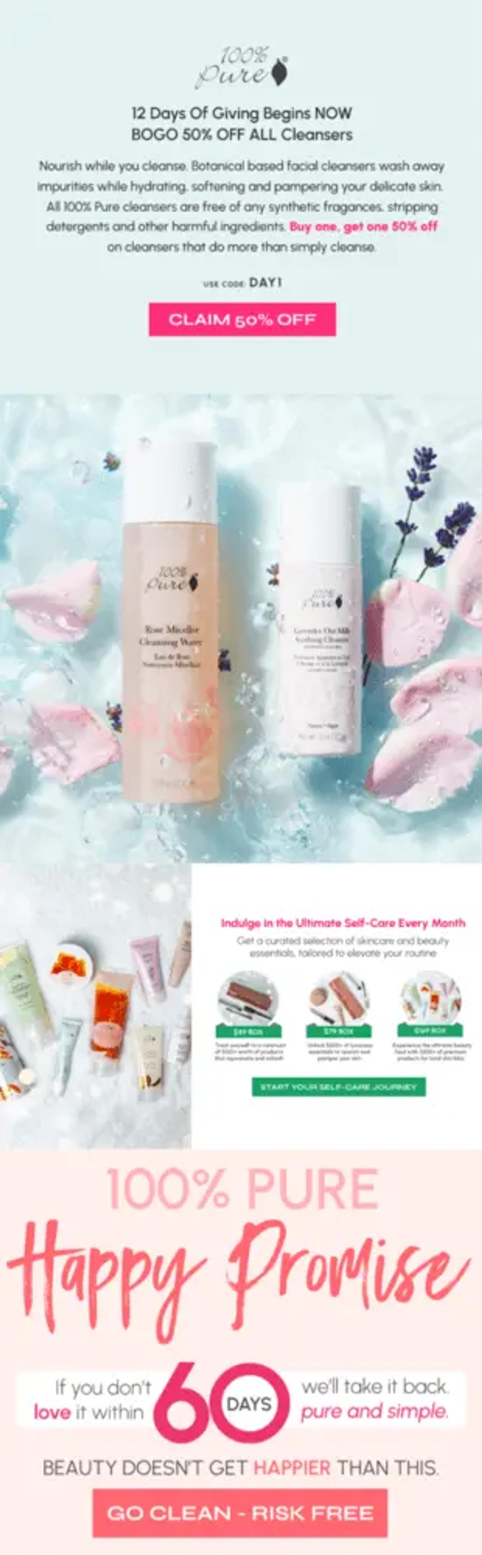
Image source: Milled
21. Linksoul’s feature-based data collection
Type: product launch email
Potential customers want to know how a product works, how it benefits them, and what it looks like in action. Clothing brand Linksoul answers these pressing questions with simple product imagery.
The email helps customers make confident purchase decisions, while also giving the brand valuable data about their fit preferences—potentially leading to better segmentation for future messages.
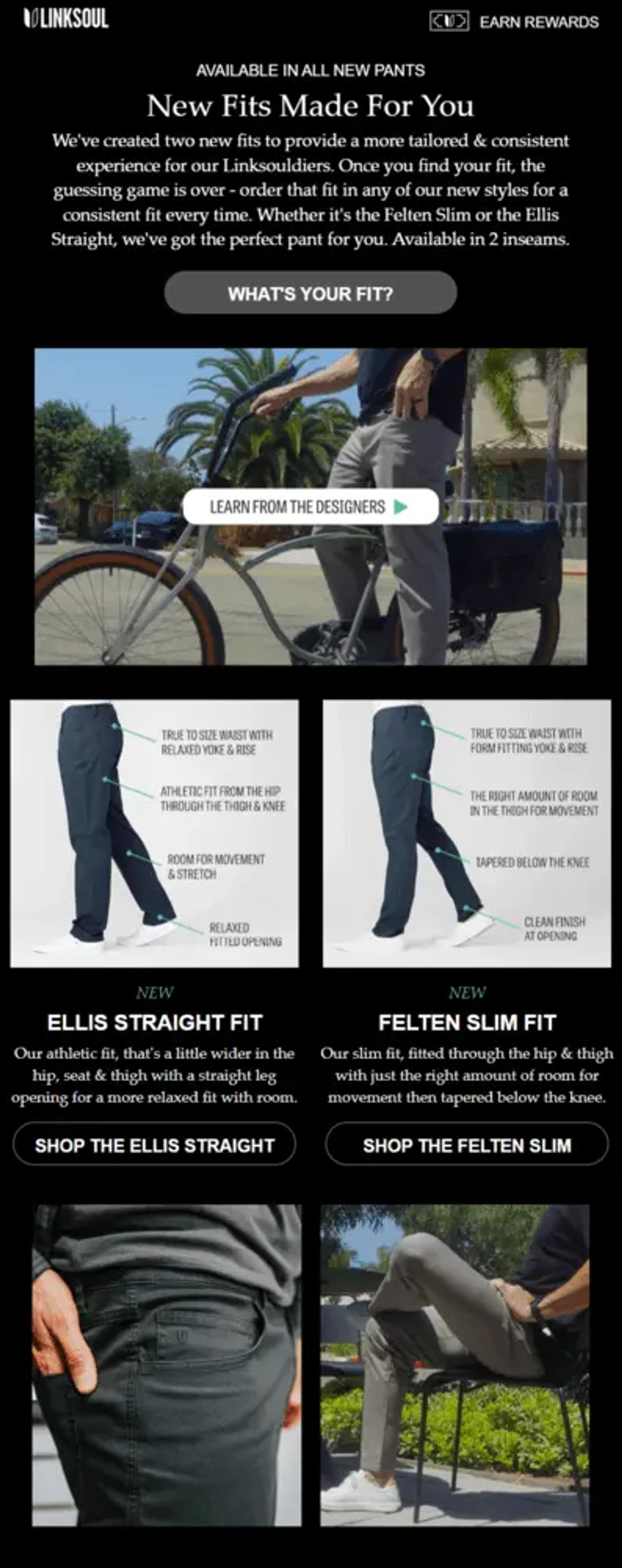
Image source: Milled
22. Red Dragon Darts’ 50th anniversary launch countdown
Type: product launch email
If you’re building anticipation for your new launch, you’ll create more excitement with a countdown timer sent to your most engaged subscribers. It’s a great visual cue for people who are really invested in your brand.
This is exactly what Red Dragon Darts did to launch their latest collection for their 50th anniversary. Notice that they didn’t send the email too far in advance—5 days is enough notice while still keeping the launch fresh in people’s minds.
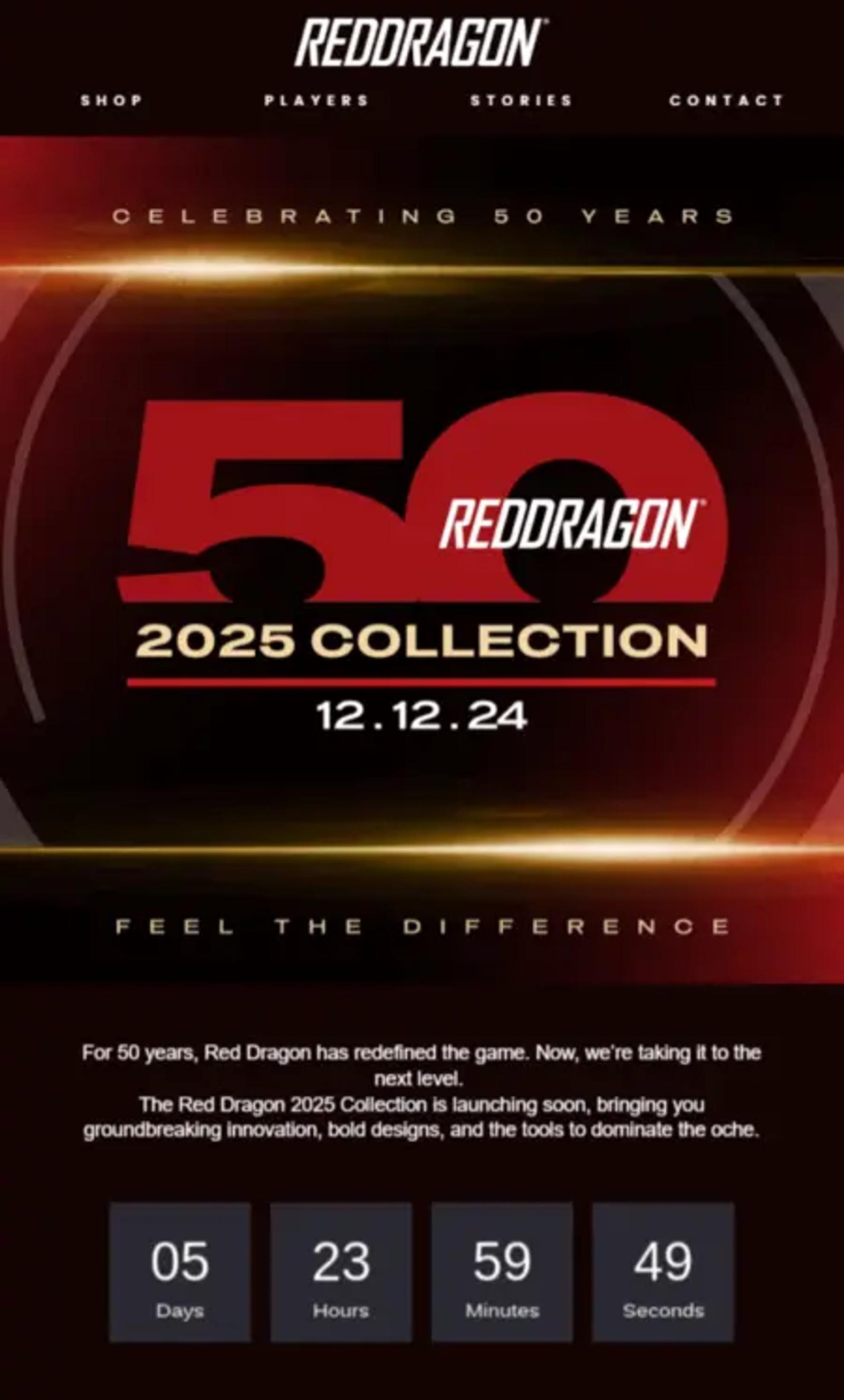
Image source: Milled
23. Taylor Stitch’s browse abandonment automation
Type: browse abandonment email
Clothing brand Taylor Stitch turns a product page drop-off into an opportunity to win back visitors. Sent automatically after someone leaves a product page, this browse abandonment automation opens with a discount code and:
- Showcases the product with premium photography
- Establishes brand expertise (10 years running)
- Removes purchase risk (free returns/exchanges)
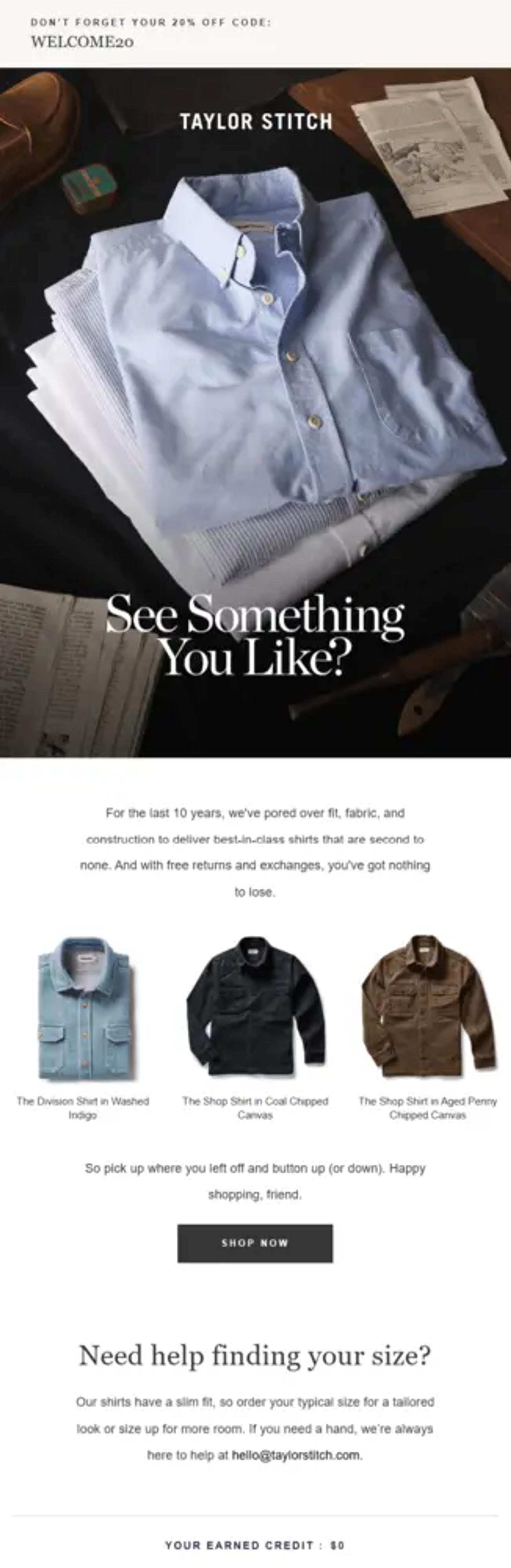
Image source: Milled
24. July’s personalised Black Friday offer
Type: BFCM promotion email
July, a travel bag company, recognises that customers want to personalise their bags. Their Black Friday offer includes free personalisation and 20% off if they bundle products together.
The magic lies in their simple story that explains the “why” behind the promotion. It makes the offer feel more like something you’re accepting from a close friend than from a brand. It’s also an important reminder—sometimes text-based emails without images are the best way to go.
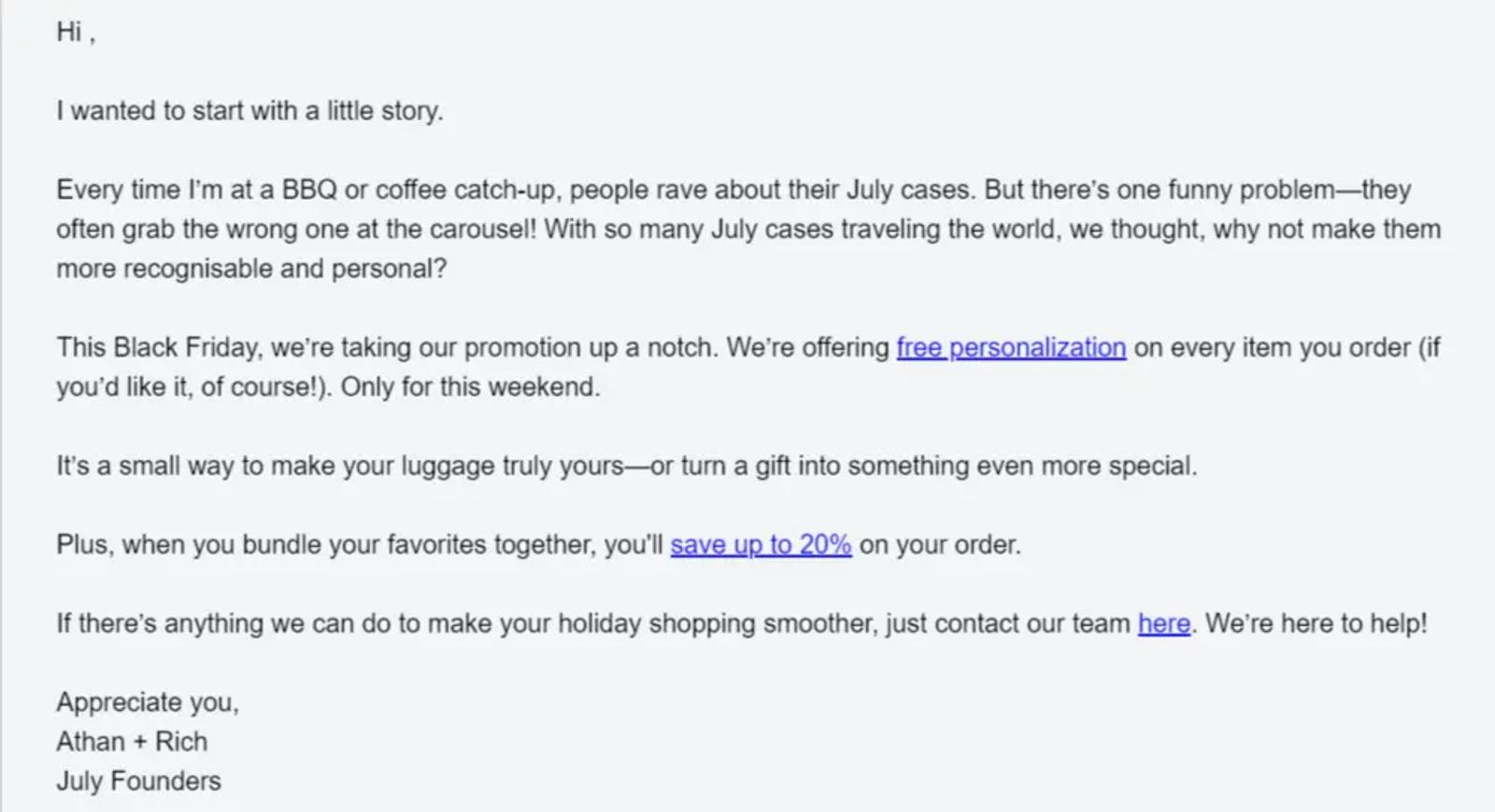
Image source: Milled
25. Filson’s seasonal legacy
Type:seasonal email
Few brands can say they’ve been in business for over 100 years, but outdoor clothing brand Filson can—and they know exactly when to highlight that legacy.
Filson’s email features a dramatic hero image and a bold headline saying, “We know winter.” This message resonates because it aligns perfectly with their value proposition: durable, time-tested gear built for harsh conditions.
For brands whose products are tied to seasonality, well-timed email campaigns aren’t just relevant—they’re essential for driving conversions.
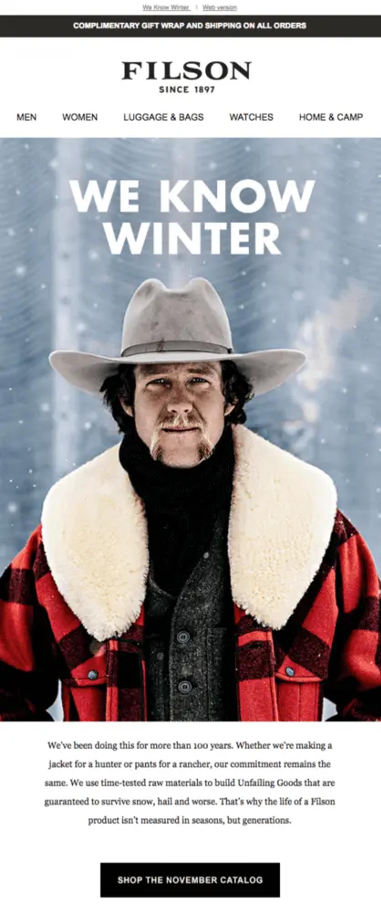
Image source: Really Good Emails
26. Dermalogica’s annual bestseller line-up
Type: holiday email
Skincare brand Dermalogica uses seasonal promotions to help customers plan ahead for the holidays. They’ve bundled their best products from the past year, positioning them as the ultimate skincare set for the season.
What’s particularly nice about this approach is how it works for different types of customers. New customers get a curated introduction to the brand’s best offerings while existing customers might spot that one innovative product they missed earlier in the year.
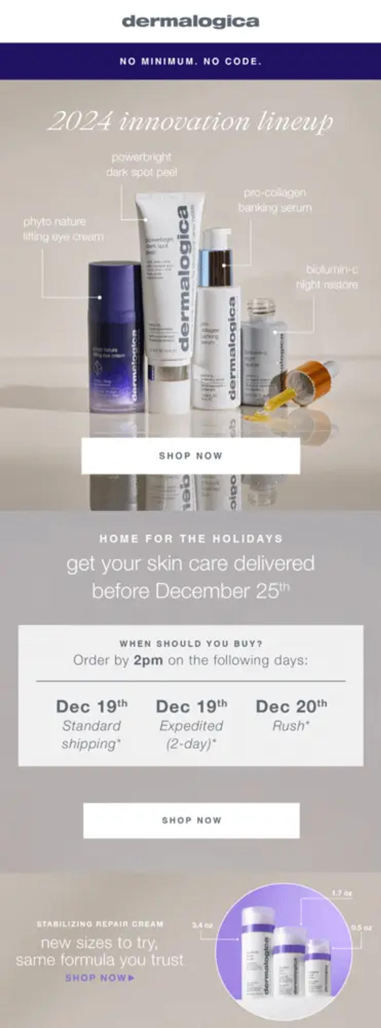
Image source: Milled
27. Pulp & Press’s cart abandonment automation
Type: cart abandonment email
The first time a potential customer visits your website, they might browse and add items to their basket—all without making a purchase. That’s where a well-timed abandoned basket email comes in.
Wellness brand Pulp & Press reminds customers which product they added to their basket, along with some hand-picked recommendations that might interest them instead.
With a subtle use of social proof—“we don’t blame you, it’s a fan favourite”—the brand reassures people that they’re making the right choice if they recover their basket. Pulp & Press removes uncertainty and encourages hesitant shoppers to take the next step.
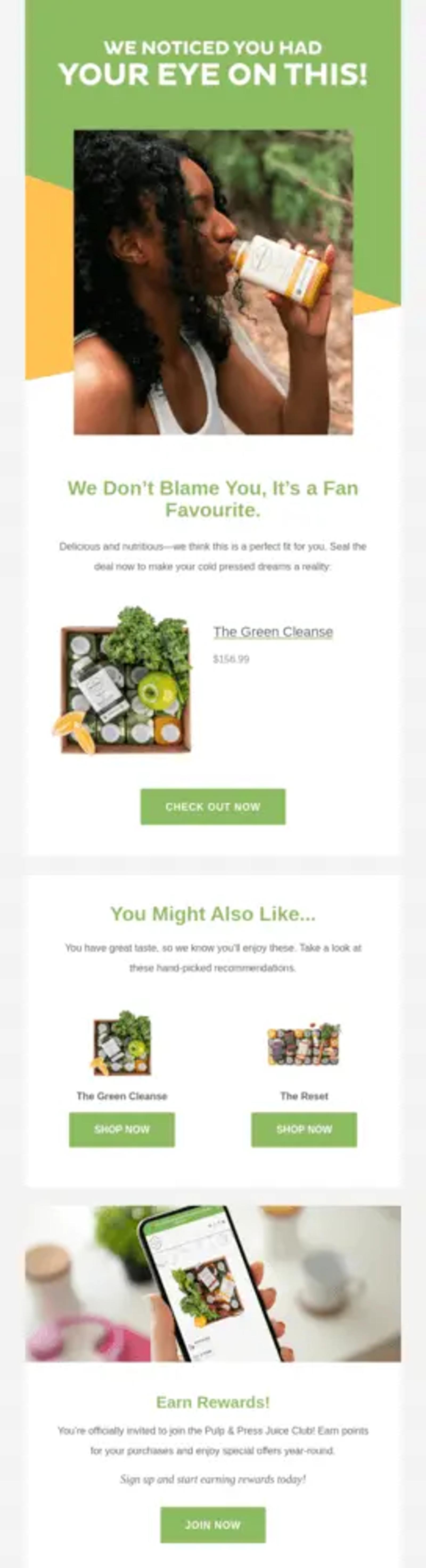
Image source: Really Good Emails
28. SABA’s VIP offer
Type: loyalty programme email
Luxury fashion brand SABA turns a tiered loyalty discount promotion into a VIP offer.
The strategy here is twofold: they create desire through exclusivity, while using tiered spending thresholds to encourage members to buy more. Segmenting subscribers by spending threshold is an excellent way to personalise a loyalty programme and increase customer lifetime value (CLV).
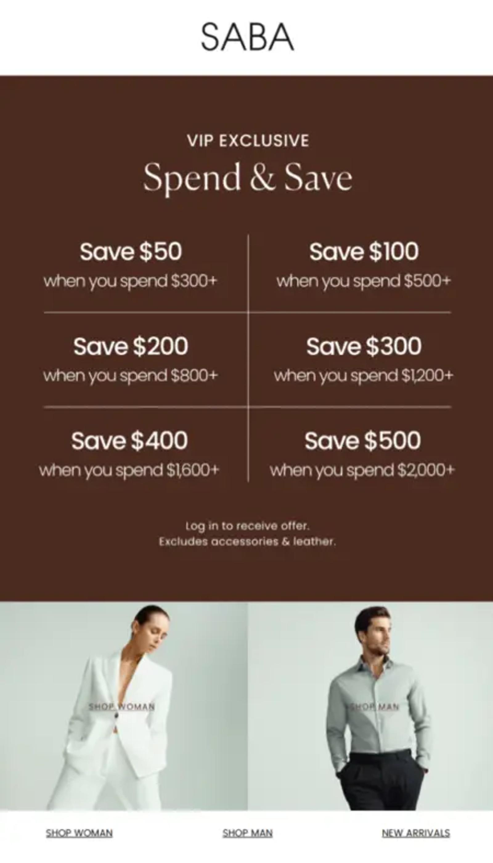
Image source: Milled
29. Hismile’s mystery pack
Type: limited-time offer email
Oral care brand Hismile uses a time-limited offer to encourage subscribers to try a new collection through an “XL mystery pack.”
By guaranteeing access to an unreleased flavour in the XL pack, they create a VIP-like experience and encourage higher-value purchases. But notice they also give people an out if they want it. If someone doesn’t want to try a new toothpaste flavour because they like what they like, there’s another CTA to buy the standard pack below.
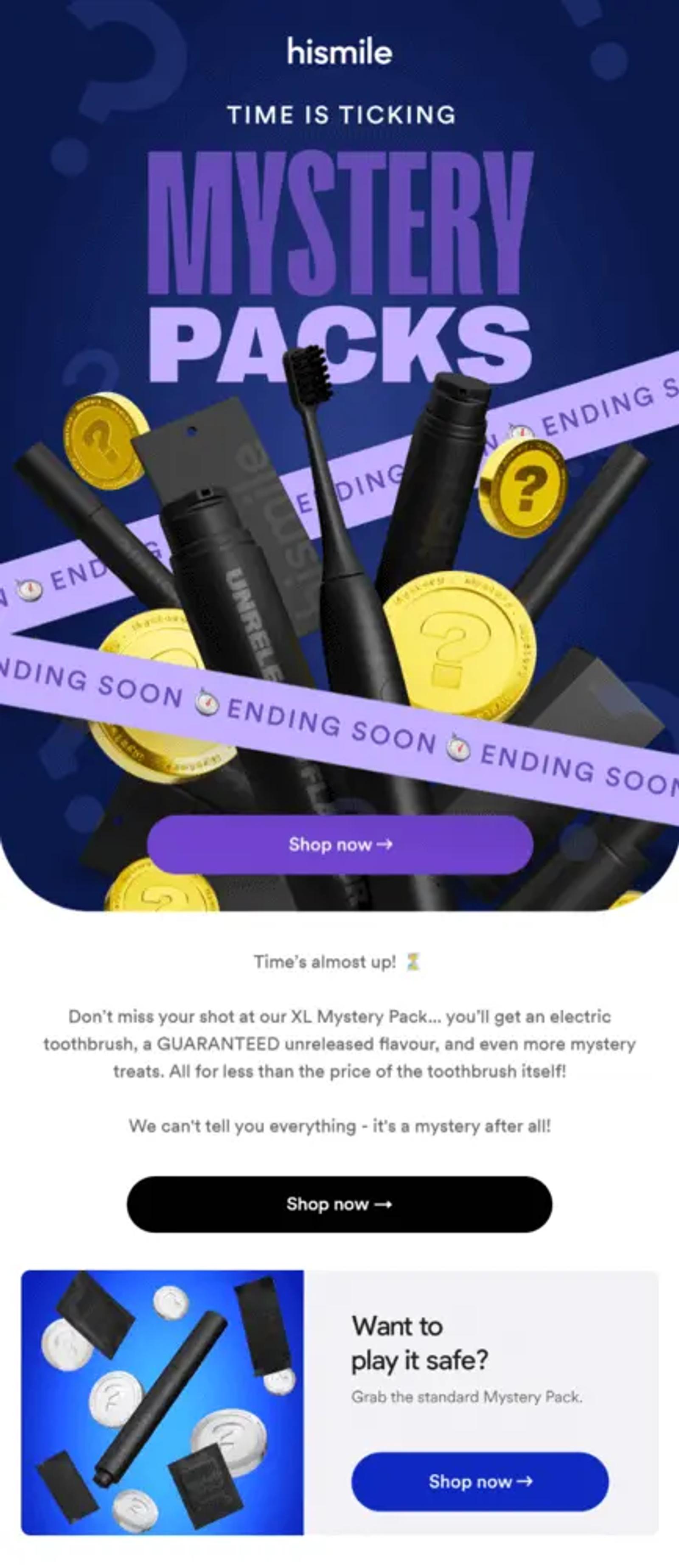
Image source: Milled
30. Brightland’s post-purchase founder thank you
Type: post-purchase email
Most post-purchase emails confirm order and delivery details. And while that’s effective, olive oil brand Brightland takes this approach a step further.
Brightland’s team sends a second post-purchase email—a letter from the founder toasting “good health and happiness.” This does two things: It humanises the brand and builds anticipation for the new product by painting a vivid picture of what happens when the customer receives it.
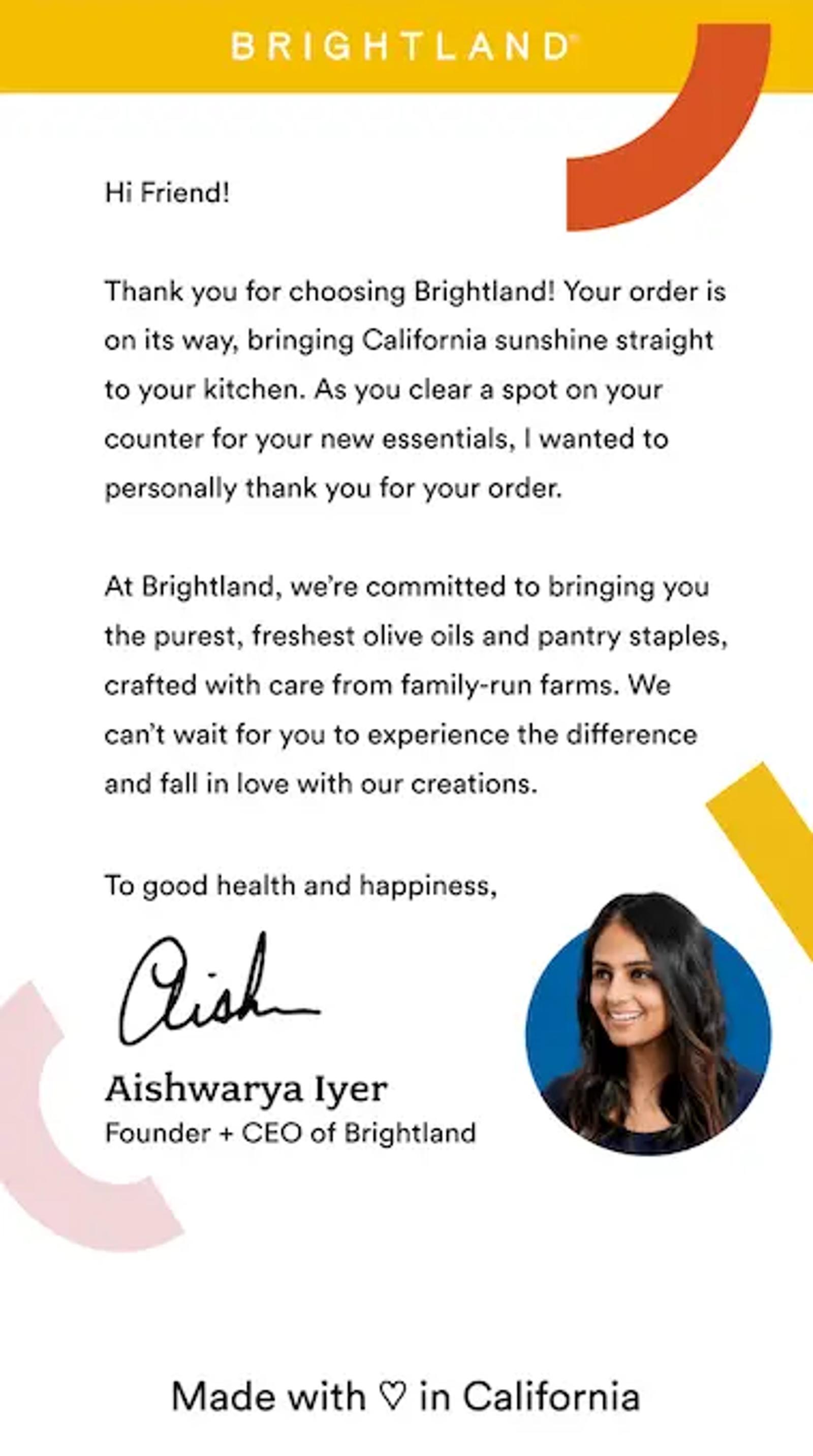
Image source: Brightland
31. Force of Nature’s decision tree
Type: holiday email
Almost everyone has experienced decision overload while shopping for the perfect gift. To help their audience get past that barrier, Force of Nature creates a decision tree for their bundles to guide subscribers to the right package.
This interactive flowchart turns a seemingly complicated decision into an enjoyable exercise, making it easier to take action. Subscribers can decide in seconds and then move on to the website or app to explore the bundles in more detail.
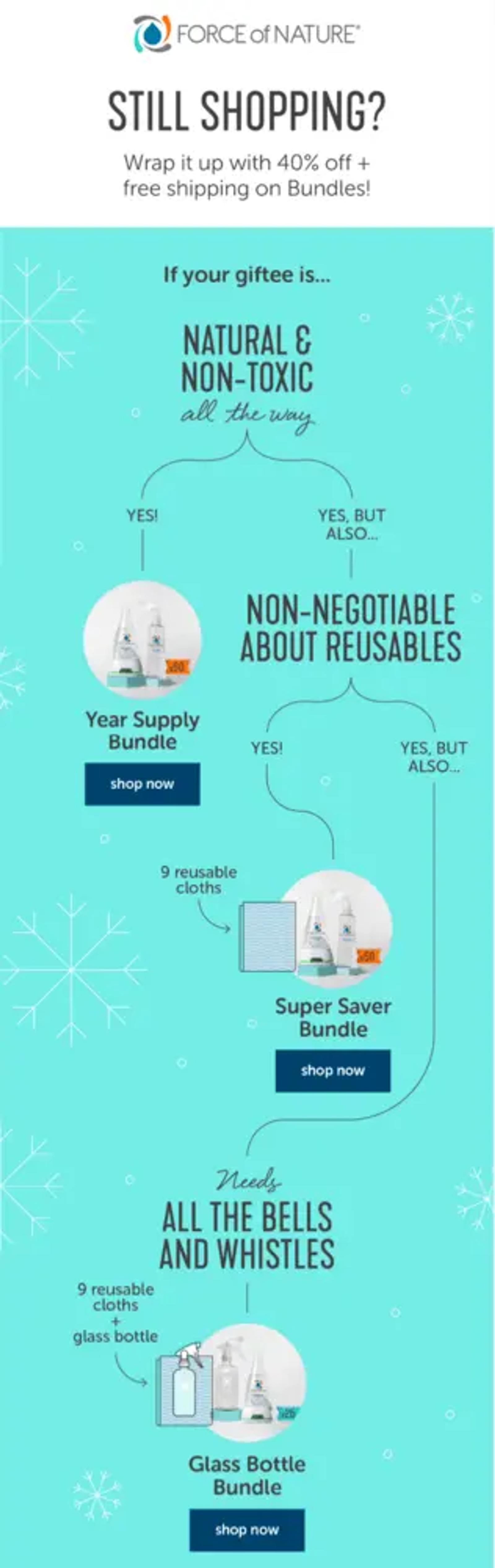
Image source: Milled
32. KURU’s social proof promotion
Type: end-of-year promotional email
KURU turns end-of-year reviews into an opportunity to drive more sales. They rebrand the moment as “people’s choice” favourites to add some social proof.
The brand is using aggregate customer behaviour to guide new customers towards products that are proven winners. The email also includes objection handlers like free shipping and 45-day returns to nudge customers towards a sale.
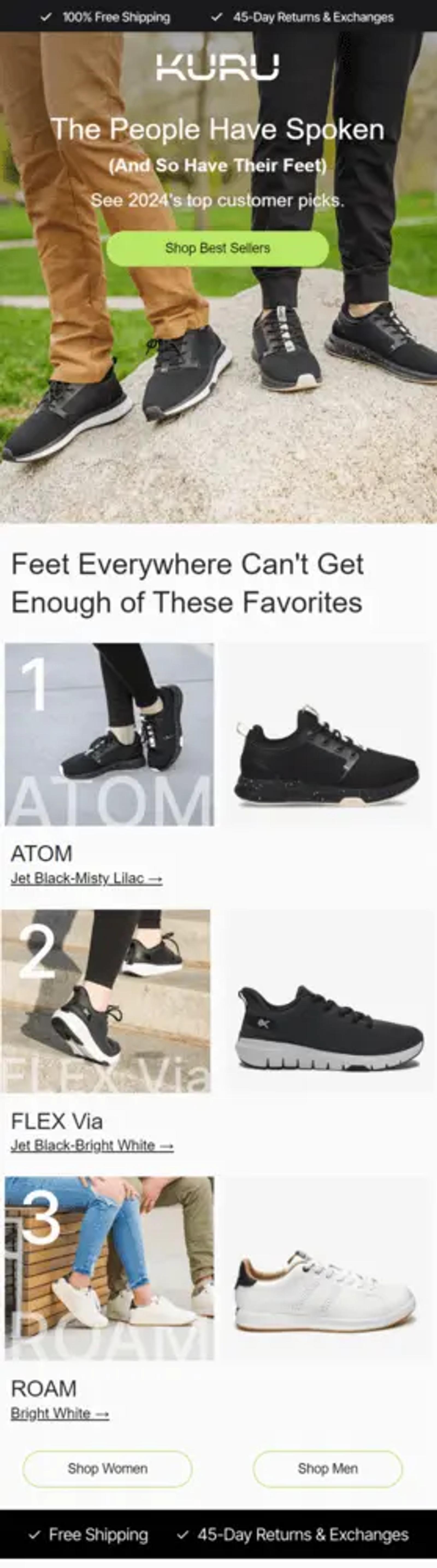
Image source: Milled
33. Beekman 1802’s limited-time offer
Type: product anniversary email
Customers won’t remember your brand or product anniversary—but that doesn’t mean you can’t include them in your celebrations. Skin and body care brand Beekman 1802 combines a product’s launch anniversary with a limited-time offer to encourage purchases.
The celebratory email includes 3 key elements:
- Social proof
- Product education
- A limited-edition bundle
By creating a sense of urgency and scarcity, both current and potential customers are motivated to buy the bundle. It’s a smart way to turn a typical anniversary celebration into an unmissable shopping experience.
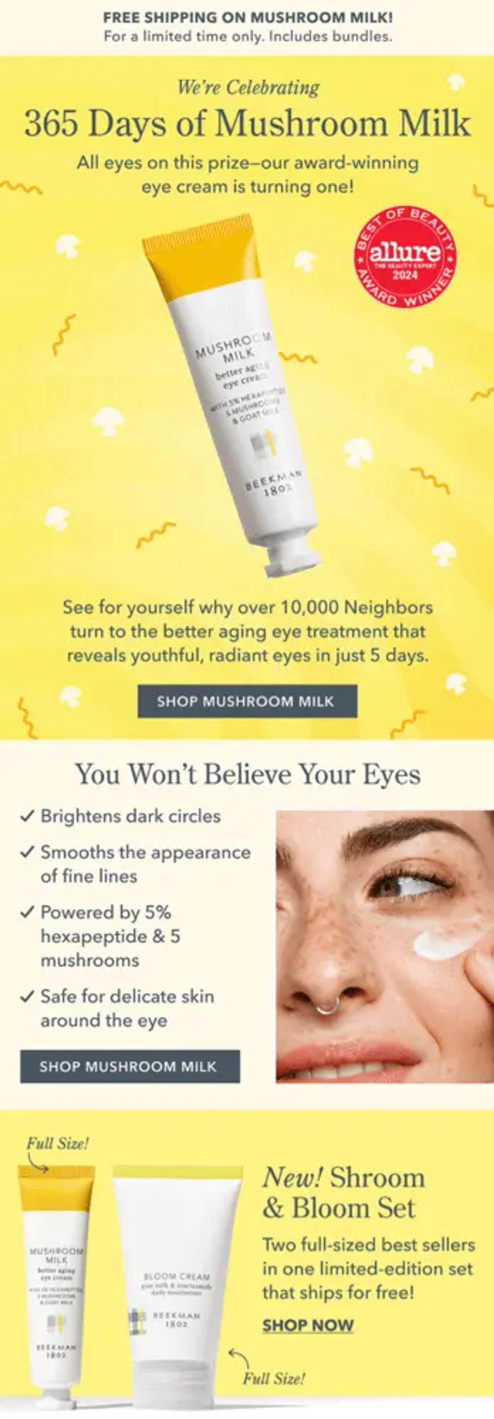
Image source: Milled
34. HoneyLove’s back-in-stock reminder
Type: product restock email
Back-in-stock flows can be highly effective because they target shoppers when their purchase intent is at its peak.
Whether it’s past buyers or subscribers who have previously wishlisted the item, these customers are already interested. That’s why your flow should do two things: showcase the product and reinforce why it’s worth buying.
HoneyLove, an underwear and sleepwear brand, combines clear, stylish product photos with real customer quotes to nudge high-intent subscribers towards a purchase of a coveted product.
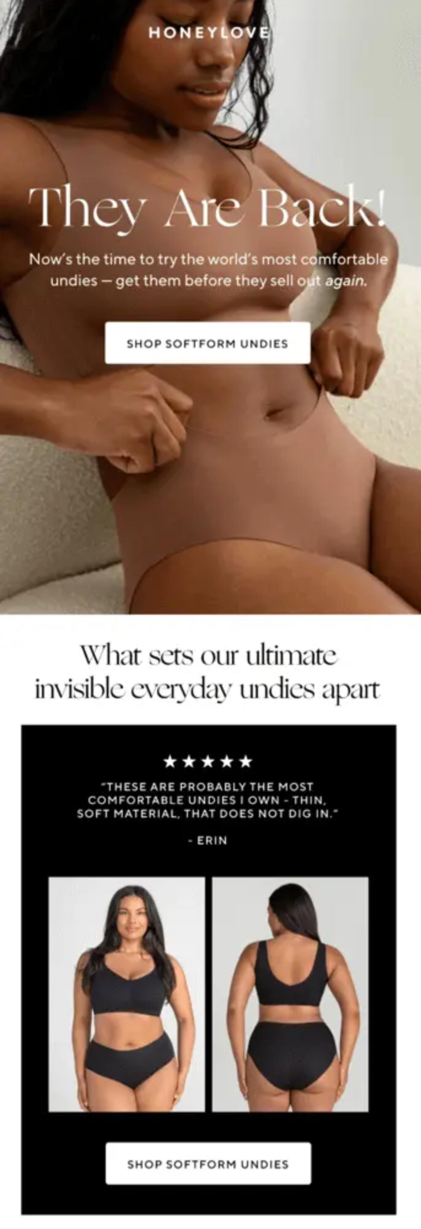
Image source: Milled
35. Balique’s simple summer email
Type:seasonal email
While beautifully designed emails serve an important purpose, text-based emails can be a simple way to connect with your audience as you would with a friend.
Haircare and skincare brand Balique sends a seasonal promotional email that reads as if it’s from a personal contact. The email begins with context on why they’re getting in touch (it’s now summer!) and how the brand addresses common skincare problems with relevant products.
Since they’re sending the message at the start of summer, they tap into their subscribers’ awareness of changing skincare needs. Beyond that, they educate subscribers about the benefits of using seasonal products and include relevant offers to encourage them to try the new collection.
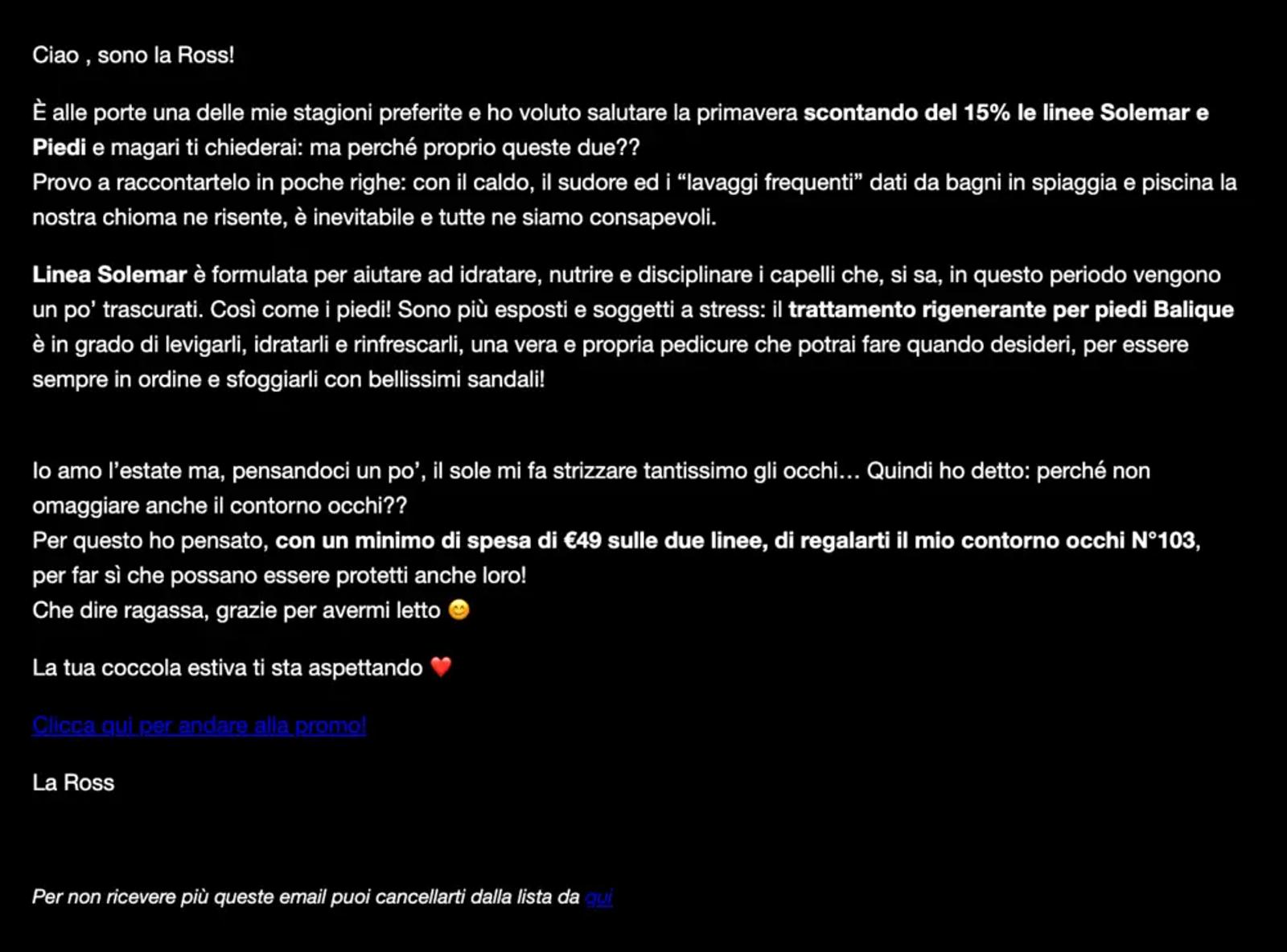
Image source: Milled
Email marketing should be personal and contextual
Looking across these 35 email marketing examples, we can see three patterns that drive engagement and sales:
- The most compelling emails reflect a unique brand voice and thoughtful email design.
- Segmentation is an important precursor to the personalised brand experiences consumers have come to expect.
- Timing and context are critical for relevance in email marketing. When you send an email is just as important as what’s in it.
As the CRM built for B2C, Klaviyo can help you drive immediate sales and lasting loyalty with the winning combination of advanced email automation, AI, and real-time customer data.
Power smarter digital relationships with Klaviyo SMS
Get started
Related content