Think about the traffic that lands on your website for the first time.
In most cases, people don’t just wander into your online store “off the street.” And whatever method you used to draw them in, it probably wasn’t cheap.
According to Klaviyo’s recent marketing mix report, paid advertising—the primary method of driving new customers to your website—continues to eat up marketing dollars: across all business segments, paid social and paid search consistently earn the largest average portion of marketing budgets.
And even if you’re driving most of your web traffic from organic search or social, “there is always a cost associated with getting those people onto your site,” points out Jacob Sappington, director of strategy at ecommerce growth marketing agency Homestead Studio.
That could mean:
- The immediate cost of paying an ad that gets someone onto your site
- The human cost of creating the content that you post on Instagram, YouTube, or TikTok that drives someone to your site
- The time cost of all of the above
Moral of the story: once you’ve paid for someone’s attention, “if you’re relying on them coming back to you through their own just thinking about you, you’re going to struggle with that,” Sappington says. “You absolutely should be concerned about being able to communicate with those users whenever you want to.”
You can do this by gathering contact information for your owned marketing channels—and that’s exactly what an on-site sign-up form helps you accomplish.
According to Ben Zettler, founder at digital marketing and ecommerce agency Zettler Digital, “if you don’t have a sign-up form that converts a user—gets someone to actually sign up for your list—generating real revenue out of your owned marketing program is going to be a challenge.”
In other words, by feeding your email and SMS marketing lists, sign-up forms have the power to transform casual website visitors into engaged listeners and, ultimately, loyal customers.
But how do you use sign-up forms to collect useful information from your customers—without turning them off? Here are 13 sign-up form best practices that can improve the customer experience—and turn more of your website visitors into marketing contacts and customers.
1. Align your offer with your sign-up form goal
Think of the information you’re asking for on a sign-up form as a form of currency. Your visitor wants to get something of equal or greater value in return for giving you their name, email address, or phone number.
“It’s really important to have something that is going to get users interested in opting in,” Zettler says. “What is the incentive? It doesn’t necessarily have to be a discount, but there needs to be a reason for a user to sign up.”
The first best practice to follow when you’re launching a sign-up form: understand your goals, and adjust your incentive strategy accordingly. “There are all different kinds of offers you could try,” Sappington points out:
- Percentage off
- Dollar amount off
- Free gift with purchase
- Chance to win a contest or giveaway
- Free shipping
- PDF downloads and guidebooks
If those options feel overwhelming, “think about impact,” Sappington advises.
How to weigh your sign-up incentive options
Most of Homestead’s clients, for example, are revenue-focused. “If you’re trying to acquire customers onto your list in a way that drives revenue,” Sappington says, “those discounts are what’s going to convert the most high purchase-intent customers.”
A recent analysis of Klaviyo brands supports that idea, suggesting that both email and SMS sign-up forms with coupons perform slightly better than those without—though not at a level of statistical significance.
But if your primary concern is profit margin and you’re comfortable attracting a lower-intent visitor, you might think about offering access to a gated content resource—style tips if you’re a beauty or fashion brand, for example, or early access to a highly anticipated YouTube video.
“If you have really regular, common questions about your product and people might find a guidebook-type resource valuable, that’s a great margin-reducing option,” Sappington says.
If you operate in an industry like skin care, where your product costs very little to make and you can sell it for a high price, a free gift with purchase might be a smart alternative to a discount. Olive oil brand Brightland, for example, offers a free spout in exchange for contact information:
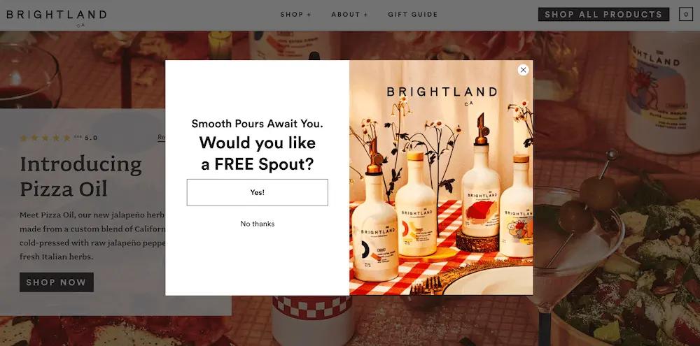
Image source: BrightlandHere’s another example from Our Place, the brand that developed the Always Pan—a multi-functional non-stick pan that’s easy to clean and looks stunning in any kitchen. The headline clearly states the value of the prize in bold text at the top of the form, but the body copy is where things get really interesting:

Image source: Our PlaceThe form includes not only essential information about the giveaway, including its monetary value, but also social proof in the form of testimonials from customers that promise the pan in question is “life-changing” and “a miracle.”
Ultimately, “you have to think about what the opt-in represents to the people who are opting in,” Sappington explains. “Someone who’s signing up for 10% off, they’re probably going to purchase. Someone who’s signing up for a giveaway, they want the chance to get free stuff, and they may or may not purchase.”
Always do the math—and test it
It’s absolutely crucial to test and figure out what works best for your brand (more on A/B testing a bit later).
Let’s say you have a giveaway sign-up offer that converts at 10%, for example, but the revenue per user is 10 cents. As Sappington points out, “a 5%-off welcome offer that converts at a dollar is better than that.”
Or let’s say you run a free shipping offer that converts at 2%. Then, you flip it to a free gift with purchase—a product that costs you $2 to make. If free shipping costs you $8, the free gift with purchase is an attractive sign-up incentive that saves you 4x the money.
If this sounds like a lot of complicated bartering, Sappington advises focusing on 3 key questions when testing your sign-up forms:
1. Can we save more money or margin with a different offer?2. Can we drive more or higher-quality opt-ins on the pop-up with a different offer?3. Can we drive higher revenue with a different offer?
Bottom line: “There has to be something,” Zettler says. “The generic ‘Sign up for news and releases’—that doesn’t work. You have to get creative.”
2. Don’t show the same sign-up form to every visitor
On a similar note: making your sign-up forms one-size-fits-all is a rookie mistake.
“For the majority of brands, even brands that are at a certain level of scale, you’re always going to want to serve a pop-up to users coming to the site for the first time,” Zettler says.
But just as different incentives will motivate different people to sign up based on where they are in the customer journey, different sign-up forms will appeal to different people based on where they’ve landed on your site.
Let’s say you’re heavily focused on organic traffic and you’ve invested a lot of time and money into building out an amazing content program on your blog. In that case, Sappington might suggest showing one sign-up form to blog readers and a different one to store browsers.
“You have to think about the users that are there,” Sappington says. “With a user who’s on your blog, a completely separate part of your website—do they have the same intent as someone who’s actually on your website shopping? The answer is no.”
Or let’s say you’re investing significant social ad spend in promoting a particular piece of content, and you want people to sign up for your email list in order to gain access to it. You might exclude paid social traffic from seeing your main, generic pop-up, and show them one tailored to the focus of the social campaign instead.
“You might have landing page-specific content depending on how you’re leveraging that across organic social, paid social, paid search, and organic search, and then pop-ups that are also specific to those different sources,” Zettler explains. “Those all become really important in getting users to sign up.”
You can also schedule forms to appear only during specific timeframes, and display forms based on real-time user behavior, such as exit intent or abandoned cart pop-ups. AI-powered forms display optimization, meanwhile, does this for you by testing which display scenarios convert best, then automatically running that version of the form.
A word of caution, here: if you’re launching specialized sign-up forms across your website, “the most important thing,” Sappington says, “is making sure they’re not bumping into each other and causing a poor customer experience.”
3. Emphasize the value you’re offering in the form header
Once you’re clear on the value you’re offering in exchange for your web visitors’ information, make sure your sign-up form emphasizes it prominently.
Watch how Caden Lane, a brand specializing in products for baby nurseries, centers the special offer on their homepage sign-up form. The form grabs the visitor’s attention with a greeting, then wastes no time in offering a 15% discount on everything sitewide:
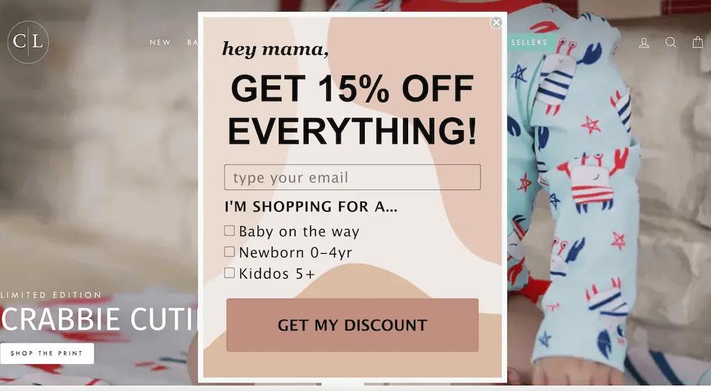
Image source: Caden Lane“Something I see happening a lot is that marketers have really poorly designed forms that don’t emphasize the value proposition enough,” Sappington says. “Show the offer. That’s what people want. Be a little more up front with what you’re trying to sell.”
4. Set clear expectations
One way to foster long-term commitment to your list is by telling subscribers exactly what they’ll get when they sign up—beyond the initial sign-up offer.
You might, for example, explain that email newsletter subscribers will receive recipes and cooking tips, while SMS subscribers will receive early access to new product drops.
Or you might simply identify how often subscribers can expect to hear from you—and give them extra peace of mind by assuring them they can opt out at any time.
Here’s a great example from Wild Fork Foods, a brand that’s on a mission to change the way people shop for and consume meats by sourcing products directly from farmers and delivering them directly to customers:
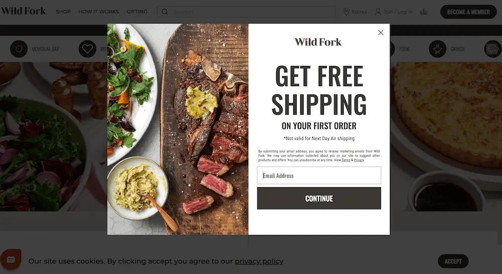
Image source: Wild Fork FoodsPay close attention to the fine print, here. In this sign-up form, Wild Fork Foods not only offers free shipping to new customers, but also:
- Explains that by entering their email address, visitors are agreeing to receive marketing emails from the brand
- Informs readers that the brand may “use information collected about you on our site to suggest other products and offers”
- Reminds visitors they can unsubscribe at any time
- Includes links to the brand’s terms of conditions and privacy policies
Wild Fork Foods covers all the bases here, setting expectations from the top to get visitors on the same page as the brand about what subscribing actually entails.
5. Keep it short and sweet
To create a high-performing sign-up form, you don’t need flashy graphics or long narratives.
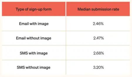
In fact, Klaviyo’s data analysis revealed that including an image has a slightly negative impact on submission rates for both email and SMS sign-up forms—though not a statistically significant one.
In terms of form length, Zettler has generally found the simplest, shortest forms are the most successful. “For the main pop-up experience, I generally tell brands, ‘Don’t ask for anything.’ Ask for email, and if it’s a multi-step form, ask for a phone number after that. That’s it,” he says.Even including a field like first name could impact your form submission rates, Zettler says. “I see that all the time—first name and email. But you don’t actually need to know that person’s first name. If you get them to buy today, you’re going to have their first name, anyway.”
Consider this example from the Official Store of Minecraft. With this simple sign-up form design, they offer customers 10% off their first order in exchange for their email address, and require them to fill out only one field:
Image source: Official Shop of MinecraftOver 140 million people play Minecraft on a monthly basis, which means Minecraft’s online store doesn’t have to do much to encourage shoppers to sign up to the store’s newsletter.
The goal, here, is to make it as easy as possible for your audience to share their information, boosting engagement in the process. “I generally much prefer that you get the opt-in so that you can start to serve more content to users who aren’t yet purchasing, to get them to make that purchase,” Zettler explains.
“While more information to enrich a user’s profile will absolutely have an impact on owned marketing success,” Zettler adds, “you can get it later on.”
6. Don’t be afraid to ask for more information
That said, for both email and SMS sign-up forms, Klaviyo’s data analysis revealed a correlation between form submission rate and the number of “components” on the sign-up form. In other words, the more “complicated” the form, the better it performs.
As always, take that with a grain of salt—the differences did not reach the level of statistical significance, and our data also doesn’t distinguish between “components” and “fields”—meaning “components” could also simply refer to key features like coupon codes, teasers, etc.
But asking for additional information on your sign-up forms could help you mine the kind of zero- and first-party data that proves invaluable in personalizing your marketing messages later—assuming it makes sense for your brand.
Zero- and first-party data refers to information your customers either consent to you collecting by observing their behavior on your website, or hand over willingly on a form.
Here are a few zero- and first-party data points you might want to ask about on a sign-up form template, in addition to getting someone’s email address or phone number:
- Their birthday
- What products they’re interested in
- Why they’re shopping
- How often they want to purchase your products
- What kinds of emails or texts they want to get, and how frequently
It makes sense if: you sell to distinct audiences
According to Sappington, asking for more of this kind of information on your sign-up form makes the most sense for brands that have “very distinct buckets of people.”
Here’s a great example from Cheeky Wipes, which offers both baby care and feminine hygiene products. For founder Helen Rankin, it’s crucial to know which of those product lines her customers are interested in.
“People looking for period products don’t necessarily want to hear about baby products,” Rankin explains. “And for people who can’t have children, are undergoing IVF, or who have had multiple miscarriages, getting an email all about baby wipes—that’s a terrible customer experience.”
To solve this problem, the Cheeky Wipes sign-up form asks visitors to identify which products they’re interested in right from the get-go:
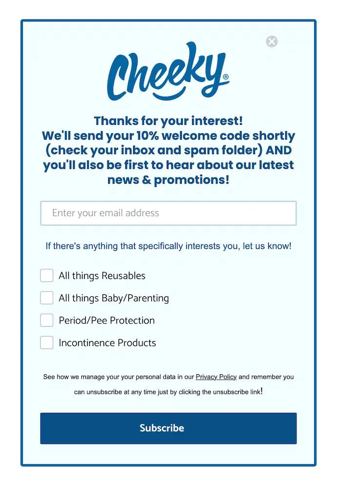
Image source: Cheeky WipesSimilarly, UK-based razor brand Wilkinson Sword experimented with adding a field to their sign-up form to allow new email subscribers to identify whether they’re interested in “male” products, “female” products, or both:
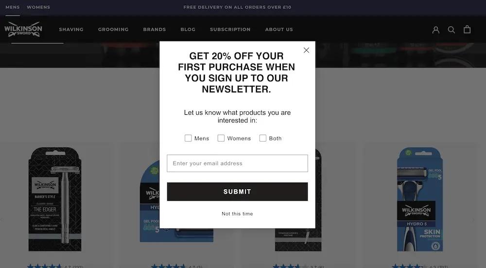
Image source: Wilkinson Sword“Data about what people are interested in helps us provide them with relevant content, so we’re willing to sacrifice a bit of conversion for that,” says John Pagni, ecommerce assistant. “But we actually haven’t seen a drop-off yet.”
It makes sense if: you test it and it works
As always, make sure you test every change you make to understand how your unique audience feels about any additional fields on your forms—and that you actually have a strategy for putting that data to use in future marketing efforts.
After testing this for many brands, the team at Homestead has learned that “for some brands we can get the exact same opt-in rate with those extra questions included,” Sappington says. “That’s a win. We’re getting extra data, and it’s not costing us anything.”
But Zettler’s team has run formal tests on a number of fields, too, and he says “it’s night and day in terms of the actual form submit rate results. The more you ask, the less users are going to fill in their information.”
And “unless the brand or we as the agency has a very clear path to how we’re going to use that data, if it hurts our conversion rates, it’s out the door,” Sappington adds. “Otherwise you’re just plugging it in just to plug it in, and it’s not actionable.”
7. Create segments with zero- and first-party data
Social platforms like YouTube, Instagram, and TikTok have trained consumers to expect personalized online experiences, making social proof a crucial factor in building trust and encouraging sign-ups. With the valuable customer information you gain from your sign-up forms, you can serve up the kind of tailored content marketing your audience wants.
Here’s how it works with Klaviyo B2C CRM: when customers fill out a form, “that information gets pushed over to Klaviyo profiles as custom properties,” Zettler explains. “So we can use it for segmentation, dynamic content in messages, and to recommend products to that particular user.”
Depending on what information you got with your forms, you can create email segments—subsets of your total marketing list—that group customers based on factors like:
- What products they’re interested in
- What aspect of the product is most important to them
- How often they want to hear from your brand
Based on the gender preferences they collect in their sign-up form, for example, Wilkinson Sword created a simple but effective segmented welcome series that yields a purchase rate of 40%—nearly 20x the industry average.
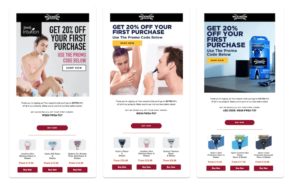
Image source: Wilkinson Sword
8. Get the “micro yes” before asking for the big one
One clear case where adding more steps does not translate to lower conversion rates: multi-step forms.
According to Klaviyo’s data analysis, multi-step forms tend to outperform single-step forms for both email and SMS, though not at the level of statistical significance.
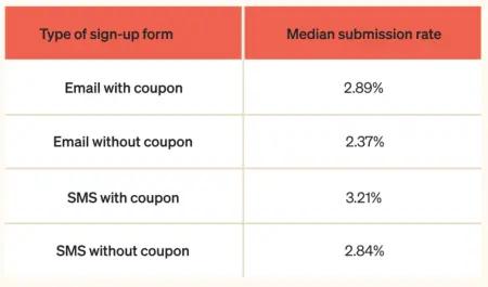
Type of sign-up form | Median submission rate |
Email multi-step | 2.85% |
Email single-step | 2.27% |
SMS multi-step | 2.98% |
SMS single-step | 2.58% |
There are several smart ways to approach multi-step forms. Homestead, for example, has seen a lot of success with what Sappington calls the “micro yes” strategy: using a multi-step form to nudge visitors to agree to the value proposition, before revealing what they need to exchange in order to get it.
Here’s an example from barbecue sauce brand Kosmo’s Q. The first page of the form teases the offer with a few lines of intriguing copy and a question: “Would you like a discount?” Instead of entering their information, all the visitor needs to do here is click yes or no:
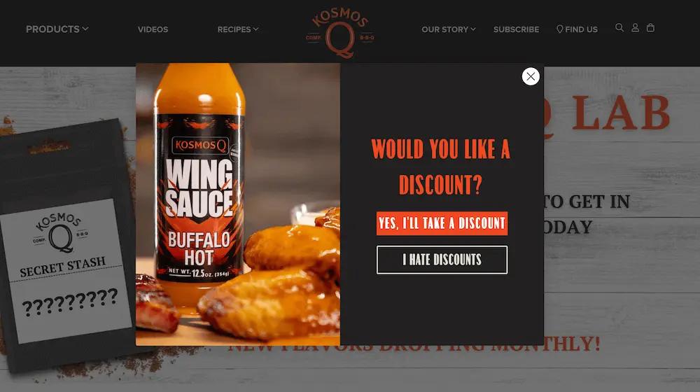
Image source: Kosmo’s QThen, on the next page, the form reveals the field the visitor must complete in order to claim their discount—their email address:
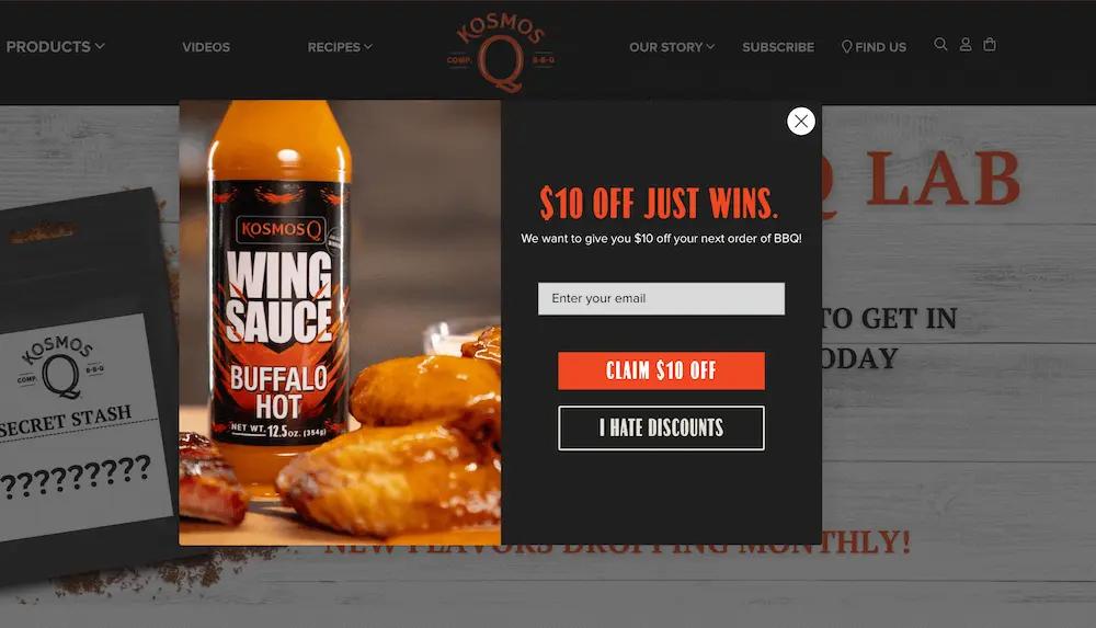
Image source: Kosmo’s QSomething about this strategy earns serious buy-in from users, perhaps because they feel they have more agency in the process.
“You’re asking someone if they want an offer prior to just giving them the field,” Sappington explains. “For almost every single brand we’ve tested this for, it’s worked really well.”
9. Ask for SMS on a multi-step form
Another savvy way to use multi-step forms: ask for an email address in the first step, and a phone number in the second.
There’s no denying that consumers are interested in SMS marketing. According to Klaviyo’s recent SMS consumer research with Recharge, 72% of consumers say brands should send text messages at least once a week.
Like additional form fields, then, asking for a phone number in addition to an email address doesn’t necessarily mean you’ll see a drop in submission or conversion rates.
Not sure whether your web visitors want texts from your brand? Create a multi-step form that offers SMS subscription after someone signs up for email.
With this type of multi-step form, the first screen asks the visitor for their email address; once they submit that form, they arrive on a second screen which also asks them for their phone number.
Here’s what it looks like in action:
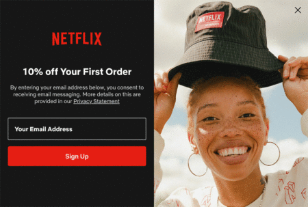
Image source: Ben Zettler DigitalSome brands find success here with escalating discounts: 10% for signing up for email, for example, vs. 15% for signing up for SMS.
But if your sign-up form already makes a special offer in exchange for someone’s email address, it might be enough to simply set clear expectations around what SMS subscription entails. With this strategy, Sappington says, about half the people who sign up for email on the first screen also sign up for SMS.
10. Don’t end the experience after someone clicks “submit”
What happens after someone signs up to your marketing list is almost as important as what happens before.
Don’t leave your new subscribers hanging—send them to a thank-you page that outlines next steps, in addition to sending an email or text confirming that they successfully signed up.
Why? Who cares? It solves what Sappington calls a “constant problem” with multi-step forms: “You try to get someone to sign up for SMS and they say ‘No thanks,’ and the form closes them out without revealing the special offer.”
That’s a frustrating user experience, Sappington points out. “That person’s feeling like, ‘Well, I gave you my email—I wanted what you were telling me you were going to give me.’ And almost always, the code’s been emailed to them, but they don’t know that.”
Homestead solves this problem by adding a final page to the multi-step form that says, “Okay, you didn’t want to sign up for SMS, but here’s the offer you opted in for anyway,” Sappington explains.
“That’s something Klaviyo’s form builder supports that not very many others do,” Sappington adds. “It’s taking care of those users who aren’t ready to give you their phone numbers yet, while still driving the conversions you want.”
Watch how hair care brand Josh Wood Colour handles the post-sign-up experience: when someone submits a sign-up form on the brand’s website, they see a thank-you message with the promised discount code—plus a call to action (CTA) to start shopping:
Image source: Josh Wood Colour
11. Use single opt-in for email sign-up forms, but double opt-in for SMS
One of the first things Homestead checks when a client is struggling with building their email list is whether their sign-ups are set to double opt-in.
Sappington’s not a huge fan of double opt-in for email. “I would much rather get them on the list, and then clean them out on the back end, rather than restrict them getting onto the list in the first place,” he explains.
“You might unfortunately get a few bad profiles or spam accounts on the list,” Sappington adds. “But I think the reward is worth the risk, there.”
“We generally advocate for single opt-in on email forms,” Zettler agrees. “You want to cast the net wide and get users receiving the content once they’ve entered into that list.”
Consent laws around SMS, on the other hand, are stricter than email—which makes double opt-in a crucial best practice on SMS sign-up forms.
Double opt-in for SMS includes both traditional double opt-in, where the user must confirm their sign-up after initially signing up, and tap-to-text (more on this below).
12. Optimize for mobile
Have you ever been online shopping on your phone, only to be interrupted by a pop-up that’s barely legible and clearly belongs on a full-sized computer screen?
Considering more than half of all web traffic is mobile, that’s a huge missed opportunity.
Best practices for mobile form optimization
Mobile forms need to fit the smaller device screen without hiding form fields, and they need to be easy to read on a monitor.
Sappington encourages mobile pop-ups to be “really simple”: flat-color backgrounds, big headers, no lifestyle photography, and copy that gets straight to the point about the offer.
“On mobile we look for fairly simple pop-ups,” Sappington explains. “You only have so much real estate, so trying to incorporate too many fancy elements can be a distraction.”
Here’s an example from the Wu-Tang Clan’s official online shop. Notice how the mobile version eliminates the photography and cuts the form in half:
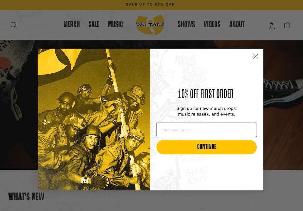
Image source: Wu-Tang Clan official shop
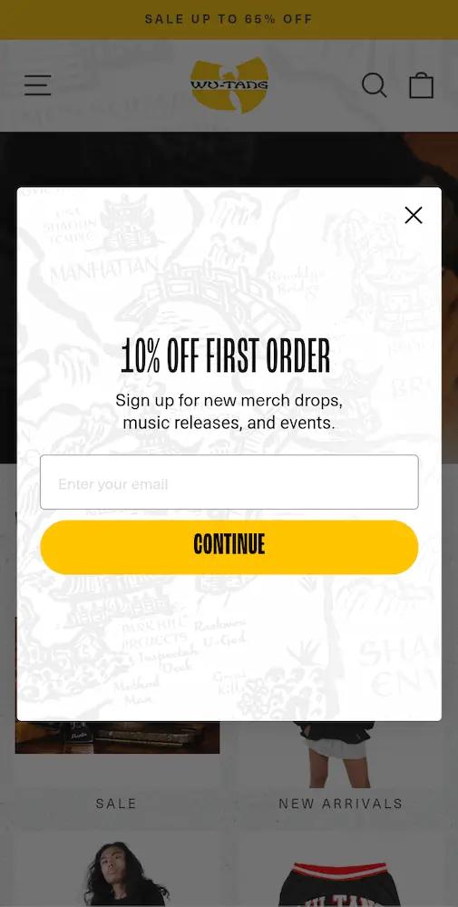
Image source: Wu-Tang Clan official shop
How to optimize your forms for mobile
When optimizing for mobile, Zettler’s team typically builds separate forms for different devices. In the targeting and behavior rules inside the Klaviyo sign-up form editor, for example, you can specify to show on all devices, desktop, or mobile.
But the Homestead team has been experimenting with Klaviyo’s all-in-one builder, which automatically adjusts sign-up forms based on the device someone is viewing them on—removing the need to build separate device-optimized forms.
With a device-optimized form, you can also add form elements that are unique to mobile phones, including tap-to-text buttons that allow your subscribers to opt into SMS marketing in just two taps rather than manually entering their phone number.
Test this, too—Klaviyo’s data analysis revealed a slight decline in performance for SMS sign-up forms that use tap-to-text rather than or in addition to a simple phone number input field. But again, the difference was not statistically significant.
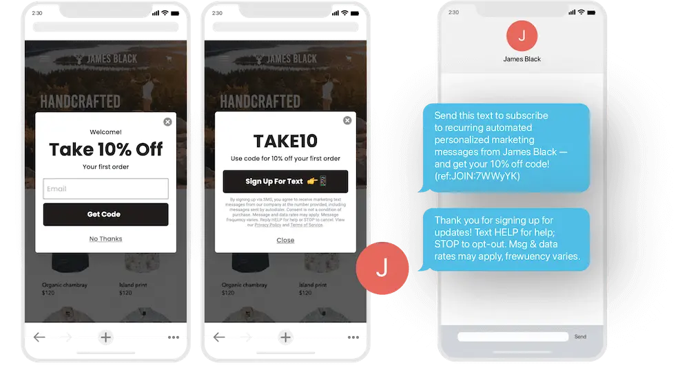
Image source: KlaviyoBecause tap-to-text qualifies as double opt-in for SMS, Sappington advises using double opt-in for desktop SMS forms, but tap-to-text for mobile ones.
“If you’re using tap-to-text, which invites you to press the button and it brings up an auto-filled text to send, that counts as double opt-in because you have to initiate it from your own phone,” Sappington explains.
13. Always be testing the form experience
A/B testing is one of the best ways to improve conversion rates on your website, and testing sign-up forms can lead to some quick but serious wins.
A/B testing works by showing your standard version, the control, to a certain percentage of your users—usually 50%. Then, it shows a different version, the variation, to a different percentage of your audience—typically the other 50%.Remember: When you run a test, change only one variable at a time. That way, if you see a movement in key email KPIs like submission rate, conversion rate, and revenue per recipient, you don’t have to guess which changes are responsible for it.
Consider testing the following elements of your sign-up form:
- Copy
- Form design (i.e., placement of fields or CTA)
- Type of incentive (i.e., free gift vs. free shipping)
- Discount size
- CTA button language and placement
- Display triggers (i.e., percentage scroll vs. time spent on site)
“Always, always, always test,” Zettler emphasizes. “There’s always something you can find out that will maybe surprise you about how you format a sign-up form.”
Build your best sign-up form yet
Making even minor changes to improve your sign-up form can boost engagement, helping you grow your owned marketing lists organically—and therefore rely less on expensive third-party acquisition channels like paid media.
“All the grains of sand make up the beach,” Zettler says. “There is a collection of many smaller technical elements of sign-up forms that brands are just missing out on.”
By always keeping your prospects and customers in mind when you design your sign-up forms, and remembering that each form must provide value in return for the information it requests, you can drive more meaningful, personalized relationships with your customers.
As Zettler puts it, “if you do all these things, you could have your acquisition points in a much healthier place, where you’re getting more users entering into your list, more qualified leads entering into your list, and ultimately making more money from your email and SMS marketing.”
Website sign-up form FAQs
What is a sign-up form?
A sign-up form is a pop-up, web page, or modal with input fields that collect information from your website visitors. You can use a sign-up form to collect contact information, like an email address and phone number, as well as other personal information, like names, birthdays, and product preferences.
Your sign-up form is essentially the pick-up line of your website: its goal is to charm your customers into continuing a relationship with your brand.
A form might seem like a small part of your ecommerce or B2C marketing plan, but it’s a budget-friendly way to encourage people to opt in to messages directly from your brand—future communication over owned channels that builds loyalty, inspires purchases, and more.
What are the main types of sign-up forms?
Not all sign-up forms are created equal. According to a recent analysis of Klaviyo brands, full-page email sign-up forms tend to outperform other types of email sign-up forms, followed by pop-up forms, fly-out forms, and embedded forms.
But take that conclusion with a grain of salt: none of the average differences in our analysis reached the level of statistical significance.
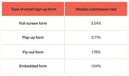
What does this mean for you? Testing is going to be the best bet to find what works for your unique brand.
For SMS sign-up forms, meanwhile, embedded forms tend to outperform other types of sign-up forms—but, again, not at a level of statistical significance:
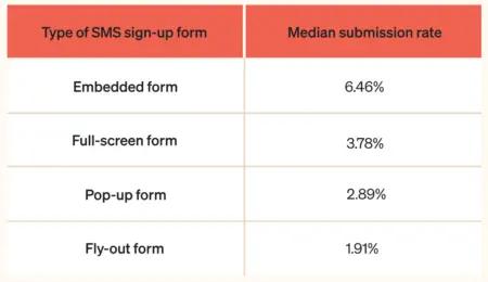
If you’re asking which sign-up form is “best,” then, the frustrating answer is: it depends. Here, we break down the pros and cons of the 4 main types of sign-up forms so you can decide which might make the most sense for your business.
1. Full-screen formsFull-screen forms display over the entire browser window, capturing your shoppers’ attention. In order to continue browsing, a user must interact with the form by either Xing out of it or submitting their information.
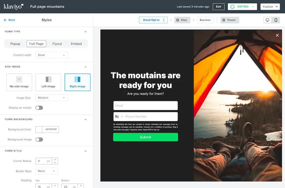
Source: KlaviyoIt’s perhaps no surprise, then, that full-screen forms tend to earn the highest performance rates out of all sign-up forms. Think about it this way: the more obvious the form, the more likely people are to notice it. As long as the offer is relevant and appealing to the customer, that means they’re also more likely to fill it out.
Does that also mean every form you add to your online store should be a full-screen form? Probably not. These forms may perform well because they’re difficult to overlook, but they’re also the most intrusive of all the sign-up form types.
2. Pop-up formsPop-up forms, which appear in the middle of the browser’s window, are slightly less disruptive than full-screen forms. They’re the most commonly used type of form, according to Klaviyo’s data—perhaps because they provide the best of both worlds.
Typically, with a pop-up form, the web visitor can still see the rest of the website in the background of the pop-up, and may even be able to click back to their browsing experience without interacting with the form.
Check out how prominently home decor brand Lust Home displays their pop-up form on their homepage:
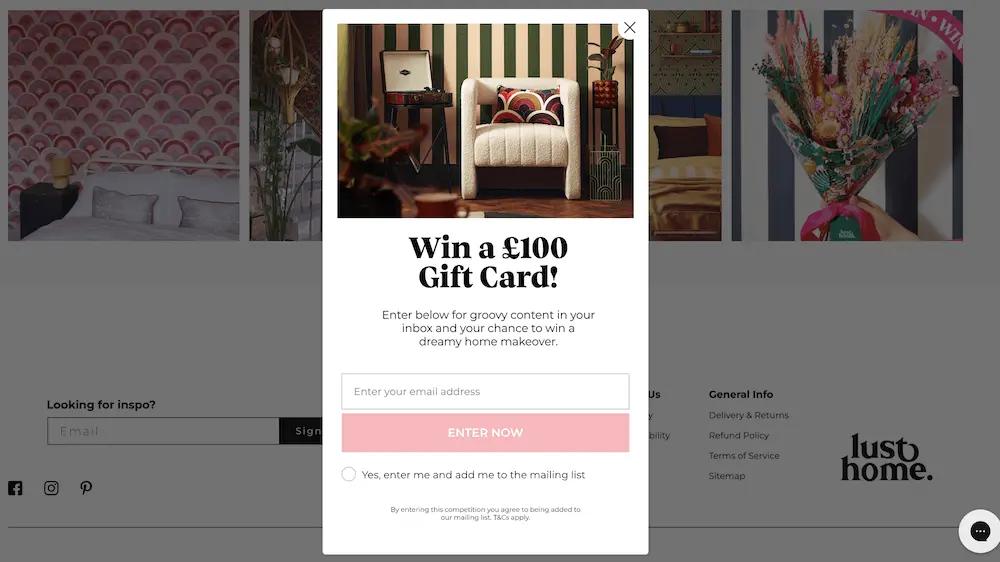
Image source: Lust HomeAs with full-screen forms, pop-up forms tend to be eye-catching and difficult to ignore. But remember: Too many pop-ups—or a pop-up at the wrong time—can be annoying or distracting to a potential customer.
Depending on your goals for your sign-up form and the user experience you’re trying to create, a fly-out or embedded form might make more sense for your business.
3. Fly-out formsFly-out forms slide into the browser’s window from any direction, typically to the edge of the screen rather than the middle.
Edinburgh Skincare features a fly-out form on their website, which appears when the user clicks on a teaser in the corner:
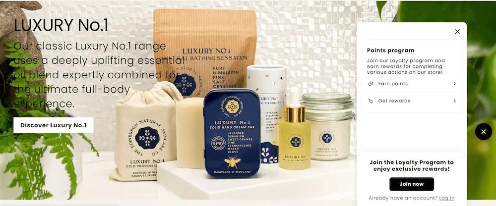
Image source: Edinburgh SkincareFly-out forms are less intrusive than pop-ups, but they’re still noticeable. They generally allow a visitor to keep browsing without interacting with the form.
4. Embedded formsFinally, embedded forms appear statically on a specific page on your site, such as in your footer.
Here’s an example from hair care brand Living Proof, which includes an embedded newsletter sign-up form in their website footer:
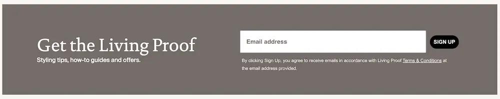
Image source: Living ProofWhy are embedded forms the lowest-performing email forms, but the highest-performing SMS forms?
It may be because most people are more reluctant to share their phone number than their email address. Since an embedded form is less obvious and typically something web visitors must seek out, those who enter their phone number into an embedded form are likely higher-intent web visitors.
Embedded forms are helpful for visitors who come to your site with the intention of subscribing, but may not trigger a pop-up or fly-out. Consider including an embedded form in your footer in addition to any pop-up.
What to include in a sign-up form?
The most successful sign-up forms include an incentive or value proposition, clear guidelines around what subscription entails, a limited number of input fields, and a prominent, actionable CTA, often leveraging social proof to increase credibility and trust. Learn more about getting started with sign-up forms.
What is a sign-up page?
A sign-up page could refer to two types of sign-up forms:
- A full-page sign-up form: a pop-up form that covers the entire browser window when a shopper is on your site. Full-page forms tend to be high-converting since they capture a shopper’s full attention, but because a shopper must interact with them in order to close them, they are also more disruptive to the shopping experience.
- An embedded sign-up form on a landing page: a sign-up form embedded into a specific landing page on your site. The most successful embedded forms tend to be embedded on high-converting landing pages, such as for high-stakes contests, rather than general-purpose or product pages.
Want to combine sign-up forms, email, and SMS into one platform?
Try Klaviyo today
Related content