Email CTAs are what give your emails purpose. And that purpose isn’t always to sell.
Sure, there’s a reason one of the most popular CTAs used to be “Shop Now.” But it’s also true that a lot of email marketers in 2016 weren’t particularly sophisticated with their CTAs.
As we’ve begun to respect the complexities of the non-linear customer journey, we’ve also broadened our use of the CTA to reflect the mindset of potential buyers.
If most of your email CTAs exist to drive revenue, you’re missing out on providing more value to your subscribers. Email CTAs can also:
- Encourage people to learn more about your brand
- Serve educational content to people who need it
- Drive people to get in touch with a customer service agent for feedback
- …and more
You’ll walk away from this article with a solid understanding of how to best use email CTAs to drive a wide variety of actions. Most important, you’ll learn how to demonstrate an understanding of the mindset of your subscribers, so you can put their needs first and ultimately increase their lifetime value—and your bottom line.
What is a CTA in email marketing?
An email CTA, or call to action, is a clickable link or button in an email that leads people to an online destination, like a landing page or product page.
CTAs are designed to grab the reader’s attention and encourage them to interact with the contents of the email, whether it’s to submit feedback, consume a piece of content, or make a purchase.
Email CTAs use action-oriented language to increase click-through rates on an email, which is the backbone of an effective email marketing strategy.
5 types of CTAs for your email marketing strategy
The biggest mistake marketers make with CTAs is only using them for one thing: to drive a purchase.
What if you stepped inside a store to browse, only to encounter a customer sales rep who repeatedly shouts, “Shop now! Buy now!” Odds are you’ll choose to leave—and shop somewhere you can have a real conversation before buying.
The only limiting factor to types of email CTAs is the action you want your subscribers to take.
This experience is what you’re replicating online when you double-down on purchase-driven CTAs without the additional components of a well-rounded email automation strategy.
The only limiting factor to types of email CTAs is the action you want your subscribers to take. Feel free to get creative beyond the types we list here, but if you’re looking to get started, we find most CTAs drive readers to:
1. Engage with content
Content-focused CTAs, which often (but not exclusively) appear in welcome series emails, drive people to assets that help them get to know your brand. This may be the most diverse category of email CTA, with a lot of room for creativity depending on your overarching brand strategy.
Content CTAs may push people to:
- Read an educational resource
- Attend an event
- Watch a video
- Listen to a podcast
- Join a community
- Take a quiz
When you’re measuring the performance of email call-to-actions, you’re measuring conversions that correspond with each piece of content. For example:
- Read an educational resource → website traffic, time on site
- Attend an event → event registrations and attendees
- Watch a video → video views, average watch time
- Listen to a podcast → unique listeners, consumption rate
- Join a community → sign-ups
- Take a quiz → quiz completions and data points collected
The desired action in this example from Pink Moon is twofold—their main CTA button asks recipients to take a quiz, while a secondary text link CTA encourages readers to join their community.
In this case, the brand’s primary focus is to gather Customer-First Data™ to further personalize the brand experience, so they can send more relevant offers to subscribers down the line.

Image source: ReallyGoodEmails
2. Try something for free
Most often associated with freemium models, trial-focused CTAs are also useful for ecommerce brands. Subscription models are especially well set up for the trial CTA, when a free trial can stimulate long-term recurring revenue.
Email CTAs of this nature work best when there’s some urgency attached to them, most often in the form of an expiration date on free access (more on that below).
Trial CTAs may push people to:
- Download an app
- Get a free sample
- Try a subscription for 30 days
- Access a free product in exchange for a review
When you’re measuring the performance of trial CTAs, you’re measuring:
- Download an app → downloads
- Get a free sample → samples requested
- Try a subscription for 30 days → sign-ups
- Access free product in exchange for a review → product reviews
In this call-to-action example, Hubble offers a free box of contact lenses as a trigger for a long-term subscription. Hubble also enhances the CTA by offering to get in touch with the recipient’s doctor to “take care of all the hard work.”
It’s a great reminder that email CTAs are only as good as their context—if it’s not easy for someone to take action, no amount of wordsmithing will make a difference.
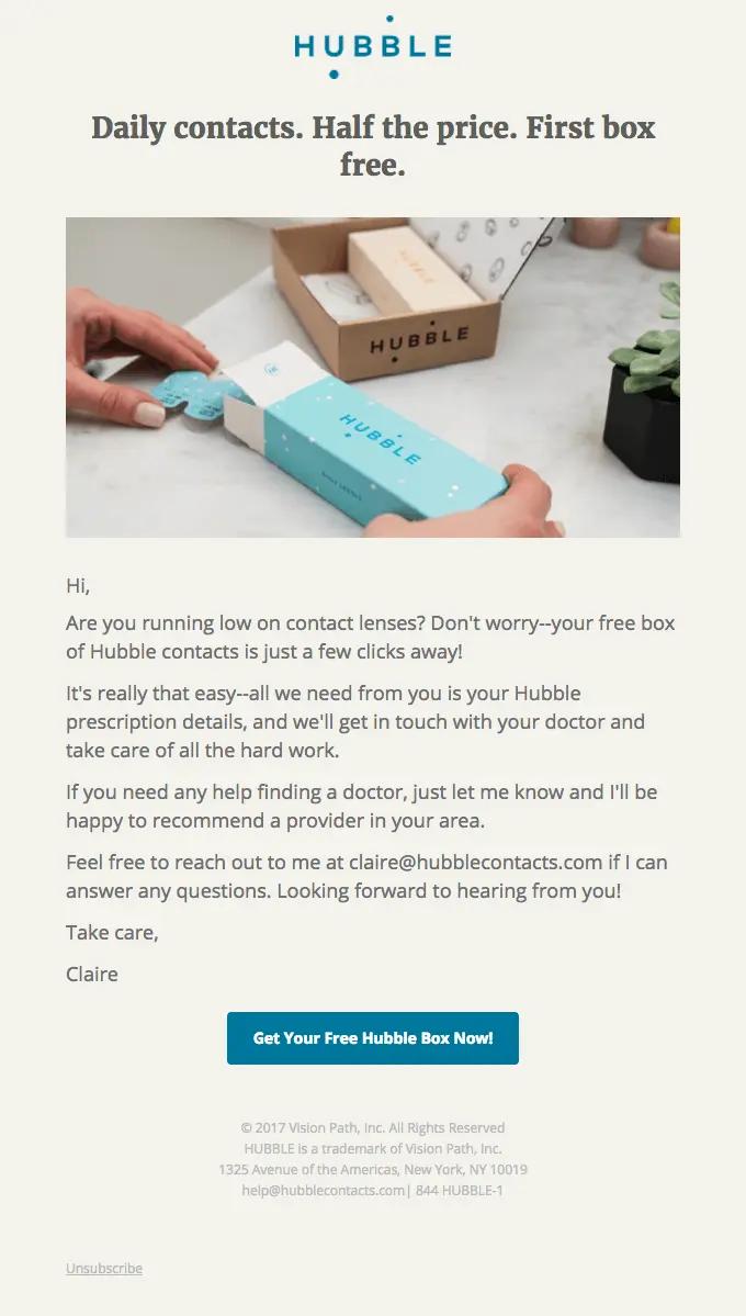
Image source: ReallyGoodEmails
3. Start a purchase
A favorite among brands, purchase-driven CTAs are measured against the revenue they generate. They come in a wide variety of flavors depending on the offer, which can drive a recipient to:
- Buy limited stock
- Purchase an item on sale
- Shop a limited-time offer
- Get a special offer or discount
- Browse a new collection
- Upgrade a product they already purchased
Purchase CTAs frame the buying experience as one that’s urgent, exclusive, special, or positive.
4. Complete a purchase
Let’s say someone almost converts from your purchase CTA, but they abandon the process midway through. This is what abandoned cart and browse abandonment emails are for: to remind shoppers to complete their purchase.
While many purchase reminder emails use discount-focused CTAs, this isn’t your only option. You may choose to remind people by encouraging them to:
- Continue shopping
- Reclaim a cart
- Check out
- Take another look
Where do discounts come in? Well, discounts and coupons can help with conversion—but only when you use them strategically. The last thing you want to do is set up an expectation that a discount will always be available.
This is why Golde makes it clear they’re only offering a discount on a first purchase, with a clever “I’m ready” CTA to drive the recipient back to the purchase they started.
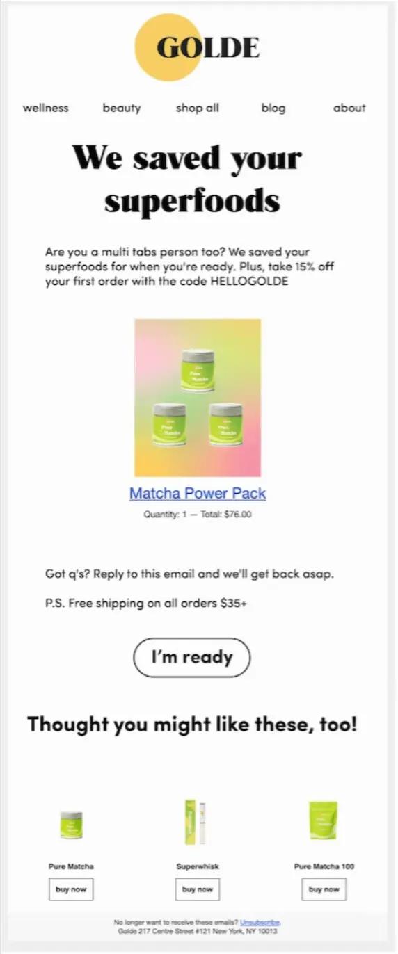
Image source: Golde
5. Submit feedback
Most often used post-purchase, a feedback-driven CTA asks people who have recently purchased an item for their opinion. Coupled with qualitative data from customer interviews, quantitative survey data is crucial for product development, ongoing improvement, and a robust customer review marketing program—so it’s a CTA you’ll want to get right.
Feedback CTAs may push people to:
- Take a survey
- Write a review
- Talk to customer support
- Recommend a product to a friend
When you’re measuring the performance of feedback CTAs, you’re measuring:
- Take a survey → survey completions
- Write a review → product reviews
- Talk to customer support → customer support tickets
- Recommend a product to a friend → product referrals
But sometimes a simple NPS score will do. Also known as the Net Promoter Score, NPS is a measure of customer loyalty and satisfaction, calculated by subtracting the percentage of detractors (customers who are unlikely to recommend a product or service) from the percentage of promoters (customers who are highly likely to recommend). It’s a common metric to gauge overall customer sentiment and predict business growth.
This is what Bellroy opted for in their feedback email, with a one-click NPS meter from 0-10 that answers the question, “How likely is it that you will recommend Bellroy to a friend?” It’s a great reminder that not all CTAs need to be buttons—in this case, the email design is structured for easy participation.
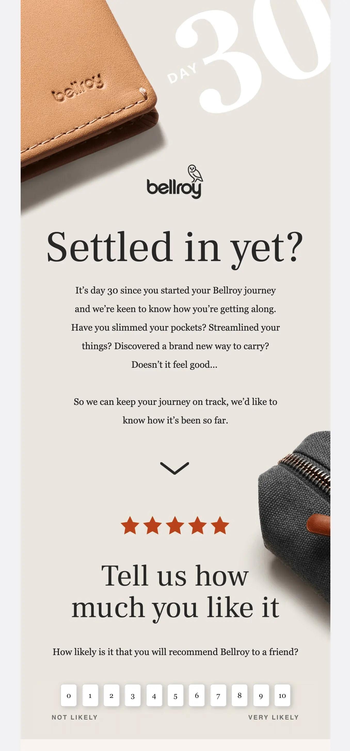
Image source: ReallyGoodEmails
6 best practices for writing email CTAs that drive conversions
Now that you have a basic understanding of your choice of email CTA, we’ll show you how to craft a punchy one.
From copy to design to placement, the devil is in the details for an effective email CTA—and even when you settle on one you think will work, you’ll need to A/B test to find out if your hunch is correct.
Here are 6 best practices for writing email CTAs that drive conversions:
1. Match the CTA to recipient behavior with omnichannel marketing
An email CTA is nothing without context—and the context of your email should be determined by the recipient. This is the guiding principle of omnichannel marketing, which relies on a centralized customer profile that calibrates the brand experience across whatever channels the customer chooses.
An email CTA is nothing without context—and the context of your email should be determined by the recipient.
It takes, on average, 6 separate touchpoints for someone to purchase a product. When those customer touchpoints use CTAs to create one long conversation as opposed to several fragmented ones, it’s instantly easier for your brand to serve people with an experience that reflects their readiness to purchase.
For example, consider these two scenarios:
Subscriber A is new and hasn’t really browsed your website. You can see they subscribed from an Instagram contest you ran to increase your subscriber rate, but they haven’t so much as lingered on any product description page.
Subscriber B is a longtime subscriber who has browsed 4 product pages and once almost completed a purchase. They bounce from one product to the next, but all of those products are part of the same category.
Which subscriber should see a “Shop Limited Time Offer” CTA? If you guessed Subscriber B, you understand the importance of mapping email CTAs to customer intent.
2. Reduce cognitive load with your CTAs
When you’re talking about cognitive load as it relates to marketing, you’re talking about the mental effort and capacity required to process messaging. People are busy and distracted, and excessive cognitive load can prevent them from engaging with your emails at all.
Too many CTAs means you’re creating too much cognitive load for the recipient. While some marketing experts recommend no more than one CTA per email, others say it depends on your goals and email design.
Don’t have more than 3 CTAs in your email. Not only does this tend to make the email very long, it also increases the likelihood of users actually not clicking anything at all.
“Don’t have more than 3 CTAs in your email,” advises Alexa Engelhart, vice president, client strategy at Power Digital.
“Not only does this tend to make the email very long (and therefore harder to digest), it also increases the likelihood of users actually not clicking anything at all.”
So how do you know if your email warrants more than one CTA? Look to your goals to find out. It makes sense that this abandoned cart email from Rudy’s only has one CTA because the goal here is clear: Redirect the recipient back to their cart to complete the purchase.
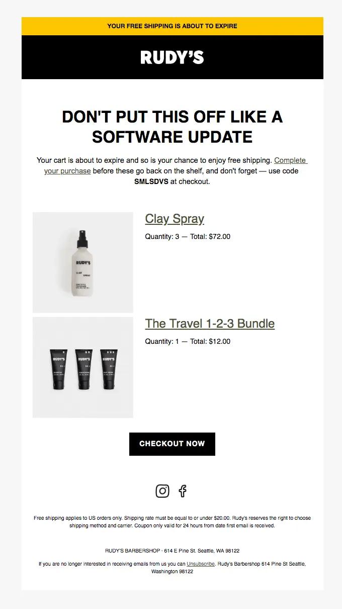
Image source: ReallyGoodEmails
But this second example from Rudy’s is a good use case for multiple CTAs. Rudy’s offers both a product and a service, and they want to create some choice for recipients who want one over the other. Some choice is good—too much is not.
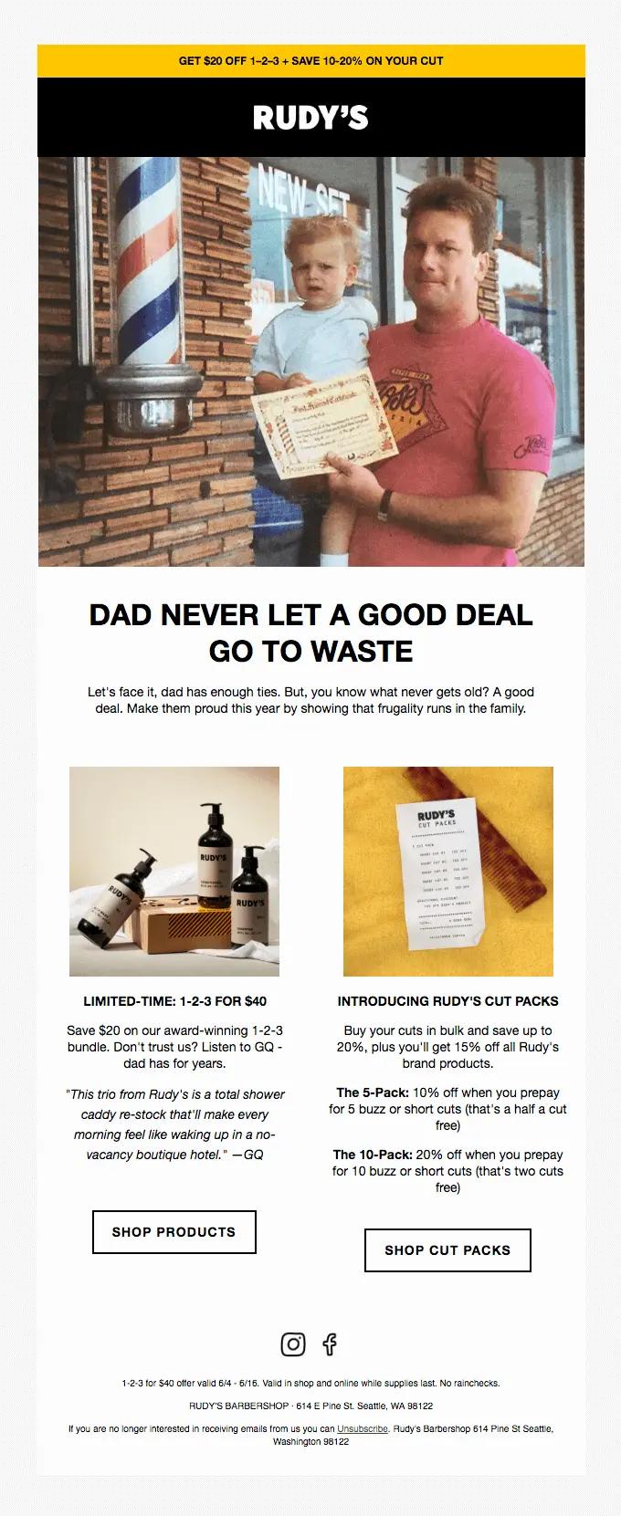
Image source: ReallyGoodEmails
3. Set CTA expectations with clear copy
It may be tempting to be as clever as you can when writing your CTA copy, and in some cases it makes sense. But cleverness should be more the exception than the rule.
Opt for clarity so that people don’t feel misled when they click on your CTAs. If they do, they’ll likely bounce from the landing page—and all your hard work will be for naught.
This email from Girlfriend Collective goes so far as to set expectations in their preview copy, so the recipient knows they can expect an offer in exchange for returning to their cart.

Source: Twitter
4. Determine the ideal CTA placement
“If you want more revenue from your emails,” says Connie Cen, founder and owner of Rocketeer Media, “include at least 3 things above the fold: the headline, an image, and the CTA. Captivate your audience before that first scroll. Because believe it or not, I guarantee that 80% of people do not scroll past the first part of the email.”
If you want more revenue from your emails, include at least 3 things above the fold: the headline, an image, and the CTA. Captivate your audience before that first scroll.
This example from Made In goes above and beyond by combining their headline, image, and CTA as one flattened, clickable image.
This option is especially effective for subscribers who have been around for a while and may not need to know much more about your brand to purchase. In this case, Made In is announcing a new product line—potentially to subscribers who were eagerly awaiting it—so there wouldn’t be a need to scroll down and read more before clicking on the CTA.

Image source: ReallyGoodEmails
5. Design email CTAs for a 4:5:1 color contrast ratio
Email CTAs rely on solid color contrast to enhance visibility and stand out. Aim to select colors that are visually distinct from the CTA’s surrounding elements, then make sure the text inside the CTA is distinct from the fill color itself.
For people with color vision deficiencies or low vision, Web Content Accessibility Guidelines (WCAG) 2.0 recommends a contrast ratio of at least 4.5:1 for large text and 7:1 contrast for normal text. Use WebAIM’s Contrast Checker to check your hex codes for contrast.
This MeUndies example may pass a contrast test with hex code inputs from its text (#FFFFFF) against the CTA fill color (#3B4187), but it fails when testing the CTA color against the email background color (#707698).

Source: ReallyGoodEmails
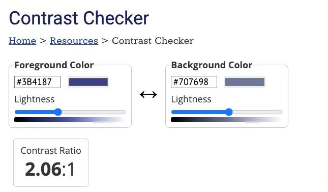
Image source: WebAIM contract checker
In making your CTAs accessible for people with visual impairments, you’re actually improving the overall visibility of your CTAs for everyone.
6. A/B test email CTAs
Now that we’ve described most of the basic rules of email CTAs, here’s the truth: You won’t know what works for your brand until you test with a real audience. This is where the A/B test comes in.
When conducting your first A/B test for email CTAs, start by identifying a specific goal to measure, like click-through rate vs. conversion rate. Create two versions of the email, keeping all elements consistent except for the CTAs you want to test.
You won’t know what works for your brand until you test with a real audience.
Divide your email list into segments—Klaviyo can help you reserve a specific percentage—and send Version A to one segment and Version B to the other. Then:
- Monitor and measure performance for each CTA variant.
- Analyze the results.
- Draw conclusions to inform future CTA optimization.
The key is to always isolate one variable at a time. For example, Version A could feature a green CTA that says “Shop Now,” while Version B could feature a blue CTA that says “Shop Now.” If you want to test text, too, you’ll need to send two tests.
You can repeat this for as many variables as you can identify—placement, font, etc.
Email CTA FAQs
Why should you include CTAs in your emails?
You should include CTAs in your emails—both email campaigns and automations—to drive action from your recipients. CTAs are clear paths to next steps, like making a purchase, consuming a piece of content, or submitting feedback.
How do I write an email CTA to boost conversion rate?
Email CTAs that boost conversion rates use clear, action-oriented language to create excitement, set expectations, and demonstrate value. Effective CTAs are also prominent and easy to click within the body copy of an email.
What is the difference between a call to action (CTA) and a call to value (CTV)?
A CTA prompts people to take a specific action, like “Buy Now” or “Sign Up.” A CTV is more descriptive, emphasizing the value or benefit people will receive by taking that action, like “Claim Your Discount” or “Join Our VIP Community.” While CTAs and CTVs are both used to create engagement, a CTV is more explicit about the outcome’s unique value proposition.
Grow you business on your terms.
Sign up
Related content