Standardize your brand photography
Generated by Klaviyo AI
This article outlines seven core elements to include in a B2C photography style guide to create a consistent, memorable brand experience. It explains how choices in color, style, composition, lighting, subject matter, typography, and post-production affect customer perception, revenue, and cross-channel cohesion.
- Color palette strategyDefine specific brand colors, usage rules, and technical codes to evoke desired emotions, support recognition, and maintain consistency across all photography.
- Style, tone, and compositionClarify your visual personality and set guidelines for composition and framing—such as rule of thirds, negative space, and symmetry—to highlight products and guide viewer focus.
- Lighting and subject choicesDocument preferred lighting styles, shadows, and highlights, along with rules for models, props, and logos, to shape brand mood and purchasing behavior.
- Typography in imagerySpecify fonts, placements, background cleanliness, and accessibility-focused contrast so text overlays reinforce brand positioning within photos.
- Post-production and distributionStandardize editing settings, methods, and treatments, and show how consistent photography should be deployed across email, SMS, web, social, and ads using tools like Klaviyo Remix and Klaviyo’s omnichannel platform.
Brand experience can drive revenue with memorability.
A consistent brand experience can reach further to build trust with your audience and ultimately generate more purchases and brand loyalty.
According to Marq’s Brand Consistency Report, 68% of professionals attribute more than 10% of their revenue growth to a consistent brand.
Your photography style guide is an important tool in creating that revenue-driving brand consistency. It provides structure for creative teams as you scale up your visual assets, no matter how many people have a hand in creating them.
Here are 7 key components to help standardize your brand storytelling and keep your business top of mind for customers.
1. Color palette
Color is one of the most recognizable brand elements. Even when your product or service isn’t the subject of a photo, a strong color palette can still trigger memory recall for your brand.
Color also evokes different emotions in consumers. Research from the Journal of Textiles, Coloration and Polymer Science explains the psychology of common colors:
- Red motivates people to be impulsive, passionate, or active.
- Blue reminds consumers of intellect, optimism, and the future.
- Yellow is associated with brightness, friendliness, and excitement.
- Green is representative of health, peace, and ecological themes.
- Purple is connected to elegance, glitz, and nobility.
- White gives off an aura of purity, benevolence, or monotony.
- Black can be seen as gloomy or mysterious.
The psychological impact of your color palette indirectly impacts your revenue. A study from Adobe revealed that nearly half of consumers (46%) think a brand’s color scheme is important when they’re making a purchase.
Think about how you want your customers to feel when they see your brand, and tailor your color palette accordingly. To ensure consistency, your photography style guide should have a dedicated section on color that includes:
- Your primary, secondary, and accent colors, as well as approved background colors
- Clear rules about which colors to avoid
- RGB, HEX, CMYK, and Pantone (PMS) codes to eliminate confusion
- Examples of proper and improper uses of color in your brand photography
Brand example: Barbie promotes new movie with only a solid color
Toy brand Barbie is known for its iconic “Barbie Pink,” which is even trademarked as Pantone 219 C. The color is so recognizable it was enough to promote the premiere date for the Barbie movie in 2023.
Image source: The Drum
2. Style and tone
You can think of style and tone as part of your brand’s personality. According to photographer Alan Ranger, your photography style involves several of the components we discuss later, so stay tuned to learn more about important concepts like composition and lighting.
In the meantime, start thinking about your brand’s visual style and tone by answering questions like:
- How does my brand’s position in the market translate to aesthetics?
- Do I want to show my products in use or as beautiful standalone objects?
- What kind of emotion do I want to evoke?
- Are my products premium enough to warrant an editorial treatment?
- Can I identify any patterns of similar themes, moods, or subjects?
Brand example: Glossier appeals to their target audience with minimalism
Skincare and makeup brand Glossier uses a minimalist style to communicate their philosophy: makeup should be accessible and uncomplicated. Their brand photography conveys a “clean girl” aesthetic that appeals to their target audience of young women.

Image source: Glossier
3. Composition and framing
Composition and framing are about creating a focal point in relation to other objects.
In product photography, composition establishes your brand aesthetic by highlighting your product’s best features, guiding the viewer’s eye to key details, and creating a visual hierarchy that can drive purchasing decisions.
Here are a few of the basic components of composition and framing:
- The rule of thirds: You may want to place your subject in the left or right third of an image and leave the other two-thirds more open. This framing feels more dynamic and can create more space to tell a story.
- Negative space: Negative space is the empty space surrounding your focal point or product. More negative space creates a clean, premium feel, while minimal negative space feels energetic and bold.
- Symmetry or asymmetry: Either the elements on each side of the frame are balanced against one another, or they’re not. A symmetrical shot conveys balance and harmony, while an asymmetrical shot creates tension and drama.
- Tight or wide framing: Tight framing zeroes in on product details like texture or quality, and wide framing can leave more room to show how the product will fit into your customer’s life.
Brand example: Vuori frames product shot for movement and energy
Activewear brand Vuori showcases how their clothing looks in action, using tight shots without much background space. This composition style works nicely with their motto: “Built to Move In. Styled for Life.”
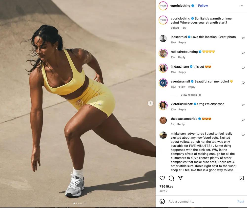
Image source: Vuori Instagram
4. Lighting, shadows, and highlights
Lighting is mood, and it can influence whether someone makes a purchase.
Research from the Silesian University of Technology found that “the way in which a product is photographed is of importance when making purchase decisions. The consumer pays attention to the way the product is presented in ecommerce offers and reacts differently depending on the lighting techniques used.”
Poor lighting can cost you sales, while strategic lighting can boost conversions. Additional lighting elements like shadows and highlights can add depth, create emotional connections, and grab attention at critical moments in the customer journey.
Jonathan Young Photography explains how different lighting styles affect brand perception:
- Backlight creates a silhouette behind the subject to highlight it, making the subject feel more important and mysterious.
- Natural light reflects authenticity and creates an inviting atmosphere. Play with natural light to create different colors and contrasts depending on the time of day.
- Soft light tones down the light source for less intense shadows, which typically gives the subject a more youthful appearance.
- Hard light amplifies the light source to create heavy shadows and produce edgy, dramatic photos.
Brand example: Loop Earplugs backlights their luxury product
Noise-reducing earplug brand Loop Earplugs uses lighting and shadows to add some mystery and prestige to their luxury Swarovski earplug collection.

Image source: Loop Earplugs
5. Subject matter
Subject matter refers to the focal point of your photography. Most of the time, your primary focal point will be the product you’re promoting.
For brands that photograph models, your brand photography guidelines should include:
- Customer persona descriptions
- Action shot directions
- Attire guidance
If your product doesn’t require a model, consider the way you showcase other elements like logos, icons, mascots, or other products. The aforementioned Adobe study reports that 34% of viewers notice logos first in images.
Include clear instructions on how to photograph extra creative elements and logos by:
- Providing a list of approved prop categories
- Specifying prop color palettes
- Explaining when logos should or shouldn’t appear, with examples
- Stating whether logos should be photographed on products or added during post-production
Brand example: Happy Wax emphasizes scent with props
Fragrance brand Happy Wax uses lemons, gummy bears, and greenery to showcase the fresh and fun scent of their product. Each additional element aligns with the design of the packaging and has a clear purpose for why it’s there.

Image source: Happy Wax
6. Typography
The font you choose to represent your business and how you display it is as much a part of your brand as your visuals.
Monotype partnered with neuroscience company Neurons to test 3 contrasting typefaces and found that font significantly impacts how people feel. Certain fonts even increased feelings of sincerity and honesty by 10%.
In other words, font choice can influence whether consumers think your brand is fun or serious, common or premium, etc. For example, you wouldn’t see a luxury brand use a font like Comic Sans because the style runs counter to prestige and high quality.
For typography, your photography style guide should:
- List acceptable fonts, weights, treatments. Direct creative teams on how to use fonts for headlines vs. body copy, and include font files.
- Indicate whether photographers should leave negative space zones in photos for text placement.
- Set rules for how busy or clean backgrounds should be in areas intended for text.
- Specify acceptable contrast levels and font colors that meet accessibility standards.
- Define how to handle faces or important subjects when you know text will be added.
Brand example: Aura Bora’s font matches the flavor of their product
Sparkling water brand Aura Bora uses a bold typeface to reflect the intense flavor of their beverages. “Condor was chosen to lead the pack as we felt it embodies our playful, otherworldly aesthetic and translates each new flavor seamlessly into the Aura Bora world,” says in-house designer Jesse Manby.

Image source: Aura Bora on Instagram
7. Post-production editing
Post-production editing is the final step in making sure your photos align with your brand style guide. Post-production edits can include cropping to remove an off-brand item, adding text, or altering several components of the photo.
Make sure to document how photographers should be editing brand or product photos. Include instructions on your preferred:
- Settings: exposure levels, saturation ranges, and contrast ratios
- Methods: tools to use for background removal or color correction
- Treatments: any filters or textures to overlay on top of images
You can also use an AI photo editing tool like Klaviyo Remix to edit and transform any image in less than a minute, bringing creativity into the flow of execution. With Klaviyo Remix, you can:
- Change the color of an item so it’s in line with your color palette.
- Swap the background to fit with the style of your brand photography, or to appeal to different audiences during different seasonal campaigns.
- Adjust a model’s facial expression to reflect the photo’s mood.
- Refresh the subject of an image.
Using your brand photography in cross-channel marketing materials
A steady stream of consistent brand photography increases memorability in a crowded market. As consumers bounce between Instagram, email, your website, and paid ads multiple times before making a purchase, each interaction is an opportunity to strengthen your brand identity.
When your brand photography looks cohesive across every platform—the same color palette in your Instagram Stories and abandoned cart emails, for example, or the same composition style on your product pages and Facebook ads—they develop pattern recognition. Your brand becomes familiar, trustworthy, and top of mind.
With Klaviyo, the AI-first B2C CRM that combines customer data, omnichannel marketing automation, customer service, and analytics under one roof, you can distribute your brand photography in content across channels like:
- Email marketing: header images, product showcases, promotional banners
- Text message marketing: campaigns with product photos and lifestyle imagery
- WhatsApp marketing: catalog images, conversational product recommendations
- Web forms and pages: sign-up forms, homepage images, category pages, about us sections, product detail pages
- Social media: TikTok videos, Instagram grid posts, Stories, Reels, Pinterest pins, Facebook posts
- Ads: social media ads, Google Display ads, billboards
Scale up your marketing efforts with Klaviyo.
Sign up
Related content