Did you know that the top 10% of popups see a 7.8% conversion rate?
If that number feels unreachable—or you want to beat it—you came to the right place.
I’m about to share some tips and examples for inspirational signup forms from European brands built on a WooCommerce, WordPress’s ecommerce platform.
Wait, why WooCommerce? Couldn’t a brand on any platform build these forms?
WooCommerce is one of the more customizable ecommerce platforms, and they support brands in industries that are often restricted, like CBD—which means they support a lot of entrepreneurial brands creating cool experiences for their customers.
Integrate Woocommerce with Klaviyo’s custom signup form builder to get started
So whether you’re running on WooCommerce or you’re just a popup fan, here are 7 tips based on inspiring and high-performing popups .
1 | Keep your signup form offer believable beleafable
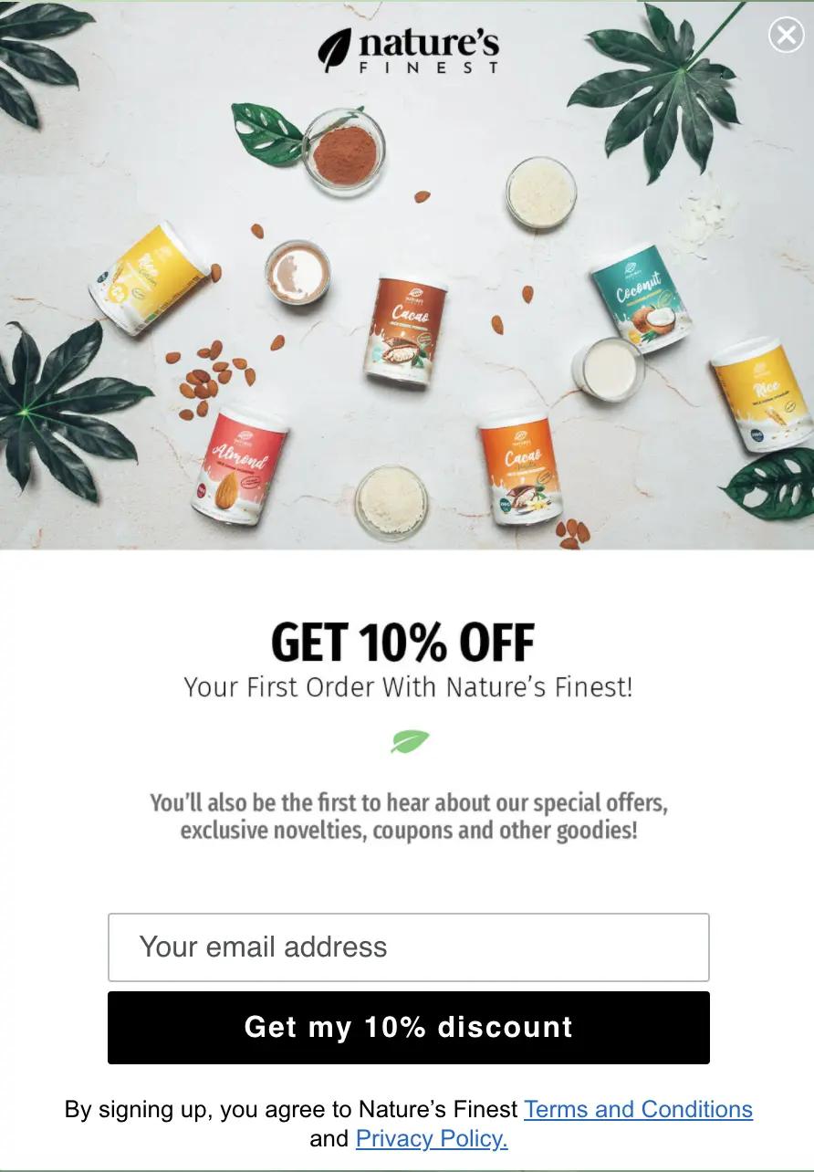
This natural supplement brand, Nature’s Finest, features fun, on-brand product imagery with a 10% discount in their welcome popup.
What works well?
- Discount within customer’s reasonable expectation
- Good message hierarchy: Discount first, then “other goodies”
- Call-to-action (CTA) references value to customer
- Bonus: Incorporation of foliage led to my bad leaf pun
Hustler Marketing, the email marketing agency behind this popup (and much of Nature’s Finest marketing) says welcome popups are a simple yet effective idea of motivating website visitors to subscribe. In fact, you’ll see it several more times in this list of WooCommerce popups.
Tip: What’s important—and what Nature’s Finest does well—is to keep your offer reasonable, so your customers will feel motivated to act without expecting a huge markdown for your product.
When it comes to a discount, bigger isn’t always better. One apparel brand, Brava Fabrics, even tested increasing the size of their welcome offer and saw no increase in conversion.
That might sound counterintuitive, but the data doesn’t lie. Perhaps people are more suspicious of larger discounts, or it takes away from their perception of your product’s value.
Either way, don’t do your brand the disservice of going too big.
Top signup form strategies that work for all platforms and how Brava fabrics uses data to increase their subscriber list
2 | Find the right pair of images and text to add to the form design
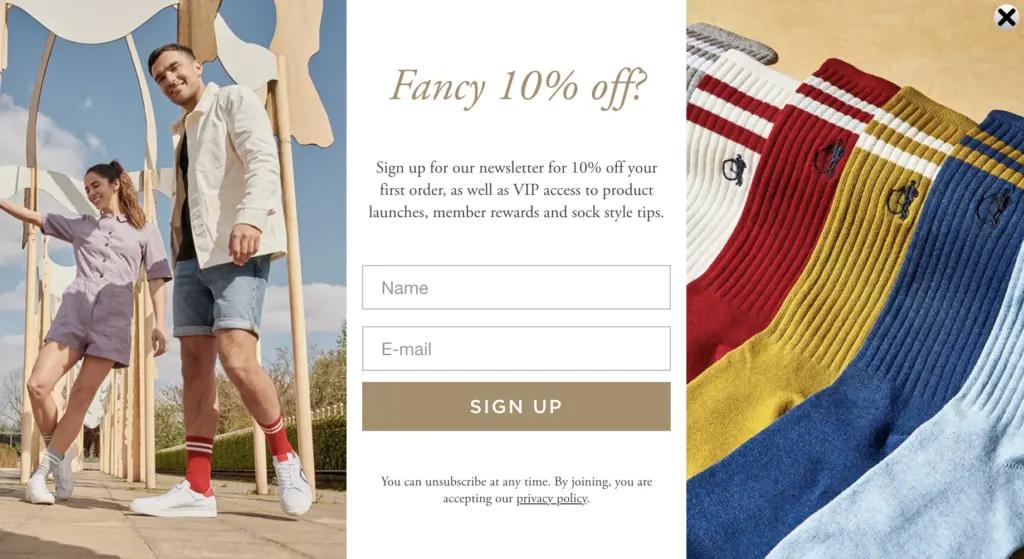
Next up, check out this welcome offer from London Sock Co that features two brand images on either side of the text.
What works well?
- Great product visuals that mix product and lifestyle
- Tempting incentives (discount and VIP access)
- Conversational tone matches their quirky brand
The bold images paint a picture of not just the product but also the lifestyle benefit—it makes sporting fashionable socks while enjoying a summer’s day with friends look cool.
Alongside the images, the use of “Fancy 10% off?” rather than the more standard “Get 10% off” is also a personal touch that fits well with their youthful brand.
Small, human touches like this brand’s copy and images, can be the difference between whether your customer smiles at or ignores your popup.
Of course, depending on your brand and product, you might not want to feature two images, or even any images.
Tip: There’s no need to copy London Sock Company’s form (though it’s beautiful), but use it to inspire and test combinations of images and attention-grabbing text to see how your audience responds on your woocommerce website.
London Sock case study for form design and more
3 | Use special offers in emails to inspire high-value actions
You might be surprised that Scrumbles, a UK-based pet brand, on Woocommerce, doesn’t rely on an adorable puppy photo to make their popup stand out.
Fortunately, the form holds its own, even without the aww-factor.
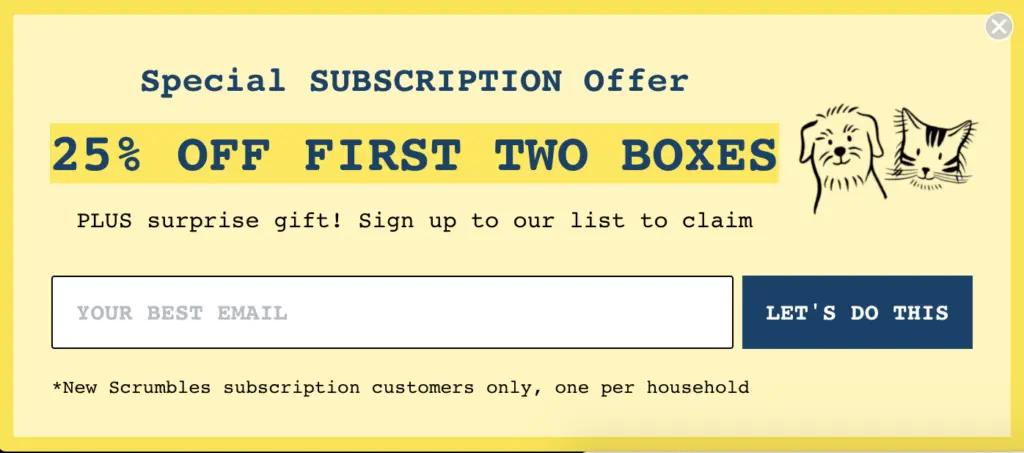
What works well?
- Eye-catching, even without images
- Promotes offer that’s more valuable to the brand (and customer) than a one-time purchase
- Adds element of curiosity with surprise gift
- Unique CTA text
This popup form does more than just catch visitors’ eyes—it educates them about the brand’s subscription offering.
Why is this such a smart move? Of course, securing a one-time purchase is good, but inspiring a visitor to become a repeat buyer will likely lead to a higher customer lifetime value (CLV).
Consider what’s most important for your brand. Is it purchasing from your best-sellers, where you know customer satisfaction is bound to be high and likely to result in a second purchase? Or maybe you also have a subscription service.
Tip: Whatever your number one brand priority, use incentives to benefit both your brand and your customers.
How to calculate CLV for your email subscribers
4 | Be honest and don’t be afraid to get personal in emails
Coffee brand We Are Littles, on the Woocommerce platform, takes a direct approach to setting their customer’s expectations with their welcome popup.
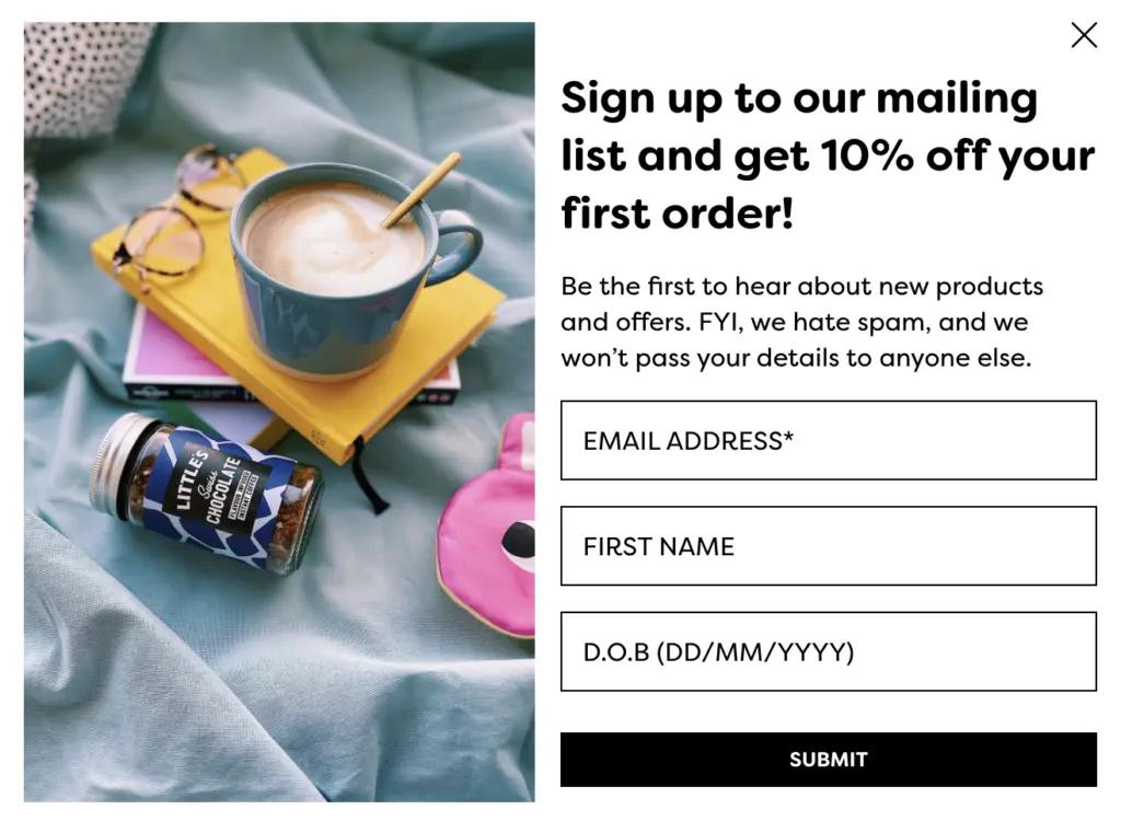
What works well?
- Promises not to spam customers
- Asking for additional information (first name and birthday)
- Reinforces security of shopper’s personal information
No respectable brand wants to spam their customers—and this brand instills trust by coming out and saying they hate spam, too.
Plus, We Are Littles takes their form one step further in getting personal with their customers by asking for their name and birthday.
Tip: If you’re hesitant to add an extra field to your form, don’t be. Asking subscribers to fill out additional fields (up to five) doesn’t mean you’ll see poor conversion rates.
So what does this mean for you?
Consider asking for information that can help you personalize someone’s experience later in their journey. That could mean asking customers whether they prefer content about women’s products, men’s products, or both—or for their birthday, so you can send them a birthday wish or discount every year.
What is the best signup form data that will help drive your email campaigns
5 | Ask for those data digits in forms, too
Thru Dark, an apparel company created by UK veterans, uses their brand to embrace the founders’ military background, and their signup form is no different.
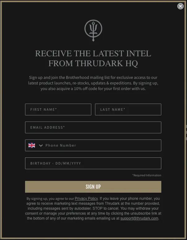
What works well?
- “Latest intel” grabs attention and matches the brand’s unique tone
- Optional phone number enables interested customers to opt into texting
- The birthday field is back—this brand knows how to collect customer data
Did you know the majority of UK consumers think brands should use texting more often?
This plays out in signup forms, too. Forms that ask for a phone number and email perform on par with forms that only ask for an email address.
Tip: If you haven’t yet, now is the time to consider adding text messaging to your marketing channels—and phone numbers to your forms.
Plus, if you’re not sure if your customers are interested in SMS, simply make it optional, as Thru Dark did, or include it as the second step in a multi-step form. That way, you won’t sacrifice your email opt-ins, but you’ll be able to test out a new channel.
Forms, SMS and UK digital subscribers
6 | Consider scrubbing the discount for an alternative offer
In Edinburgh Skincare’s welcome popup, they promote a giveaway, rather than the somewhat-standard discount, which helps them protect their bottom line.
What works well?
- Value of offer is clear
- Prominent, intriguing product images
- Unsubscribe call out
A percentage discount may be a common welcome offer, but that doesn’t mean it’s what you should use for your brand.
A giveaway has several benefits: Customers don’t learn to expect discounts on your products, you avoid losing profit margin, and you can give a bigger gift to a few customers, rather than spread the offer out on everyone.
This Spanish brand even ran an A/B test to determine whether they could save some of their budget by switching to a giveaway—and found that the giveaway converted just as well as a discount.
Tip: So if you already have a welcome discount in place, consider whether testing a giveaway could help you retain more profit while still giving your customers a great experience.
Personalize email campaigns for better form engagement
7 | Exit intent popup forms that show up at just the right moment
Like the above brands, CurlsForYou, a haircare brand, also has a welcome popup—but they take it one step further to make sure their website visitor doesn’t leave without considering it.
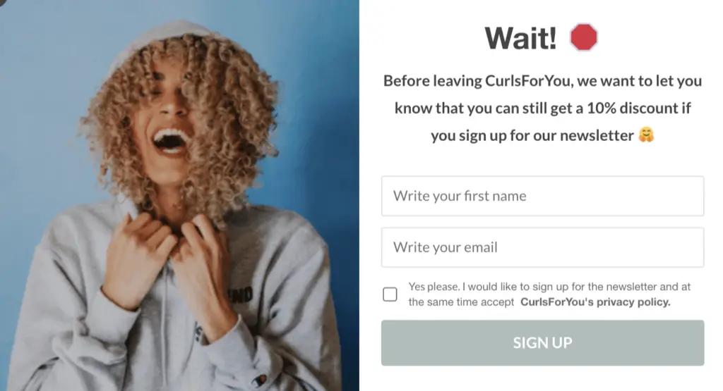
What works well?
- Popup shows up just as the visitor is about to exit their browser
- Emojis and fun imagery match brand personality
The text in CurlsForYou’s exit intent popup speaks exactly to their web visitor’s behavior, so it feels especially relevant and timely.
The emojis and bold imagery also help to grab attention at an important moment, while the friendly tone and discount aim to convert the user into a subscriber.
Tip: If you don’t already have an exit intent popup, test adding one and see how many visitors you’re able to woo back to your brand. You might even want to consider adding a more valuable offer, just in case the first one wasn’t tempting enough.
Exit intent pop up forms as an engagement strategy on the website
You can’t go wrong with data staying true to your brand
Whether you model your WooCommerce popups after one of these examples or something completely different, the two considerations to keep in mind are to accurately represent your brand and test everything.
Added personality, as many of these forms have, only makes sense as it fits your brand, but when you find something that works, it can make the difference for how your customers see your brand.
Ready to start testing a new signup form on your WooCommerce site? Integrate with Klaviyo forms

