Boost email signups with exit pop-ups
Generated by Klaviyo AI
The article explains why exit-intent pop-ups typically convert better than standard landing-page pop-ups and how they can significantly increase email list growth. It outlines design, targeting, device, copy, and incentive best practices based on Klaviyo’s analysis of 204 million pop-up displays.
- Higher conversion performance: Klaviyo data shows exit pop-ups outperform landing-page pop-ups by about 5%, which can translate into thousands of additional email signups per year.
- Brand-aligned design: Effective exit pop-ups closely match the website’s colors, imagery, and fonts so they feel integrated rather than disruptive.
- Visibility and relevance: Using overlays, larger fonts, and device-responsive triggers, plus tailoring messages to personas and categories, makes exit pop-ups more noticeable and contextually appropriate.
- Compelling copy: High-performing pop-ups use unique, specific, urgent, and useful wording—often with humor—to grab attention just as visitors are about to leave.
- Incentives that convert: Offers such as coupons, free shipping, sweepstakes, or free content can significantly lift exit pop-up subscription rates, and A/B testing helps refine what works best.
Exit pop-ups are powerful.
The Klaviyo data team analyzed the performance of a sample of email pop-ups cumulating 204 million displays.
Among our key learnings, exit pop-ups outperformed pop-ups displayed on landing pages by +5%. If you’re collecting 10,000 emails/month (congrats if that’s the case), that would represent 500 additional emails/month and 6,000 emails/year.
A Klaviyo user? Find out how you can use the pop-up forms in Klaviyo.
Why exit pop-ups work better
Let’s start from the beginning. What are exit pop-ups, exactly?
Exit pop-ups, sometimes called exit-intent pop-ups, are triggered when a visitor moves his or her mouse to leave the page. They are displayed when the user is moving her mouse upward to close the window.
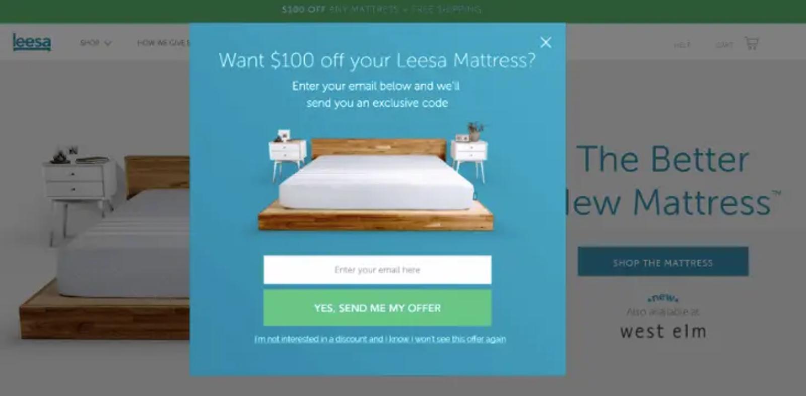
Exit pop-ups are particularly effective because:
- They don’t interrupt the visitor’s path on your website.
- They give you one last chance to convince your user to stay on your website…or at least to provide a way to keep in touch.
As exit pop-ups are displayed at the last minute, when the user is in a rush to leave, they require a specific design and wording.
Based on the result of our analysis, here are 6 best practices to skyrocket your exit pop-up conversions.
Create a design that is super consistent with your brand identity
To drive conversions, your exit pop-ups must be part of your website experience. They must match your website identity in terms of colors, pictures and font family. Otherwise, the user might feel disoriented and just leave.
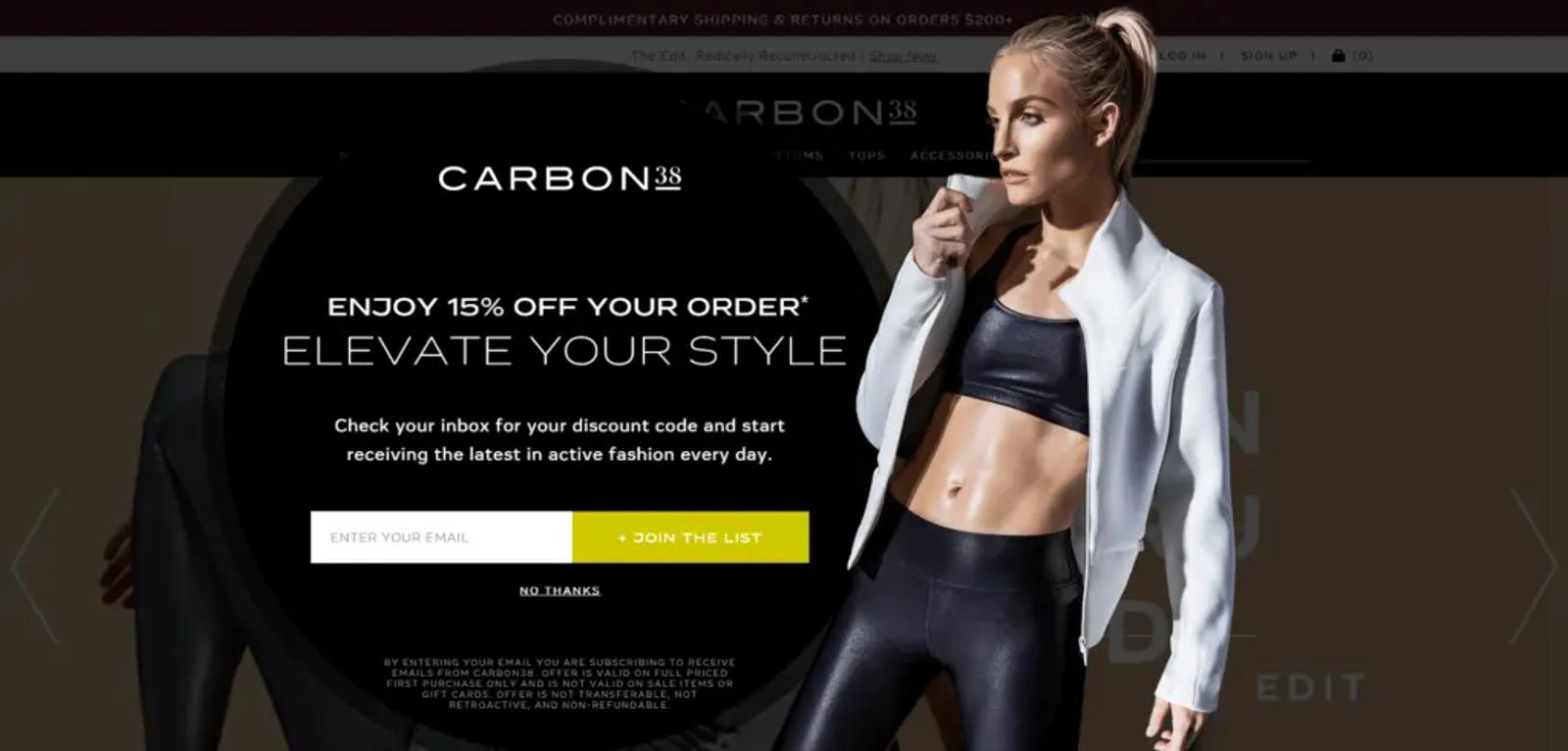
Here’s what works for Carbon38:
- The picture is appealing and coherent with the website mission.
- The black background is coherent with the website which is mostly black.
- The font family is the same as the website’s font.
Make your message visible
Your user is about to leave. So we need to make sure she won’t miss your message. In other words, you need to make it big and visible!
A few tricks can make your message stand out:
- Use an overlay to dim the background and allow your user to focus on your pop-up.
- Pick a bigger size for your font.
- Make your elements (e.g., email field, call to action, etc.) bigger.
- Use catchy colors (as long as they match your identity, of course).
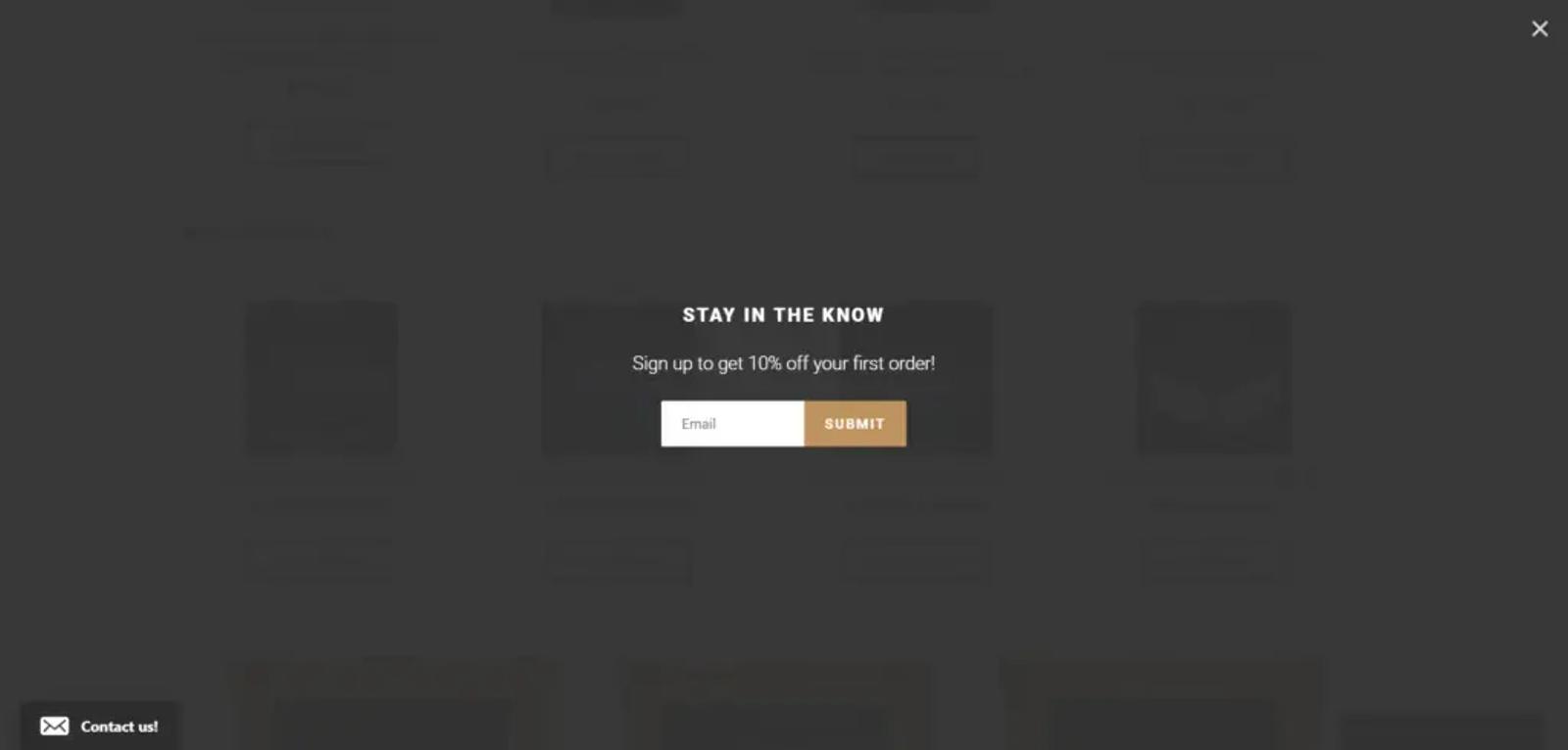
Furless Cosmetics’ exit pop-up dims the background, making the message unmissable.
Analyze the data to personalize your message
Displaying the same pop-up on your entire website is not a good idea. What do you think the female customers of an ecommerce website will think if they’re presented with a pop-up featuring men’s items? Exactly.
To maximize your pop-up impact, we recommend adapting your campaign to your different buyer personas.
That can be as simple as displaying a different exit pop-up for each gender. In that case, you can display a different pop-up if the URL contains “women” or “men” for example.
You can also adapt your pop-up to your different product categories. Your “shoes” pop-up could feature shoes visuals, etc.
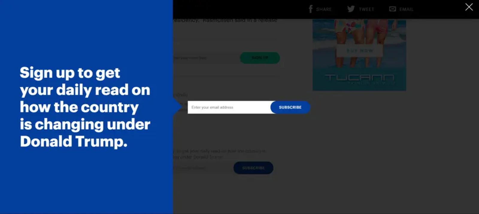
Mic’s exit pop-up displays the national news category.
Make the pop-ups responsive to device type
Traditional exit pop-ups don’t work on touch devices as they rely on mouse movements to predict exit. So to display exit pop-ups on mobile devices you need a plan B.
You can display your pop-up after the visitor has scrolled down until the bottom of the page. You can also try displaying your pop-up when the user scrolls up as if she wanted to display the URL bar to leave.
Craft your content to grab attention
Your wording is one of the key elements to catch your visitor’s attention.
In his guide to copywriting, Neil Patel shares some tips for headlines that apply well to pop-up wording.
In short, your content must be:
- Unique: Use words which reflect your brand and help your message stand out.
- Ultra specific: Your users must understand that the offer is relevant to them.
- Urgent: Remember, your users are about to leave. And it might be forever. You need to convince them to act now.
- Useful: Your pop-up copy should convince your user of the benefit of subscribing (remember, they’ll leave in no time).
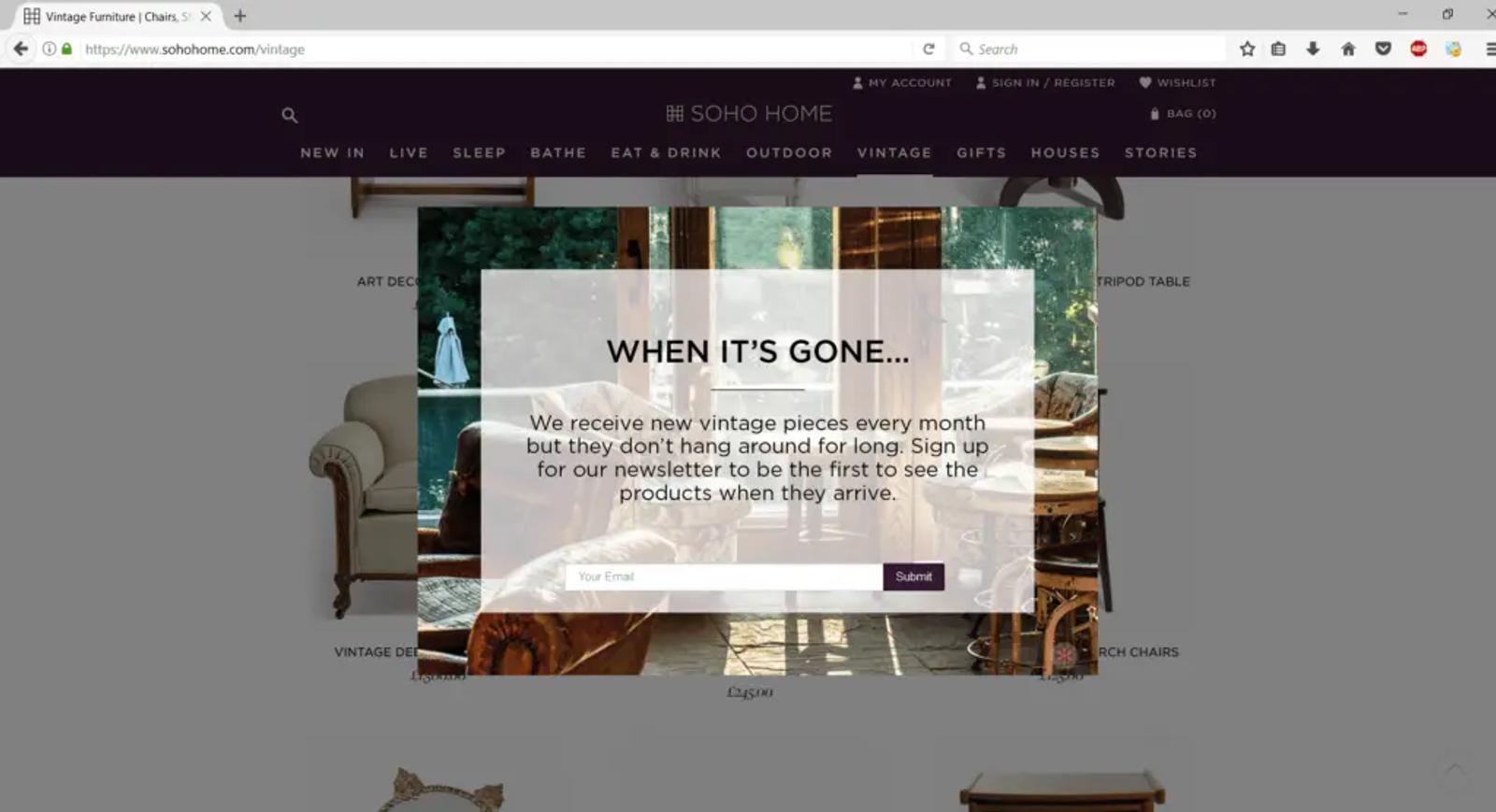
Here’s an example from Soho Home. Displayed in the vintage category, it’s highly relevant and conveys a great sense of urgency.
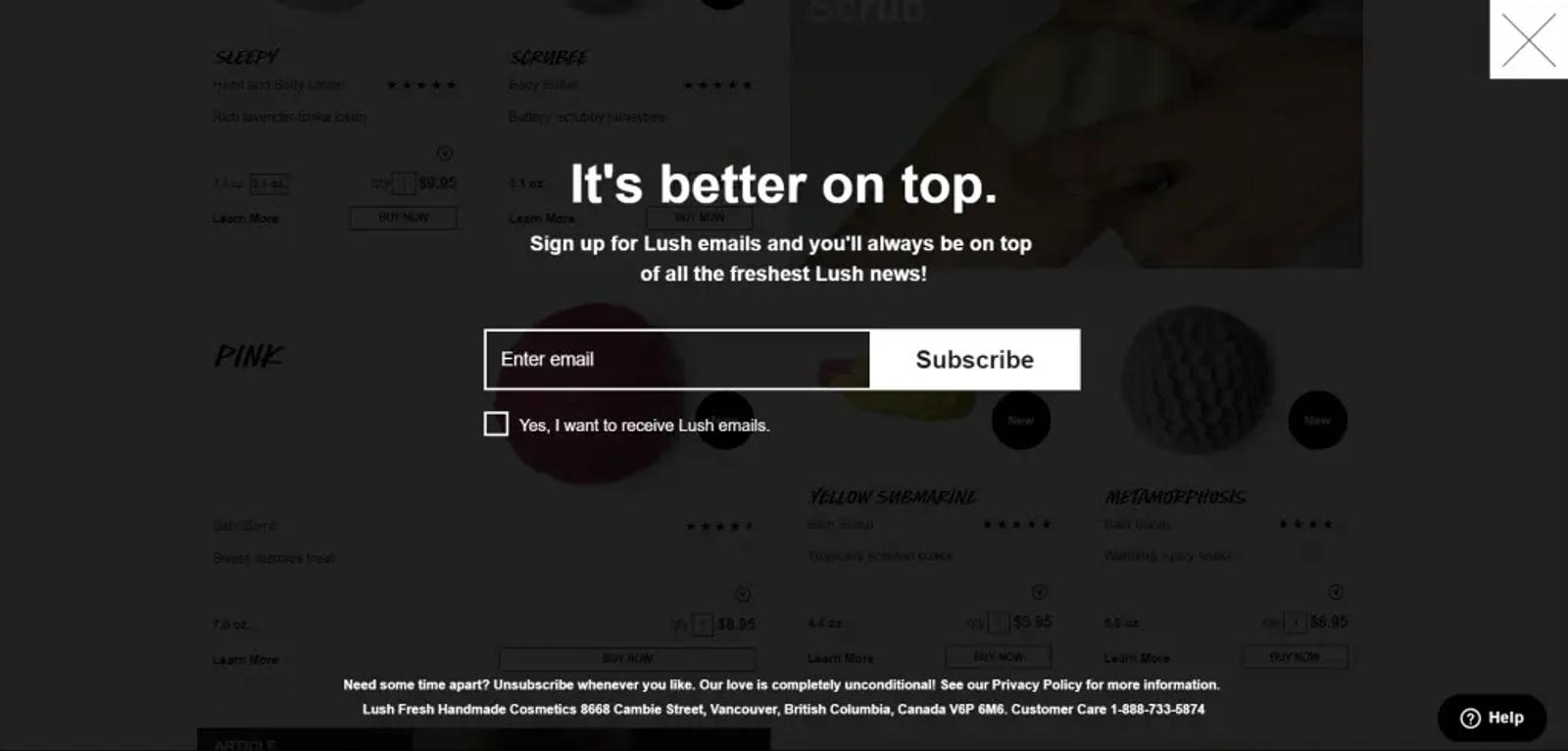
Humor can be powerful as well. Here’s how Lush invites their visitors to sign up:
Provide an offer or incentive
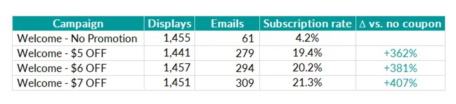
Let’s get it straight. Offers have a huge impact on your exit pop-up conversion rate. One of our customers, a leading online retailer, tested the impact of a coupon on their subscription rate on their pop-up targeting new visitors. The results are pretty self-explanatory.
But coupons are not the only option. You can pick one of these alternatives:
- Share a free shipping coupon.
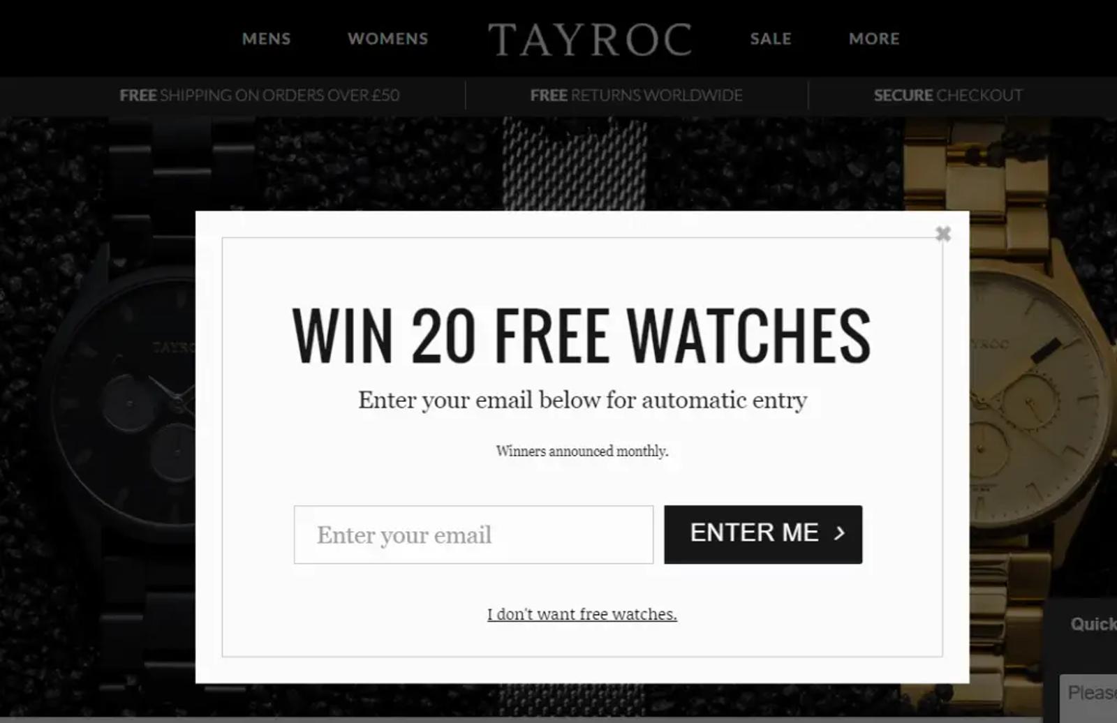
- Invite to take part in a sweepstake.
- Share a free document, MP3, etc.
Tayroc entices their visitors to sign up.
On average, exit pop-ups work better than regular pop-ups. But if you want to make the most of them you need to be very careful about their style, wording, and targeting. Going the extra mile is really worth it, trust our experience. If you’re unsure, don’t hesitate to rely on A/B tests to validate your hypothesis or add a timer for urgency.
Launch forms that convert.
Get started with Klaviyo
Related content