Once you’ve nailed product-market fit, it’s time to focus on how to communicate your product to your subscribers.
Thoughtful, strategic email design can help you:
- Reinforce brand identity and affinity
- Stay top of mind in your subscribers’ headspace
- Drive traffic to your product pages—and generate revenue
- Increase open and click rates, which, in turn, can improve your sender reputation and deliverability score
Lisa Livingston, principal customer success manager at Klaviyo, says email design can be overlooked as part of an effective omnichannel strategy. But that doesn’t make it any less important.
“Well-designed emails will enhance every other part of your strategy,” Livingston says. “Making sure all of your channels’ designs align will make your brand more recognizable and make all your assets perform better.”
Most well-designed emails take into account:
- CTA strategy
- Mobile-first and accessibility considerations
- Balancing design and text
In my 9 years as an email strategist and designer at Spark Bridge Digital, I’ve helped 100+ brands stand out in the inbox with strategic email design. Here are 13 tips to make sure your marketing emails are easy on the eyes—and cohesive with your brand’s look and feel.
1. Prepare with a master template
Livingston suggests brands keep a master email template. That way, “each of your emails will have the same font and size for the header, subheader, and text,” she says.
You can even maintain several master templates at once—one for each type of email you send.
While you’re in these early planning stages—before you’ve begun the design process—it’s a good idea to focus on your subject lines and preview text.
“Use your voice and tone in the subject line and preview text,” says Morten Bustrup, senior creative director at Elva. “Don’t be afraid to be playful with your copy—you can create a little brand moment.”
Don’t be afraid to be playful with your copy in preview text—create a brand moment.
2. Design for accessibility
Email design best practices dictate that you want to meet your subscribers where they are, not halfway.Follow accessibility best practices:
- Write succinct subject lines and preview text
- Add alt text to all of your images
- Leave important information out of images
- Use contrasting colors
- Use large headers to separate ideas
- Use descriptive language in links
Check out this marketing email from JOGGY that follows accessibility best practices: the colors are contrasted and the important information is laid out in a chart—not overlaid on an image.
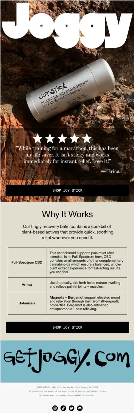
Image source: Joggy
3. Keep your header components simple
Your email header is important real estate, but you want to make sure it doesn’t distract from the main message. Keep it simple and streamlined, with your logo and some eyebrow copy—but only add the eyebrow if it enhances your headline.
4. Be strategic with your CTAs
You only have to look at your own inbox to know how much competition your marketing emails have. So, if you want to drive subscribers to product pages, your calls-to-action (CTAs) should adhere to some email design best practices:
Keep your CTAs simple
To make sure your emails are easy to scan, consider these strategies for reducing cognitive load:
- Don’t include too many offers or CTAs.
- Keep the offers relevant and aligned—to the season, your subject line, and headlines.
- Consider color choice for CTA hierarchy—if you have 2 CTAs close to each other, make sure you distinguish them using color.
- Use clean email design with lots of line breaks in copy and just a few impactful images. This will make your CTA stand out.
Make sure there’s a CTA above the fold
Remember, the moment your email hits the inbox, you only have milliseconds to get your subscriber’s attention. Make sure your subscribers don’t need to scroll down to take action. Beautiful images and product information are important, but so is the vehicle for the action you want them to take.
Consider a low-commitment CTA
Nathan Doverspike, customer success manager at Klaviyo, draws a distinction between high-commitment CTAs—like “buy now” and “shop now”—and low-commitment CTAs, like “learn more.”
“There are ways to include CTAs so the reader doesn’t feel pressured. Shoppers can simply be there to learn, to experience, or to see more,” Doverspike explains.
“Some people experience a mental block with a CTA that pushes them to buy,” he adds. “A low-commitment CTA helps them get through that block.”
Some people experience a mental block with a CTA that pushes them to buy. A low-committment CTA helps them get through that block.
Sustainable fragrance brand Apotheke sends this email with a low-commitment CTA above the fold.
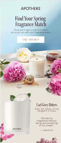
Image source: APOTHEKE
Use live text and buttons instead of text on images
Doverspike also advocates for CTAs as live text and buttons—any text that isn’t image-based—because they’re easier to A/B test and change aspects of a particular campaign.
That way, you don’t have to go back to your design team and get an entirely new image or a whole new text block just to make a small change.
Klaviyo’s template editor makes this easy with drag-and-drop editing.
5. Use a mobile-first email design
Without question, people are opening emails on mobile devices. That means an email design best practice is to adopt mobile-first email design principles and ensure emails are responsive—meaning they adjust depending on the size and orientation of the screen someone is using to view them.
Mobile-first email design looks like:
- Subject line and preview text that fits the mobile inbox
- Properly sized, mobile-optimized images that maintain their impact and integrity when someone is viewing them on a smaller screen
- A one-column layout
Check out OSEA Malibu’s email below for an excellent example of what “perfectly optimized for mobile” looks like in action.
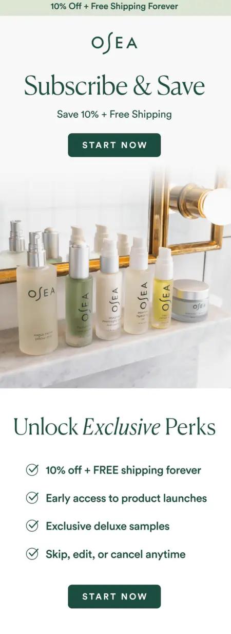
Image source: OSEA Malibu
6. Be mindful of the balance between visuals and text
It may be tempting to go heavy on the images because you want your products front and center. But image-heavy emails can also be slow to load, especially if the user is out and about and the coverage isn’t perfect.
That’s just one reason why it’s important to have a healthy balance of images and copy as a principle of email design best practices. The visuals communicate your vibe, but the copy delivers the message. It’s important to have a good balance between the two.
Jeni’s Splendid Ice Creams does a great job of finding that balance with their spring collection email. New products are the first thing the user sees upon opening the email, but any questions they might have are answered clearly in the copy.
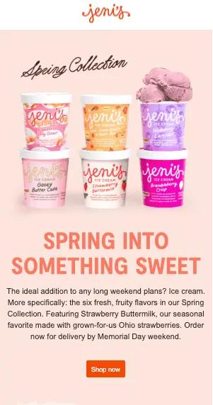
Image source: Jeni’s Splendid Ice Creams
7. Consider including GIFs—or some type of movement
The inbox is getting more and more competitive by the day. Any type of movement can help hold attention just a little bit longer.
FOCL’s sitewide sale email features movement to highlight a discount. It’s not overwhelming, but it catches the subscriber’s eye, for sure.
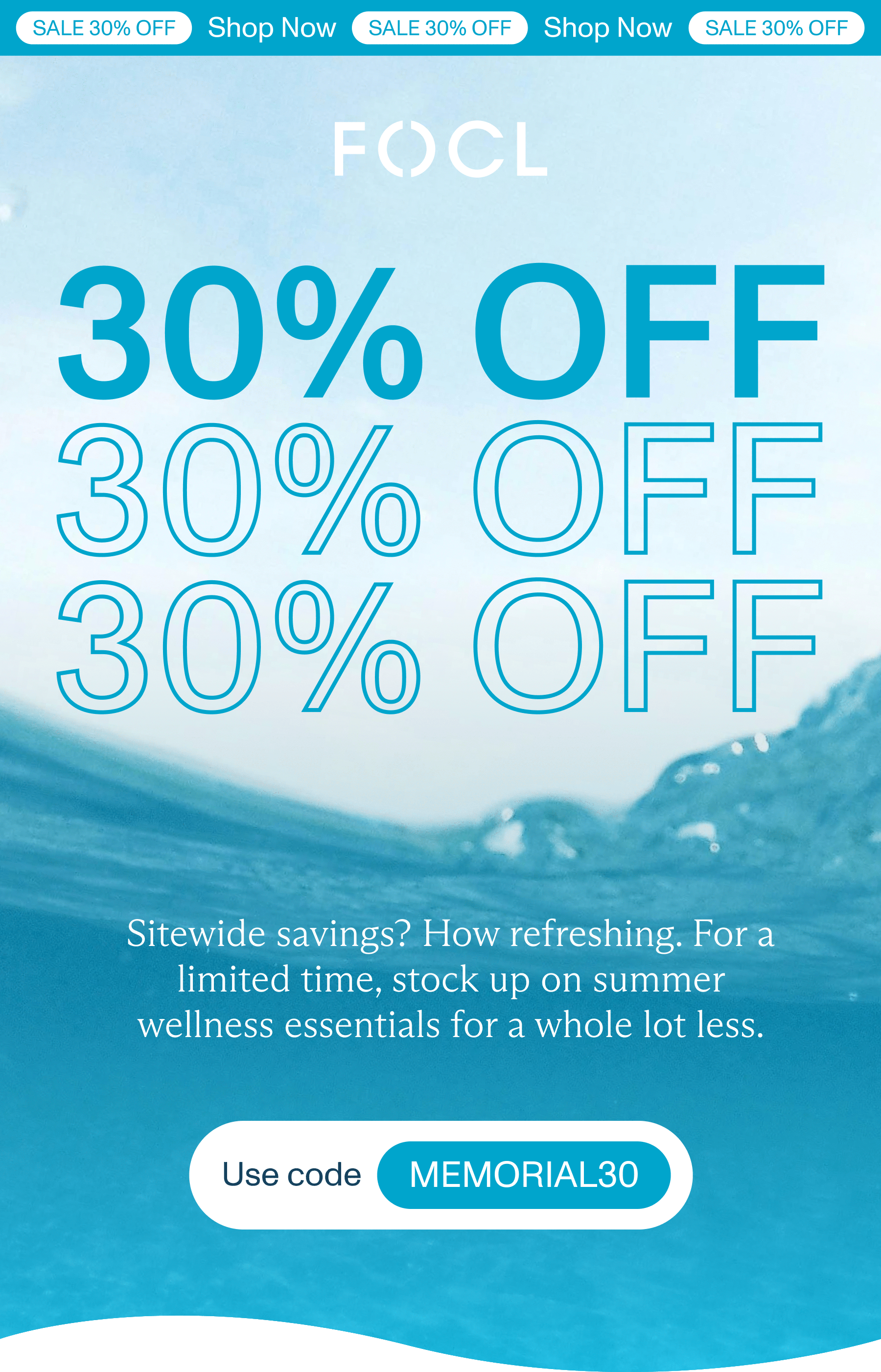
IMAGE: FOCL
8. Use design to further personalize
Personalization, based on email segmentation, proves time and time again to outperform email blasts.
“Personalization is your way of voicing who you are to your customer,” Doverspike says. “If you can provide overwhelmed customers with a unique experience, they’re more likely to look forward to those emails and even action on them.”
“Personalization is one of the best ways to get in front of your highest drivers, your brand enthusiasts, and your high rollers,” he adds. “Make sure you’re giving them a positive experience to continue that relationship with you.”
Segment your subscribers and customers based on:
- Products they’ve purchased
- Where they are in your funnel (such as brand new, only browsing, have purchased several times before)
- Geography
- Niche, zero-party information they’ve shared in surveys, quizzes, and on-site forms
Those are only a few segmentation examples to help you align with email design best practices. But in each of these instances, because you’re creating a customized message for that specific segment, the content is already highly personalized in a 1:many way.
Then, to make the email experience feel 1:1, you can incorporate even more customized touches, including:
- Customers’ first names
- Product recommendations based on products customers previously browsed
- Communication at a time the customer is most active and receptive—likely depending on their time zone
- Special milestones, such as a customer’s birthday, their anniversary of their first purchase with your brand, and major holidays in their region
- A banner at the top personalized to their rewards status
Klaviyo’s show/hide feature sets you up to collect preferences from subscribers and then use that data to personalize your messages further. You can also show or hide certain images or promotions based on event data. FOCL uses the feature to personalize the banner at the top to the subscriber’s reward status.
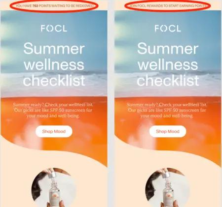
Image source: FOCL
9. Use design to focus on pain points
Solving your customers’ problems should be the driving force behind your email design principles. While brand personality is also important, solutions-based design is more likely to resonate.
Premium CBD and plant-based wellness solutions brand FOCL puts their customers’ problems front and center—literally—in this marketing email. The headline, image, copy, and footer all highlight how well they can solve their subscribers’ problems. And they don’t ask readers to take their word for it—they include stats to back up their claim.
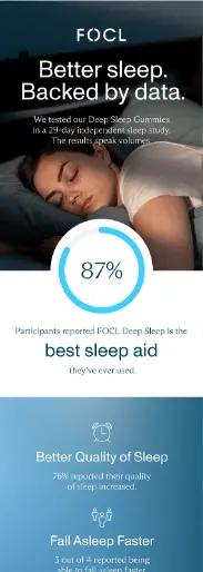
Image source: FOCL
10. Design for dark and light modes
Similar to designing for accessibility, you’ll want to design for dark mode. A lot of people keep their smartphones in dark mode even in the daytime, and this can create both a challenge and an opportunity for marketing emails.
Klaviyo even allows you to select a specific person from your email list to view the email the way they would see it.Bustrup stresses ensuring a seamless user experience no matter what mode the recipient’s phone is in.
Beauty brand Wildling optimizes their marketing emails for both light and dark mode, as seen in the comparison below.
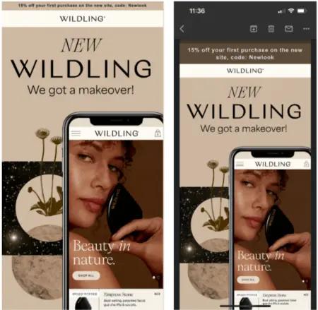
Image source: Wildling Beauty
11. Use design to give a behind-the-scenes look at your brand
Thoughtful design elements can create windows into your company culture and values without explicitly stating them—a practice that can feel preachy or performative if you don’t do it carefully.
Instead of spelling out your company culture, consider how design, color schemes, and image selections can subtly communicate your brand’s personality and working environment.
This kind of transparency builds trust with subscribers who appreciate authentic glimpses into how your organization operates. Consistent visual storytelling through email design helps recipients feel connected to the humans behind the brand.
These design choices create a narrative that goes beyond promotional content and invites subscribers into a relationship with your company.
FAO Schwarz, the famous toy store in Manhattan, has been around since 1870, and bringing the brand online—with all the excitement and history people associate with it—was no small task.Ben Zettler, founder of Zettler Digital, shares this welcome email he and his team helped design.
“The ‘World’s Most Iconic Toy Store’ deserved a design refresh for their welcome message,” he says. “A big priority for the company in enhancing their online presence has been bringing their iconic branding and elements of the in-store experience they’re famous for to email. Educating new subscribers about everything FAO Schwarz has to offer has been a major part of that.”
A big priority for FAO Schwarz in enhancing their online presence has been bringing their iconic branding and elements of the in-store experience they’re famous for to email.
The email references their most iconic visuals, like toy soldier outfits and their giant piano, along with photos of smiling, ecstatic children.
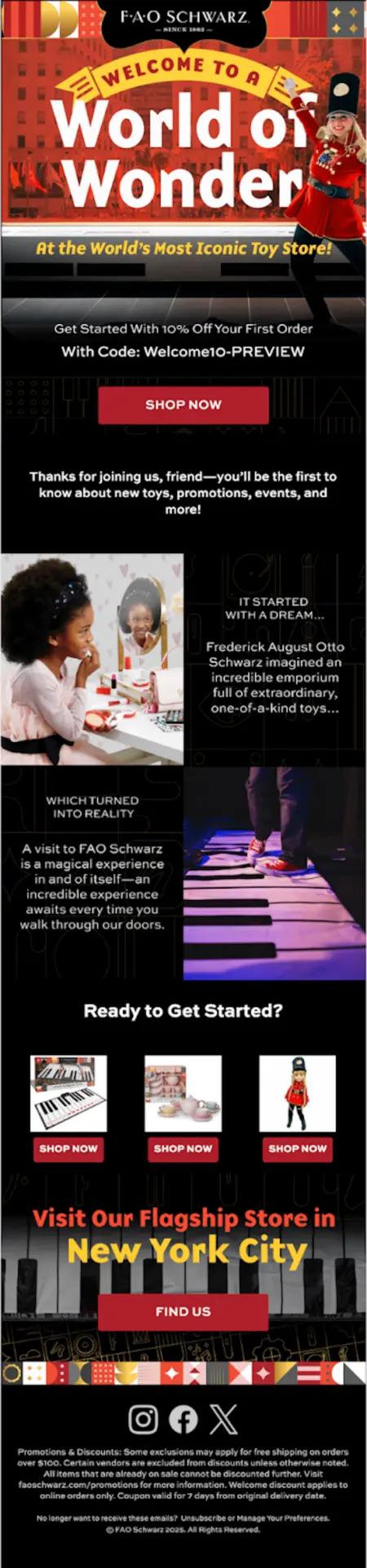
Image source: FAO Schwarz
12. Incorporate user-generated content
Word of mouth can top even the best branding. Incorporating content created by your customers into email designs transforms marketing from one-sided broadcasting to community conversation.
User-generated content (UGC) elements like customer photos, testimonials, or social media posts add authenticity that professionally produced content often can’t match. This approach demonstrates that you value customer voices while providing social proof that resonates more deeply than brand-created messaging.
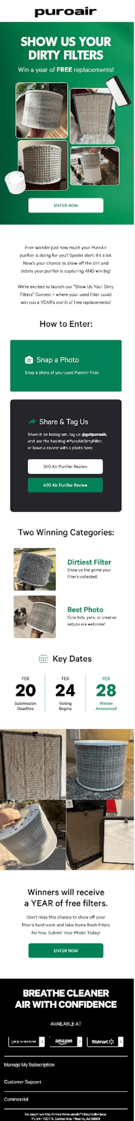
PuroAir knows that air purifiers, the product they sell, might not find shoppers who are confident about what criteria will guide their purchase—and they design their emails accordingly.
This email engages customers by using UGC and encouraging reviews, reinforcing trust and community engagements. It also highlights key product usage benefits, educating recipients on the importance of timely replacements.
“This campaign also strategically includes an incentive, boosting motivation for customers to take action while reinforcing product value,” says Al Salomon, head of retention at PuroAir. “The combination of social proof, education, and a compelling offer add up to a conversion-driven email.”
The combination of social proof, education, and a compelling offer add up to a conversion-driven email.
The brand saw a 50% increase in review submissions with photos as a result of this email. Reviews including photos can be a great bank for your email design team to draw from.
13. Don’t be afraid to be bold
Being bold—strategically—in email design can create memorable experiences that stand out in crowded inboxes. Consider how unexpected color combinations or unconventional layouts might differentiate your messaging while remaining appropriate and on-brand.
Of course, bold design choices are most effective when they serve a purpose, such as highlighting seasonal promotions or signaling important company announcements. This approach works best when you build it on a foundation of consistent brand elements that provide context for creative departures.
Email design pro tip: Test bold design variations with segments of your audience before implementing them broadly. This will provide valuable insights about engagement.
Seeq, a brand that makes clear whey protein, designed this email that’s bold, vibrant, and instantly engaging, leveraging a rainbow color palette to create a visually dynamic experience.
“Each product section is strategically color-coded to match its flavor, making it easy for recipients to differentiate between options and reinforcing the brand’s playful, flavor-forward identity,” says Zac Fromson, co-founder of Lilo Social, the full-funnel ecommerce growth agency that Seeq works with.
The result of these bold decisions? This campaign saw 2x the average revenue.
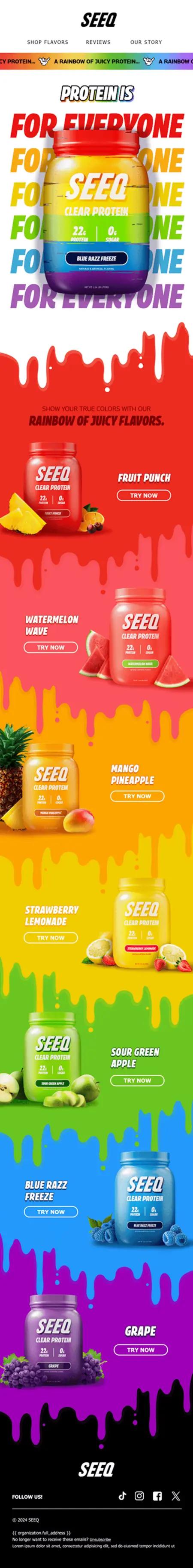
Image source: Seeq
14. Make the most of your footer
The footer is a great place for your unsubscribe and preferences links, business address, and links to your social accounts, but it’s also a great place to showcase your brand’s personality.
Australian toilet paper brand Who Gives a Crap is famously known for its brand personality, and their footer is no exception. With text in bold that reads, “Send us love letters” and a sincere land acknowledgement, subscribers have a better sense of what they can expect when they engage with the brand.
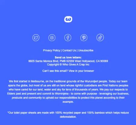
Image source: Who Gives a Crap
15. A/B test your emails
A beautiful email isn’t necessarily effective. To find out, you’ll also need to test your designs with real recipients. A slight change to one design element may translate to a significant change in performance.
Consider A/B testing your email design by:
- Adding or removing a navigation bar
- Changing fonts
- Adding or removing product blocks
- Switching colors
- Experimenting with different CTAs
- Mixing up your subject line copy
For definitive results, you’ll want to test only one variable at a time.
After sending out each variation, you can track email performance metrics like open and click rates to determine which design works better. Klaviyo offers conditional splits in email flows to help you A/B test your emails more effectively.
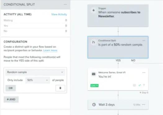
Image source: Klaviyo
Meal delivery service Sakara Life conducted this A/B test to determine whether the presence of a product block improved email performance. The email on the left, including the product block, performed better with a higher click rate.
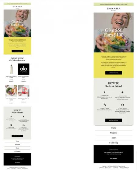
Image source: Sakara Life
Let Klaviyo be your go-to email design platform
Klaviyo’s customizable email templates have been powering smarter digital relationships for top brands for years. Features like Email AI for block creation, dynamic content for personalizing product images, and customized product feeds can help you make the most of your marketing emails.
Related content:
- Must-have email designs and trends for 2024
- 11 pop-up best practices, with real-life examples for inspiration
- Email segmentation tools have evolved—and you should use them to do the same
Schedule a call with Spark Bridge Digital.
Reach out
Related content