Kunle Campbell has some suggestions to help you figure out if ecommerce personalization makes sense for your brand.
According to Campbell, who co-founded Octillion Capital Partners, an acquisition platform company liberating commerce founders with hassle-free exits, “brands executing on-site personalization require both traffic and SKU scale.” This means the brands most eligible for ecommerce personalization tend to:
- Have a heavy SKU count above 500 (ideally in the 1000s)
- Have a high returning visitor rate (50%+)
- Encourage account sign-ins for a full-on user experience
- Constantly collect transactional data
But even if your brand doesn’t match these descriptions, you might still benefit from experimenting with personalization tactics that are more accessible for a small to midsize ecommerce business:
- Personalized product recommendations based on past website interactions and purchase history
- Exclusion of certain pop-ups, messages, or even form fields for folks who have already provided information
- New messages to repeat customers, like, “Welcome back! Looks like you haven’t used that 10% off code yet.”
- Geo-targeting to areas where you have a physical store, have region-specific products, or by language and currency
- Personalized website copy that differs by referral source, such as social media vs. email marketing vs. organic search
Want to start working toward offering a more personalized shopping experience for your audience? From simplest to most complicated, here are a few examples of low-hanging fruit you can try before going all-in.
1. Dagne Dover matches an SMS campaign to a collection page
Dagne Dover has seen a 12K% return on investment with SMS marketing, thanks in part to their deep understanding of what their SMS subscribers want.
The leather accessories brand recently sent out text messages promoting their Leather + Signature sale. Subscribers who clicked through the text landed on a collection landing page that included all the items from the sale.
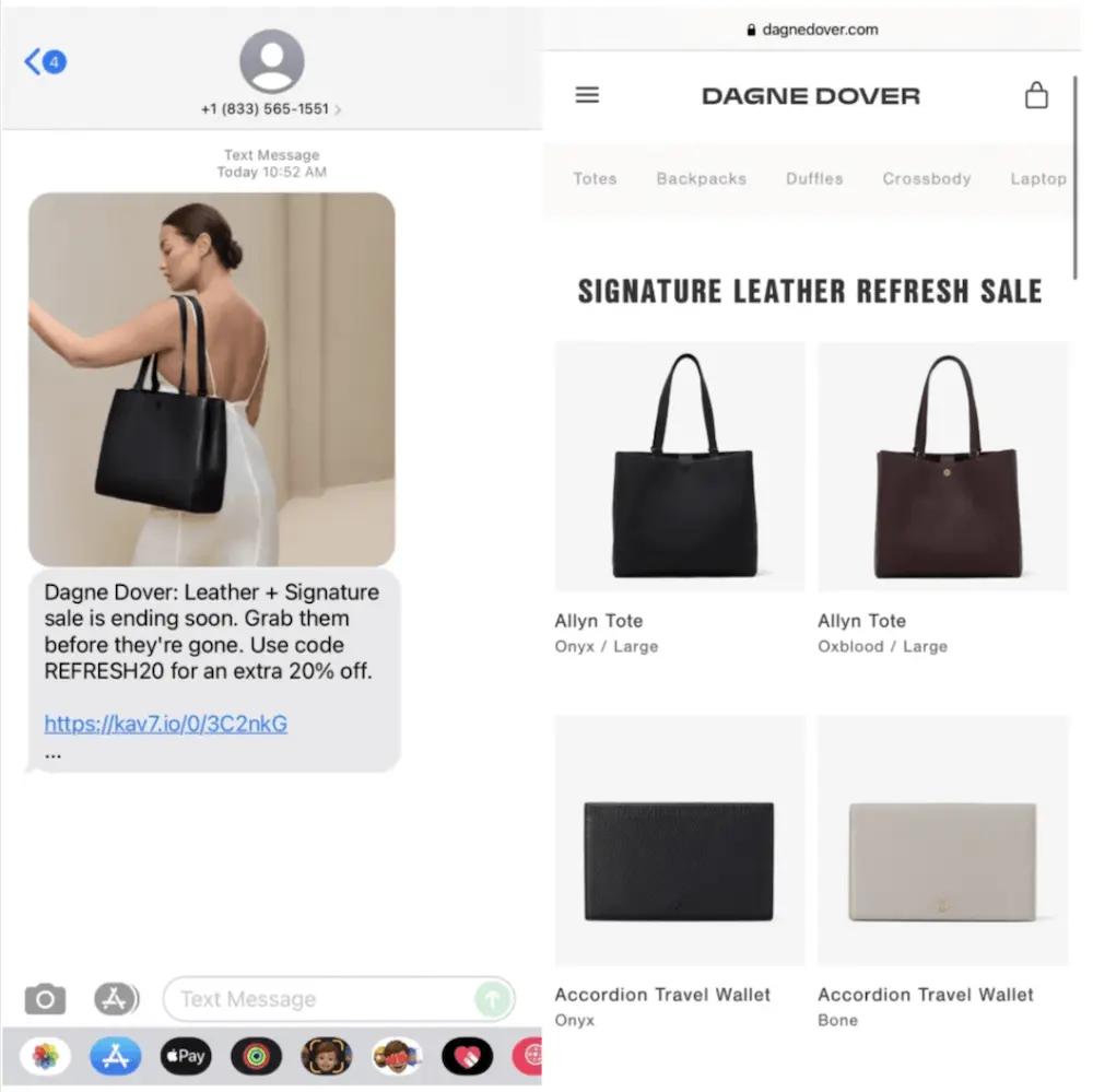
While this is a fairly simple strategy, it aligns the on-site experience with consumer intent by helping people find the sale items they came to the site for, instead of forcing them to navigate through the site to find the collection page.
Pro tip: Make sure your ecommerce site experience is optimized for smartphone and tablet users by limiting pop-ups, making sign-up forms mobile-friendly, and implementing responsive design.
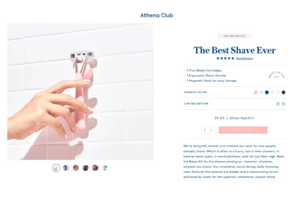
2. Athena Club uses high search intent to accelerate the customer journey
At one point, if you searched for a razor subscription on Google, you could see an ad for Athena Club.
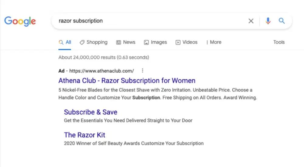
Athena Club is known for their razors, but they also offer a variety of hygiene products. For this Google search ad, however, they wasted no time helping shoppers find their larger product catalog.
Athena Club recognized that people searching “razor subscription” have a high intent to purchase exactly that. Instead of wasting time by sending them to the home page of their ecommerce website, they landed people directly on the subscription page.
3. Ogee aligns the website experience to an Instagram ad
Beauty brand Ogee ran an Instagram ad that featured an influencer using one of their face sticks. Because people who interacted with this ad were likely interested in beauty tips from the pros, swiping up on the ad led to an educational article: “3 Top Makeup Tips By Beauty Insiders.”

The blog post included multiple CTAs to product pages and additional user-generated content, like an influencer-led makeup tutorial and social proof in the form of customer testimonials. It’s a smart marketing strategy that speaks directly to the site visitor who clicks on the ad, bringing them into Ogee’s buyer journey.
4. Girlfriend Collective helps customers reach free shipping
Activewear brand Girlfriend Collective uses these cart fly-outs to cross-sell similar items from their activewear line—and also call the shopper’s attention to the brand’s free shipping threshold.
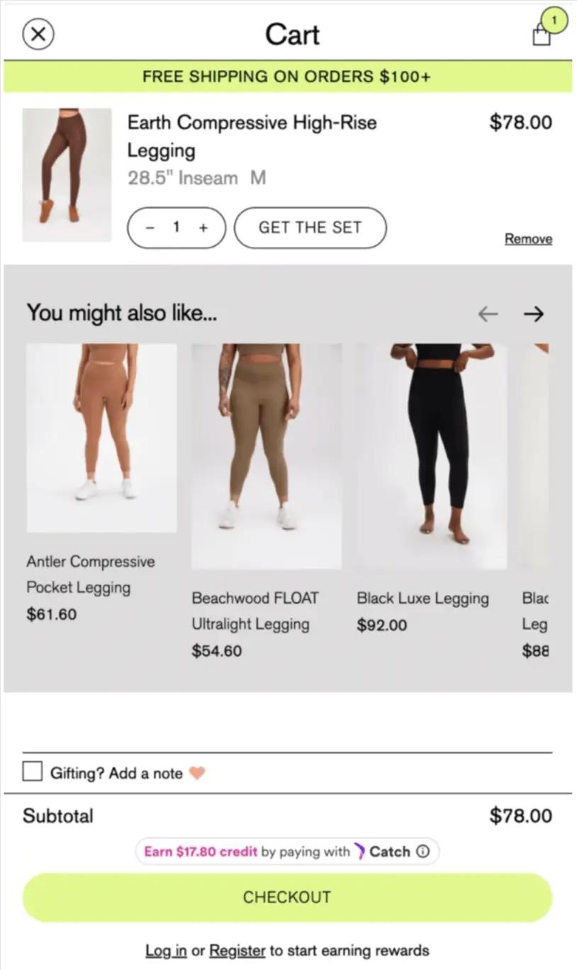
Reminding shoppers about your free shipping threshold before they head to check-out is a great way to encourage them to add a few more items to their shopping cart—especially if you include a few personalized suggestions of similar products that would trigger free shipping.
Pro tip: Set your free shipping threshold just above the average cost of a single product. That way, you can easily encourage higher average order value (AOV) with a single product add-on.
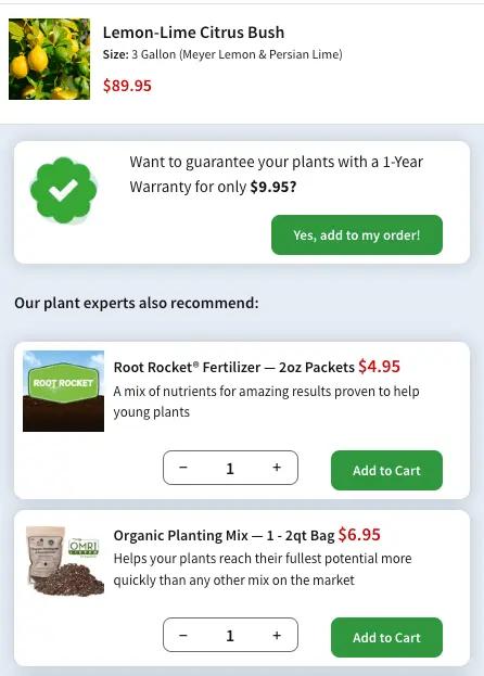
5. FastGrowingTrees suggests complementary items
FastGrowingTrees doesn’t just offer similar products as a way to up-sell—they offer products that complement the item in the shopper’s cart.
To increase AOV, the brand doesn’t assume the shopper wants more of what they’re already getting. Instead, they offer personalized recommendations for products that enhance the one in the cart—in this case, a lemon-lime citrus bush that will grow more healthy with fertilizer and the right planting mix.
Learn why ecommerce personalization is key to business success in 2024 and how to implement it on your website.
Read full story6. Princess Polly uses location to keep online shopping convenient
Australian fashion brand Princess Polly uses geo-location to guide shoppers to the version of their online store that lists sizes and currency in metrics the visitor will understand.
This switch may seem trivial—after all, people can use conversion calculators. But it’s likely a crucial strategy to increase conversion rates across different regions of the world: According to Smart Insights, 97% of consumers have abandoned a purchase because it wasn’t convenient enough.
7. Dermalogica personalizes pop-ups for returning shoppers
Skincare brand Dermalogica recognizes returning shoppers with a pop-up featuring the products they showed the most interest in on their last visit.
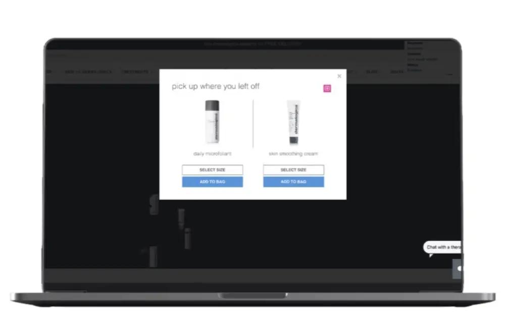
Instead of showing returning shoppers the same email sign-up form Dermalogica shows to new customers, this experience allows loyal customers to pick up where they left off last time.
The results: According to Jay Narula, head of business development at Nosto, this approach led to a 5% click-through rate on the pop-up and a 6.93% increase in AOV.
8. KaisaFit unlocks gated content for subscribers and customers
Personal trainer, fitness educator, and social media influencer Kaisa Keranen runs several fitness brands:
- KaisaFit, which provides one-time-purchase workout videos in a digital ecommerce store
- Just Move, KaisaFit’s membership website, which offers unlimited access to workout videos for every fitness level
- Start Moving, which targets beginners and pre-beginners with “workouts for people who don’t work out”
With a unique business model that requires distinguishing between ad-hoc paying customers, Just Move subscribers, and more casual web visitors, KaisaFit needs to create a highly customized online customer experience.
Here’s how it works: For starters, first-time KaisaFit website visitors are greeted with a traditional sign-up form offering 25% off a Just Move membership in exchange for their email address.
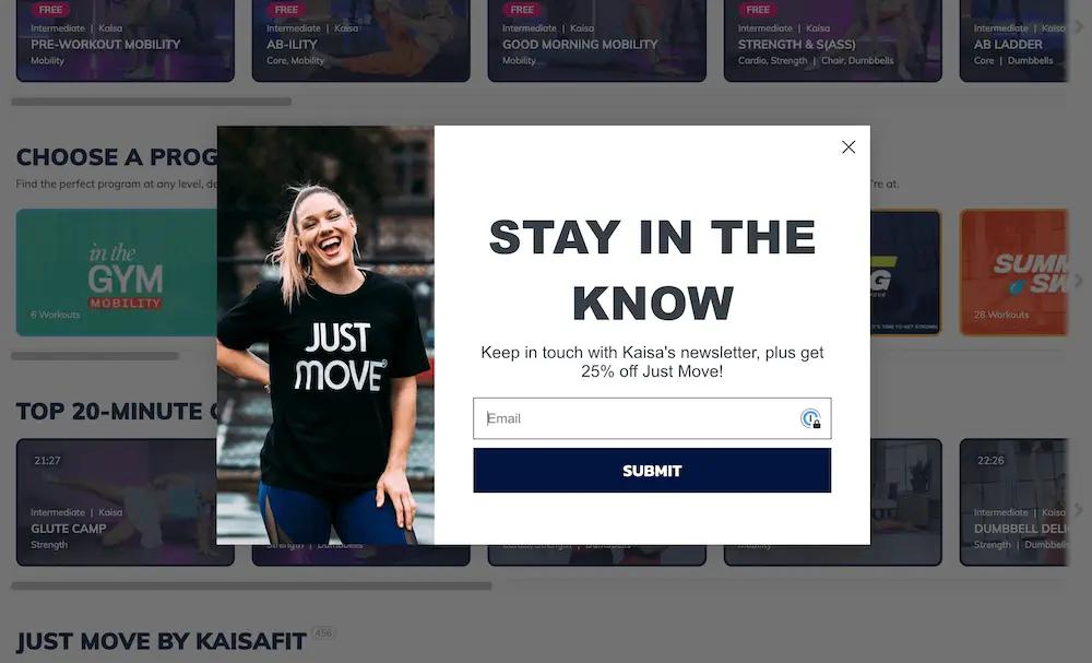
Whether the visitor enters their email address or dismisses the pop-up, or they’re a returning visitor who doesn’t get the pop-up, all of the videos in the KaisaFit digital product catalog are clickable.
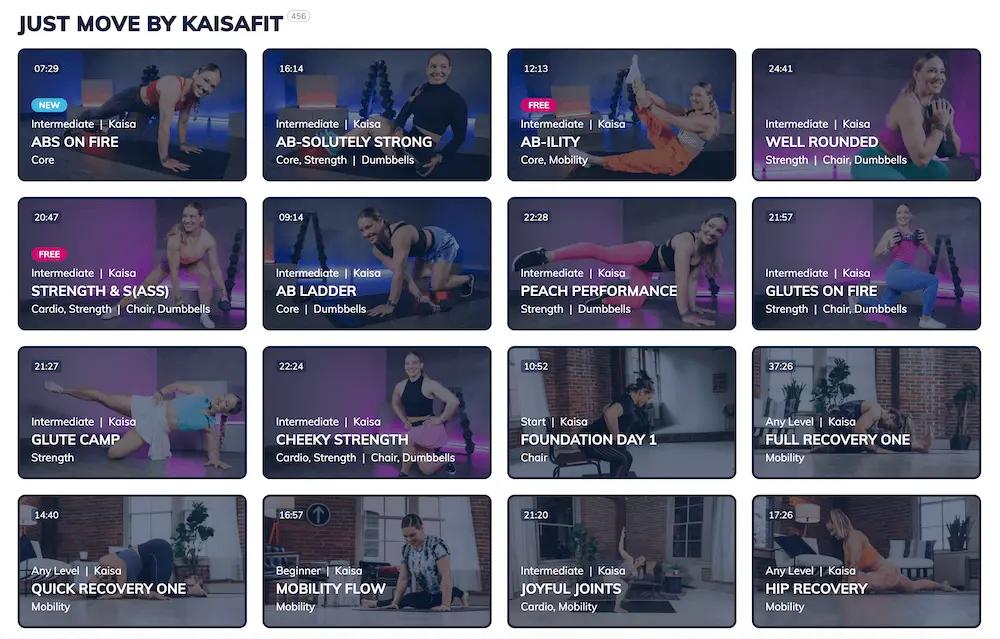
What happens in the next tab, however, depends on whether:
- The video content is free or paid
- The visitor is an email subscriber, a paying customer, or neither
For-purchase content requires log-in or payment
When someone who isn’t a paying customer clicks on one of the for-purchase workout tutorials on the KaisaFit website, they’re greeted with an overlay like this one, which allows a glimpse into the video in the background but blocks full access until the visitor logs in or makes a payment.
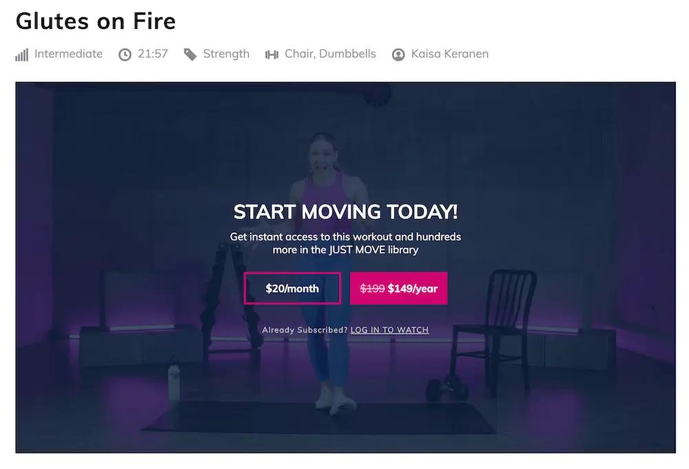
The video plays in real time, giving visitors a sneak peek of what they could access if they purchased it. Once they make either a one-time or subscription purchase, the website recognizes them as a paying customer from that point forward, unlocking access to the content they’ve bought.
Free content requires an email address
Similarly, when someone who isn’t a paying customer clicks on a video labeled “free,” the video keeps playing, soundlessly, in the background, and a sign-up form blocks the visitor from actually watching the content—until they enter their email address.
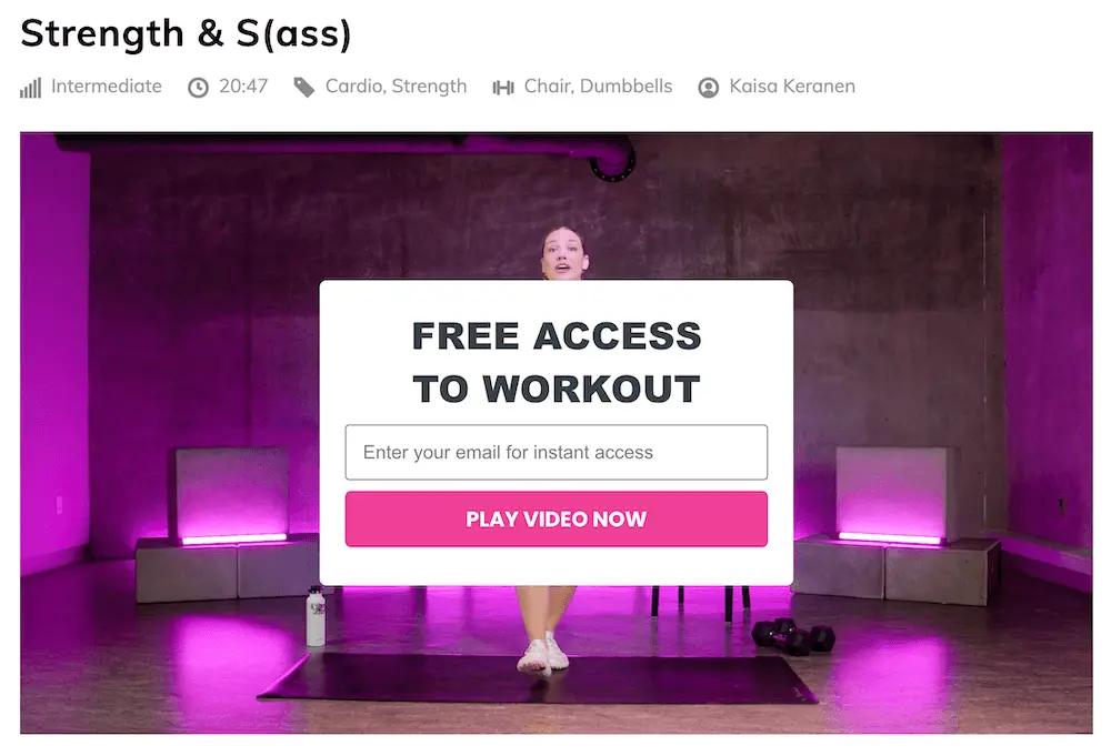
Once someone enters their email address, the website recognizes them as an email subscriber from that point forward, unlocking access to all free fitness videos—and maximizing KaisaFit’s list growth in the meantime.
With this clever use of custom video overlays and sign-up forms, KaisaFit creates an on-site experience that’s tailored to each visitor’s unique relationship with the brand.
Next steps: gather the data you need to execute these tactics
While 78% of ecommerce executives understand personalization at scale is a must-have in marketing, 41% say they can’t execute the tactics to get it done.
A customer data platform like Klaviyo CDP solves this problem by centralizing subscriber and customer data within a platform that also sends marketing. When you only need one piece of software to gather data and use that data, the tactics we’ve highlighted here are a lot easier to execute.
Learn more about what a CDP can do for your marketing strategy—and for your bottom line.
Power smarter digital relationships with Klaviyo SMS.
Get started
Related content